
September 14, 2026 · 32 min read · Updated October 5, 2026
How to Build a Resume Website: Steps, Options and When Not To
A resume website is not a resume and not a portfolio, and the bad ones come from never deciding which. What it is for, who should not build one, four ways to build it with the free-tier facts checked, and why the address outlives the site.
To build a resume website, decide the one thing you want a reader to judge you on, then write a single page that carries your name and a specific one-line claim, three to five pieces of evidence, a short about section, an email address and a link to your PDF. Publish it on a free host, point a domain you own at it, and put that address at the top of your resume. That is the whole job, and it fits in an afternoon; the rest of this guide is about the parts that go wrong, which are rarely the building.
Most bad resume websites are not badly built. They are competently built versions of a thing nobody decided on. Somewhere between the first draft and the launch, the page stopped being a resume and started being a portfolio, or it kept the shape of a portfolio but filled it with employment history, and the result is a page that a recruiter opens, scrolls once, and closes without having learned the one fact it existed to tell them.
That is the failure to design around, and it happens before you choose a host, a template or a framework. A resume website is a specific artefact with a specific job. It is not a portfolio. It is not your PDF resume rendered in HTML. It is not a personal brand. Confusing it with any of those produces a page that is longer than a resume, thinner than a portfolio, and worse than both at the moment it actually gets opened — which is usually on a phone, from a link at the top of a PDF, by someone with nineteen other candidates to get through.
The conflict of interest should be stated now rather than discovered later. Bunfolio builds portfolio and personal sites, so we are one of the options in this guide and we benefit if you pick us. The honest position is that for a large share of the people searching this question, the right answer is a hand-written HTML file on a free developer host, and we say so below with the current free-tier facts checked against each provider's own documentation. We have also written our own limitations up as limitations. If this reads as an advert at any point, stop reading it as advice.
What a resume website is for, precisely
One durable web address that you control, which tells a stranger what you do, shows enough evidence to make that credible, and gives them a way to contact you. That is the whole specification. Everything else is decoration.
Three properties make it worth building rather than just having a LinkedIn profile.
It is an address, not a document. You put it on a PDF, in an email signature, in a conference bio. The PDF you sent in March is frozen; the address printed on it is not. Update the site and every copy of that link is current, including copies in inboxes you will never see again.
It opens instantly, on a phone, with no account. A recruiter clicking through from a PDF at a bus stop will not download a 4 MB file and will not sign in to anything. A web page is the lowest-friction format there is.
It is the one place where the framing is yours. Every other surface in a job search is a form somebody else designed. Your site is the only one where you decide what the first sentence says.
What it is not: a portfolio. A portfolio is project-led. Its unit is the case study, its reader is someone deciding whether to commission or hire you for a specific piece of work, and it is judged on the depth of two or three pieces rather than the breadth of ten. If your work is the argument — design, writing, photography, front-end engineering — you want a portfolio and a resume website is a lesser version of it. We have written about what belongs on one in the pages a portfolio website actually needs, and about the difference in shape in one-page versus multi-page portfolios.
And it is not the PDF. The PDF is still the thing almost every application form asks for, it is the thing that gets parsed into an applicant tracking system, and it is the thing a hiring manager prints or forwards. The website does not replace it. It is the other end of the link you put on it.
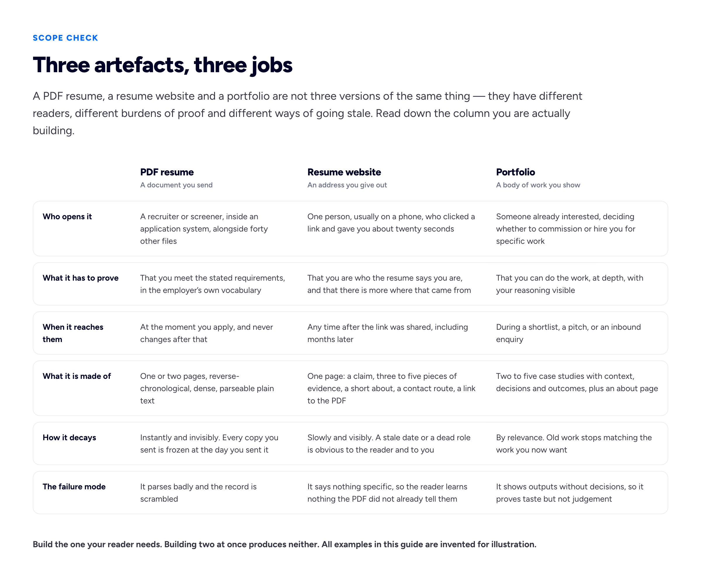
The commonest mistake is building the middle column with the contents of the right one, or the left one, and shipping something that does neither job.
Who should not build one
This section exists because most guides on this topic assume the answer is yes. Often it is not, and a weekend is a real cost when you are unemployed.
If nobody will click it. Some hiring processes genuinely do not involve a human following a link — high-volume graduate schemes, public sector applications scored against a fixed competency framework, agency submissions where your CV is reformatted onto the agency's letterhead before the client ever sees it. If you have applied to twenty roles and every one of them was a form with no free-text field, your website is not the bottleneck.
If you have nothing you can publish. Clinical work, classified work, internal tooling, anything under an NDA. A resume website with no evidence on it is a styled paragraph, and a styled paragraph is not more persuasive than the same paragraph in your LinkedIn summary. There are ways around this — we cover them in showing confidential work without breaking an NDA — but they take work, and you should do that work before building the container for it.
If the site would be a substitute for applying. Building a website is pleasant, bounded and entirely under your control. Applying for jobs is none of those things. The temptation to do the first instead of the second is strong and worth naming: if your application rate drops to zero for a fortnight while you refine a hero section, the site is costing more than it can return.
If you will never touch it again. A site whose most recent role ended two years ago is actively worse than no site, because it tells a reader something specific and wrong. Be honest about whether you will maintain it. If the answer is no, keep an accurate LinkedIn profile and spend the weekend on your PDF instead.
If what you actually need is a portfolio. If you are a designer, an illustrator, a writer or a photographer, the work is the argument and a resume website will underserve it. Start at building a portfolio when you have no professional experience if the material is the problem, or writing up one project as a case study if it is not.
If none of those apply, build one. It takes an afternoon if you decide the next thing first.
How to make a resume website, step by step
Whether you call it a resume website, an online resume or a personal website for your resume, the steps are the same, and the order matters more than the tools. Each step below has its own section further down; this is the route through them.
- Decide what you want judged. One sentence: the specialism, the career change or the service you sell. Everything else on the page follows from it.
- Gather your evidence before you open an editor. Three to five pieces, each written as what it was, what you did and what changed. If you cannot publish any of it, solve that first.
- Write the page in a plain document. Name and one-line claim, the evidence, four to six sentences about you, an email address. Writing it in a text file first stops the template from deciding your content.
- Choose where it lives. A hand-written file on a free static host if you can write HTML, a site builder if you cannot, or a profile-driven service if you want it done in twenty minutes. The comparison below has the free-tier facts.
- Register a domain you control, or at least decide which address you will commit to, because that address is what goes on every PDF you send from now on.
- Add the link to your current PDF and check it downloads the version you are actually sending out.
- Test it the way it will be read: on a phone, from the link in your PDF, with no other tabs open. If the first screen does not say what you do, rewrite the first line, not the layout.
- Put the address on your resume, your email signature and your LinkedIn profile, then set a reminder to update it whenever the PDF changes.
Most people do these out of order, starting at step four, and that is how a page ends up beautifully hosted and saying nothing.
The decision that determines everything else
Before you open an editor: what is the one thing you want judged?
Not the three things. One. The page will carry more than one fact, but it can only lead with one, and the one you lead with determines the structure, the evidence you need, and what you cut. Three common answers, each producing a different page.
"I am a specialist in a narrow thing." A Postgres performance engineer, a paediatric nurse practitioner, a technical writer for API documentation. The page leads with the specialism stated flatly, then three pieces of evidence only a specialist could produce. Breadth hurts you here — every unrelated skill dilutes the claim.
"I am changing fields and the resume does not explain me." The page's job is translation. Lead with where you are going, not where you have been, then show the bridge: the projects, the transferable work, the thing you built on your own time. The employment history goes lower down, because on the page it is context rather than the argument. This is the single case where a resume website earns its keep most clearly, because a reverse-chronological PDF is structurally incapable of making this argument and a web page is not.
"I am available for work and here is what I do." The freelancer's version. The page is closer to a small service site: what you do, who for, what it looks like when you do it, how to start a conversation. If this is you, you are probably building a freelance portfolio site rather than a resume website, and the difference is real.
Write your answer in one sentence before you build anything. If you cannot, the site will not say it either.
The sections that earn their place
A resume website is one page. Not because one-page sites are fashionable, but because the reader arrived from a link with a specific question and every navigation choice you offer is a chance for them to leave without answering it.
In order:
Your name and one line that says what you do. Above the fold, in text, not in an image. The line should be specific enough that a stranger could repeat it. "Senior backend engineer, payments and reconciliation, ten years" is a line. "Passionate problem-solver who loves building things" is not a line; it is a gap where a line should be.
Three to five pieces of evidence. This is the section that does the work, and it is the one people skip. Each item: what it was, what you did, what changed. Two or three sentences. Link out to the live thing where one exists. If nothing is public, describe the outcome in a way that a colleague would recognise as accurate. Five is a ceiling, not a target — how many projects to show covers why a shorter list reads as stronger.
A short about section. Four to six sentences, first person, no third-person biography unless you are genuinely writing for a conference programme. It answers "who am I dealing with", not "what is your life story". We have a longer treatment in writing the about page, and if the blank page is the obstacle, our about me generator will give you a draft to argue with, which is faster than staring at nothing.
A contact route that is an actual address. An email address, written out, as text. A form is fine as an addition; it is a poor substitute, because a recruiter forwarding you to a colleague needs something they can paste. Put your city or time zone next to it if you want to filter for location.
A link to the PDF. One line, clearly labelled, pointing at the current file. This is the single highest-value link on the page and it is frequently missing.
Now the sections to leave out, and why.
Skill bars showing you are 87% proficient in JavaScript. Nobody can calibrate that number, including you, and the visual precision makes a vague claim look like a measured one. List the skills as text, grouped, honestly — the same reasoning we set out in the resume skills section applies here. A blog you will not write; an empty blog dated eighteen months ago is a liability. A testimonial from a friend, unless it is specific and attributed to a real role — asking clients for testimonials properly is the fix. A hobbies section, unless the hobby is evidence. A full employment history duplicating the PDF: link the PDF instead. And an animated hero that delays the first readable sentence by two seconds.
If you want to see what the shape looks like when it is done well rather than described, personal website examples walks through several, and our templates show the same structure filled in.
Where to build it, honestly
Four routes. The free-tier facts below were checked against each provider's own documentation at the time of writing, and free tiers move, so re-check before you commit an evening.
A hand-written static file on a free developer host
If you can write HTML and CSS — or are willing to learn enough over an afternoon, which for a single page is genuinely achievable — this is the best answer for most technical readers, and it costs nothing but a domain. One index.html, one stylesheet, no build step, no framework. The whole thing can be under 30 KB and load in well under a second.
GitHub Pages. Free accounts can publish from public repositories only: the documentation states that Pages "is available in public repositories with GitHub Free and GitHub Free for organizations, and in public and private repositories with GitHub Pro" and the paid tiers. The documented limits are a recommended 1 GB source repository, a 1 GB published site, a soft bandwidth limit of 100 GB per month and a soft limit of 10 builds per hour — none of which a resume website will approach. The same page prohibits using Pages for commercial transactions or as a general web-hosting service for an online business; a personal resume site is not that, but read it yourself if you plan to sell anything. Custom domains are supported for both apex domains and subdomains, and HTTPS is automatic — GitHub requests a TLS certificate from Let's Encrypt once the DNS check passes.
Netlify. The free plan is listed at $0 and explicitly includes "Add Custom domains with SSL". Read the credit model before you rely on it: the free plan carries a 300 credit limit per month, a production deploy costs 15 credits, bandwidth costs 20 credits per GB and web requests cost 2 credits per 10,000. For a resume website that is comfortable — but it does mean roughly twenty production deploys a month if you spend nothing else, so a day of fiddling with commit-triggered builds can exhaust a month's allowance. Additional credits require enabling auto-recharge, which the same page says is disabled by default. Pointing a domain you already own at Netlify is a CNAME for a subdomain, or an ALIAS/ANAME record for an apex domain.
Cloudflare Pages. The published free-plan limits are 500 builds per month with one build at a time, up to 20,000 files per site, a 25 MiB maximum size per asset, 100 custom domains per project and 100 projects per account, with unlimited preview deployments. That page documents no bandwidth cap at all, which is the most generous position of the three for a site that unexpectedly gets attention.
All three are genuinely free, all three give you HTTPS, and all three let you attach a domain you own at no charge. If you are a developer and a hiring manager is going to look at your site, the site being a clean hand-written page on one of these is itself a small piece of evidence.
A site builder
The consumer builders will get you a good-looking page in an hour with no code, and for a lot of people that is the right trade: you buy design competence you do not have to supply yourself. What you give up is knowing what the page weighs, and on most of them the custom domain sits behind the first paid tier while the free tier puts the platform's badge or advertising on your pages. We went through which ones do what, every claim linked to the company's own pricing page, in free portfolio builders with a custom domain. The short version: look for the words "custom domain" in the cheapest column, not in the marketing copy.
LinkedIn only
A genuinely underrated answer, and the honest fallback. A complete LinkedIn profile with a custom public URL is a functioning resume website: it has an address, it is indexed, it opens on a phone, and recruiters are already there. What you give up is the framing — the first thing a visitor reads is LinkedIn's layout, not your sentence — and the address is LinkedIn's, which matters for the reasons in the next section. If you are going to build a site anyway, the profile is the best raw material you have; turning a LinkedIn profile into a website covers how to lift it across without simply pasting it.
Bunfolio
Ours, so weight it accordingly. You sign in with Google or with an email address and password, fill in a short wizard or import a public LinkedIn profile, and publish to a subdomain such as jane.bunfolio.com. The site is free. Connecting a domain you already own is an optional paid add-on, and we do not sell you the domain itself, because a domain someone gives you is a domain someone else controls.
The limitations, stated as limitations: there are four fixed templates, so if you want a specific visual identity you will be fighting them. You do not get the file, so you cannot take the HTML somewhere else. And your site lives on our infrastructure, which means our continued existence is a dependency of yours — the mitigation is that you point your own domain at it, so moving costs you a DNS change rather than an address.
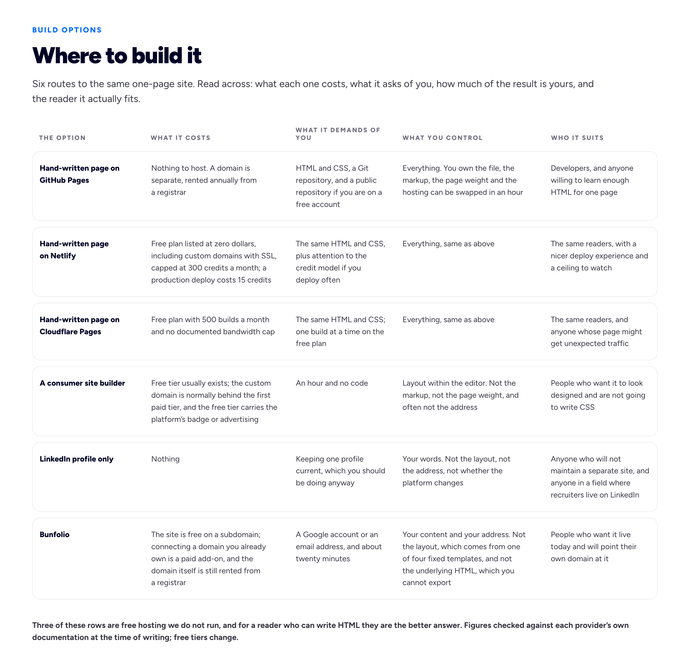
Fill in the last column for yourself before the other three. Most of the argument is settled there.
The address outlives the site
Here is the part that most guides treat as a footnote and that actually decides whether this was worth doing.
Your site will be rebuilt — two or three times over a career you will redesign it, move hosts, or start again on something newer. None of that matters if the address stays the same, and all of it is destructive if it does not, because the link you gave out is sitting on PDFs in inboxes, in old email signatures, and in whatever a former colleague saved three years ago.
The scale of that decay is measurable rather than anecdotal. Pew Research Center sampled roughly a million web pages from the Common Crawl archive and found that 38% of pages that existed in 2013 were no longer accessible in October 2023. That is the base rate for the open web. A page whose address belongs to a platform you do not control is drawn from a worse distribution than that, because it can disappear for reasons that have nothing to do with you: the platform shuts, the free tier changes, the subdomain scheme is reorganised, your account lapses.
So: register a domain. It is the one part of this that always costs money, and it is the only part that is genuinely yours. Be precise about what you are buying, because the vocabulary misleads. A domain is registered for a term, usually a year at a time, through a registrar, and you renew it. It is a rental, not a purchase. That is not a technicality — ICANN's Expired Registration Recovery Policy exists because people forget, and it requires your registrar to send you at least two expiration notices, one about a month before and one about a week before, plus one after. If it still expires and is deleted, most registries must offer a 30-day Redemption Grace Period during which DNS resolution is disabled and you can recover it. That period is your last chance and it is not free. Turn on auto-renew, and keep the card on the account valid — ICANN's own registrant rights and responsibilities page puts "keep your payment information current" and accurate contact data squarely on you.
Hosting is a separate transaction from the domain. Every option in the previous section, ours included, lets you point a domain you own at it. We do not sell domains, and connecting one to Bunfolio is an optional paid add-on; either way, a domain you registered yourself means the link you print on a resume is a link you can redirect anywhere later.
The practical form of all this is the line you put on your resume. Where to put your portfolio link on your resume covers the mechanics — write it as plain text as well as a hyperlink, keep it short enough to retype, and never point it at something that will 404 in a year.
Making it findable, and fast enough
Do not expect a personal site to rank for anything competitive. It will rank for your name, sometimes below your LinkedIn, and that is mostly the whole opportunity. Treat the search work as making sure the page is not broken when someone searches your name, not as a growth channel. If you do want the longer version, portfolio SEO covers what is worth doing.
The short list:
A real <title>. Your name and what you do — "Jane Okafor — Backend Engineer, Payments". Google's documentation on title links says there is "no limit on how long a <title> element can be", that it gets truncated to fit the device width, and warns specifically against vague descriptors like "Home". The title is also the browser tab and the text of a bookmark, which is where most of its value actually lands.
A meta description that reads like a sentence. Google's snippet documentation is explicit that there is no length limit and that the snippet is truncated as needed — so the widely repeated 155-character rule is a rendering estimate, not a specification. Write one honest sentence and stop.
One clear top-level heading. Not because Google counts them — it does not say it does — but because a heading structure is how a screen reader user navigates a page and how a skim reader finds the section they want. The W3C's guidance on headings is about conveying structure, and a resume website has an obvious one: your name at the top, then the sections beneath it in order.
A sensible URL. Your domain root. No /index-final-v3.html.
Mobile layout, checked on an actual phone. Not the browser's device emulator. Open it on your own phone, on mobile data rather than wifi, and read it. That catches more than any audit tool.
Page weight. This is where a resume website should quietly show off. The HTTP Archive's 2024 Web Almanac put the median page at 2,652 KB on desktop and 2,311 KB on mobile, with 1,054 KB of that images and 613 KB JavaScript, across 71 requests. A one-page resume site has no business being anywhere near that. A single photograph, correctly sized and compressed, plus text, plus one stylesheet, is a few hundred kilobytes at most and needs no JavaScript at all. For context on what "fast enough" means, Google's Largest Contentful Paint guidance suggests 2.5 seconds or less at the 75th percentile of loads; a static page of text should be finished long before that.
Accessibility, which is also a work sample
If your site claims attention to detail and a screen reader cannot get through it, you have provided evidence against yourself. This is not a compliance exercise for a personal page; it is ten minutes of checks that also happen to make the page better for everyone reading it one-handed on a train.
The W3C's Easy Checks is the right starting point, and it is deliberately described as "quick and easy, rather than definitive". Its list — page title, image alt text, headings, contrast, resizing text, keyboard access and visible focus, form labels, moving content, multimedia alternatives, and a basic structure check with images and styles disabled — maps almost exactly onto the things a one-page site can get wrong.
The four that matter most here:
Contrast. The fashion for light grey body text on white is a genuine accessibility failure, not a taste disagreement. WCAG's minimum contrast criterion requires a ratio of at least 4.5:1 for normal text, and 3:1 for large-scale text, defined as at least 18 point or 14 point bold. Check your body colour against your background before you ship.
Alt text on the photograph. One short factual description. If the image is purely decorative, an empty alt attribute is correct and is better than a filename.
Keyboard access and a visible focus ring. Tab through the page. If you cannot see where you are, you have removed the browser's focus outline in CSS and not replaced it. That is a one-line fix and a very common one.
Text that resizes. Zoom to 200% and read it. Fixed-height containers and text sized in viewport units are the usual culprits.
Run the basic structure check too — disable styles and images and read what is left. If the page still makes sense as a plain document, its markup is sound. If it becomes an unordered heap, the meaning was in the CSS, which is exactly the failure mode that also breaks a resume PDF when it is parsed.
Keeping the PDF and the site in step
The website does not retire the PDF. Almost every formal application still asks for a file, and that file is what gets pulled apart into database fields. Two artefacts, two jobs, one set of facts — and the commonest maintenance failure is drift, where a recruiter reads one date on the page and a different one in the document. Keep the facts in one place and give the other the same edit the same day. Dates, job titles and the current role are what must match; the prose can differ, and should, because the audiences differ.
The PDF has its own constraints that do not apply to the web page at all. It has to survive being parsed, which is a formatting problem rather than a writing one and which we cover in ATS resume formatting. It has a length convention, which is a reading problem rather than a rules problem — how long a resume should be goes into it. And if your career is a list of clients rather than a list of employers, it has a structure problem, covered in putting freelance work on a resume.
If you do not have a current PDF, or the one you have was made in a design tool and comes out as a picture, our free resume builder will produce one. It needs no account, it lays out a single column with conventional section headings, and it produces the file through the browser's own print-to-PDF, so the output is real selectable text rather than a rendering. One thing to know before you export rather than at the moment you export: the finished PDF carries a small "Created with Bunfolio" credit at the foot of the page. That credit is what pays for the tool being free, and it is the only string attached.
A reasonable rhythm: rewrite the PDF for each application, because the employer's vocabulary changes; rewrite the website roughly never, because it is addressed to nobody in particular. Tailoring in the resume builder and leaving the site alone is the right division of effort.
Frequently asked questions
What is a resume website?
A single web page at an address you control that states what you do, shows three to five pieces of evidence, and gives a way to contact you. It is not a portfolio, which is project-led and judged on the depth of individual case studies, and it does not replace a PDF resume, which is still what application forms ask for and what applicant tracking systems parse. Its distinguishing property is that it is an address rather than a document: every copy of the link you have given out points at the current version.
Do I really need a resume website?
Often not. If you are applying through forms with no free-text field, if you have no work you are permitted to publish, or if you will not keep the site current, it will not repay the weekend. It earns its place most clearly when you are changing fields and a reverse-chronological PDF cannot make your argument, when you freelance and people need somewhere to send an enquiry, or when your work is public and linkable. A complete LinkedIn profile is a legitimate answer for everyone else.
How do I build a resume website for free?
If you can write HTML and CSS, write one index.html and a stylesheet and publish it on GitHub Pages, Netlify or Cloudflare Pages. All three host static sites free, all three provide HTTPS, and all three let you connect a domain you already own at no charge. If you would rather not write code, a builder will get you a page in an hour, though on most of them a custom domain sits behind the first paid tier. Hosting being free does not make the domain free: that is rented from a registrar, annually, and is a separate transaction from hosting whichever route you take.
How do I make a personal website for my resume?
Treat it as a companion to the resume, not a copy of it. Write one page that leads with a specific line about what you do, backs it with three to five pieces of evidence the PDF has no room to show, adds a short first-person about section and an email address, and links to the current PDF. Publish it wherever suits your skills, then print its address in your resume header so the two point at each other. If you find yourself pasting your whole employment history onto the page, stop: the PDF already does that job, and the website is where you show what the bullet points only claim.
How do I create an online resume website without coding?
Use a builder or a service that generates the page from your details. A site builder gives you a template to fill; you choose the layout and write the content yourself, and on most of them a custom domain needs a paid plan. A service that imports a LinkedIn profile, such as ours, pre-fills the page from what you have already written and leaves you editing rather than starting from a blank form. Either way, the writing is still yours to do: no tool can decide what you want judged on, and a well-made template with a vague first line is still a vague page.
Is GitHub Pages or Netlify better for a resume website?
For one static page, either is fine and the difference is administrative. GitHub Pages on a free account requires a public repository, and documents soft limits of 100 GB of bandwidth per month and 10 builds per hour, which a personal site will never reach. Netlify's free plan includes custom domains with SSL but runs on a 300-credit monthly allowance, where a production deploy costs 15 credits — comfortable for a site you rarely change, tighter if you deploy on every commit. Cloudflare Pages allows 500 builds a month and documents no bandwidth cap. Pick on where your code already lives.
Should a resume website be one page or several?
One page, in nearly every case. Your reader arrived from a link with one question and each navigation choice is an opportunity to leave without an answer. Multiple pages start to make sense only when you have case studies substantial enough to deserve their own URLs, at which point you are building a portfolio rather than a resume website.
What should I put on a resume website?
Your name and a specific one-line description of what you do, above the fold and as text rather than inside an image. Three to five pieces of evidence, each saying what it was, what you did and what changed. A short about section of four to six sentences in the first person. An email address written out as text. A link to your current PDF. Leave out percentage skill bars, an empty blog, unattributed testimonials and a full employment history that duplicates the PDF.
Do I need a custom domain for a resume website?
Not to publish, but it is the part worth paying for. A free subdomain on a platform is an address you do not control, and it can stop working for reasons unconnected to you. Pew Research Center found that 38% of web pages that existed in 2013 were unreachable by October 2023, which is the background rate of link decay you are trying to survive. A domain you register yourself can be pointed at a different host in an afternoon, so the link on a three-year-old PDF keeps working through every rebuild.
Does a resume website help with ATS?
No, and it is worth being clear about it. An applicant tracking system parses the file you upload; it does not visit your website. Everything about parsing — layout, columns, headings, date formats — applies to the PDF and to nothing else. The website is read by a human, later, after the file has already got you into the database.
How long does it take to build one?
An afternoon, if you have decided what you want judged and have your evidence written. Days, if you have not, and the extra time goes into rewriting the same first sentence. The writing is the work; the building is the easy part, which is why most guides on this topic are about the wrong half of the problem.
How we put this guide together
Bunfolio builds portfolio and personal sites and runs a set of free career tools, so this topic sits directly on top of our commercial interest. What is sourced fact here is narrow and linked below: the free-tier terms of the three developer hosts, the link-decay measurement, the domain expiry rules, Google's own statements about titles and snippets, the page-weight medians, and the accessibility criteria. Everything else is our judgement and should be weighed as such — the three-artefact distinction, the argument that one page is right for almost everyone, the "what do you want judged" framing, the list of sections to cut, and the claim that the address matters more than the site.
We have not cited the best-known statistic in this topic: the figure, usually given as 56%, that hiring managers are more impressed by a personal website than by any other personal branding tool. We followed it back. It appears to originate in a 2013 magazine column quoting research supplied by a company that sold personal websites, with no published method, sample size, question wording or date of fielding available. That is a vendor claim about its own market, thirteen years old, repeated until it acquired the texture of a finding. We could not verify it, so it is not in this guide, and a number that convenient should make you suspicious wherever you meet it. If you find the underlying study, read the method before you believe the headline.
The verifiable claims point at primary documents, each checked at the time of writing. Free-tier terms come from GitHub Pages' documented limits, GitHub's statement of which accounts can publish, its HTTPS documentation, Netlify's pricing page for the free plan's credit allowance and custom domains with SSL, and Cloudflare Pages' limits page. The link-decay figure is from Pew Research Center's When Online Content Disappears, published May 2024, based on about a million pages sampled from Common Crawl. Domain expiry and renewal come from ICANN's Expired Registration Recovery Policy and its registrant rights and responsibilities page. Search statements come from Google's documentation on title links and snippets. Page-weight medians are from the 2024 Web Almanac and the load-time threshold from Google's Largest Contentful Paint guidance. Accessibility claims come from the W3C's Easy Checks, its headings tutorial and the WCAG 2.2 minimum contrast criterion. Free tiers change faster than articles do; re-check the three hosting pages before you rely on them.
Every person, role, employer, address and example above is invented for illustration, including everything in both diagrams. Jane Okafor, the Postgres performance engineer, the paediatric nurse practitioner and the sample job titles are fabricated to show the shape of an argument, not drawn from a real candidate or a real site. No figure in either diagram is a measurement; the numbers that are measurements are in the prose, linked above.
The conflict of interest is worth restating rather than burying. Bunfolio is one of the six options in the comparison table, this article is published by Bunfolio, and we gain if you choose us. What we did about it: recommended three hosting services we do not run over our own product for any reader who can write HTML, gave those three more space and more verified detail than our own row, named LinkedIn alone as a legitimate answer, wrote our fixed templates and the absence of an HTML export up as limitations in our own row, opened with a section arguing that many readers should not build a resume website at all, and quoted no prices — ours or anyone else's — beyond the figures printed on the providers' own pages.
Related reading: the pages a portfolio website actually needs if you decided you want the right-hand column instead, where to put your portfolio link on your resume for the line that joins the two artefacts, personal website examples for what the shape looks like finished, and portfolio SEO if you want your name to resolve to your own page rather than someone else's.
More from the blog
November 5, 2026 · 19 min read
Student Portfolio Examples: How to Build One From Coursework
What counts as work when you have no clients, from coursework and group projects to societies and part-time jobs, how to write each project up in five short parts, how many pieces to show, how to stru...
November 1, 2026 · 19 min read
Cover Letter vs Resume: What Goes in Each, and When You Need Both
The resume is the record; the cover letter is the argument for this role. What belongs in each and what must never be repeated, when a letter is really needed, how the two should point at each other,...
October 28, 2026 · 19 min read
References on a Resume: Should You List Them, and How?
Usually not on the resume itself, and never "available on request". When references do belong on the application, how to choose referees who will actually help, how to ask and brief them, the referenc...