
July 14, 2026 · 17 min read · Updated September 25, 2026
One-Page vs Multi-Page Portfolio: Which Should You Build?
One long scrolling page or a page per project? An even-handed look at what each structure costs you in depth, upkeep and search surface, and why most freelancers end up with a hybrid.
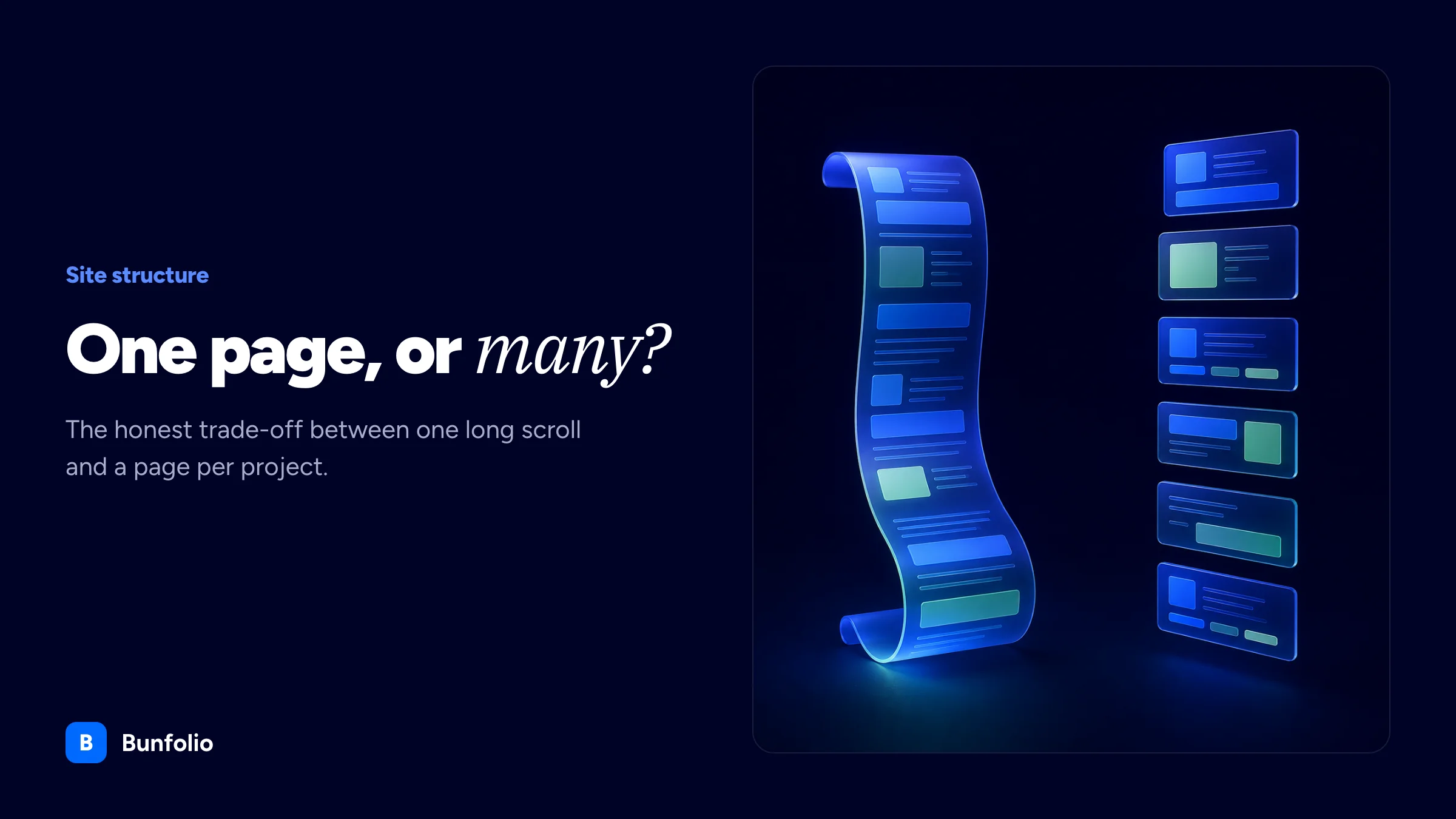
You are about to build or rebuild your portfolio, and you have hit the first real fork: does everything live on one long scrolling page, or does each part get a page of its own? It looks like a design question. It is mostly a content question, and it sets how your site behaves for the next two or three years.
Almost everything written about it is generic agency advice about single-page versus multi-page websites in general, which is a different problem with different stakes. A freelance portfolio has one visitor type, one conversion, and a body of work that grows unevenly.
So this guide is specific to portfolios: what "one page" means to a browser and to a crawler, the honest search trade-off that one-page advocates skip, the hybrid structure that suits most freelancers, and how to change your mind later without wrecking what you built.
What "one page" actually means for a portfolio
A one-page portfolio is a single URL containing every section stacked vertically: hero, about, services, work, testimonials, contact. Navigation does not load anything. It scrolls you to a position on the page you are already on, usually through an anchor link like #work or #contact.
That distinction matters more than it sounds. To a search engine, a one-page site is one page, full stop. Google's URL guidance is explicit that you should not use fragments to change what a page contains, because "Google Search generally doesn't support URL fragments". Your #about section is not a second page in any sense a crawler recognises.
It is worth separating a one-page site from a single-page application, which swaps content with JavaScript while keeping one URL and can have dozens of logical screens. A one-page portfolio is the simpler thing: one document, no routing, no state.
In practice "one page" is a spectrum. There is the pure one-pager where the page is the entire site, the one-pager that links out to work hosted elsewhere, and the hybrid, where a one-page home is the front door and individual case studies and posts live on their own URLs behind it. Much of this guide argues that the third option is where most freelancers end up, and that they get there faster if they plan for it.
The case for one page
The one-page format is not a compromise or a beginner's option. For many freelancers it is the right structure, for four reasons that have nothing to do with laziness.
One narrative arc. A portfolio has an argument to make: here is the problem I solve, here is proof, here is how to reach me. On a one-page site the visitor gets that argument in the order you wrote it. On a multi-page site they enter wherever a link dropped them and assemble their own version, often skipping the part that would have convinced them.
The scroll is free. Scrolling is the cheapest interaction on a phone, and much portfolio traffic is someone glancing at your link between other things. Every click is a decision, and every decision is a chance to leave. A one-page site turns navigation into a gesture people perform without thinking.
There is less to maintain, so it stays true. A four-page site has four sets of copy and four opportunities to go stale. Freelance portfolios rot not because people are careless but because updating them competes with billable work, and fewer surfaces means the site is more likely to still be accurate in eighteen months.
You are much more likely to finish it. Unglamorous, and probably the most important. A live one-page portfolio beats a beautifully architected multi-page site that has been "nearly ready" since March. If you have been stuck for months, the structure is often what is doing the sticking.
Speed is usually claimed as a fifth advantage, and it is real but conditional. One page means one document request and no navigation cost afterwards. It also means every image sits in that one document, so a dozen full-width photographs loading eagerly makes your first view slower, not faster. The fix is well documented: use loading="lazy" on offscreen images while leaving the ones at the top alone, since browser guidance is clear that you should not lazy-load images likely to be in the viewport on load, especially your largest. Done properly a one-pager is very fast; done carelessly it is the slowest thing you will ship.
Where one page runs out of road
The limits are predictable, and they arrive at roughly the same moment: when your work gets good enough to be worth explaining.
Depth gets crushed. A one-page portfolio gives each project a card: image, title, two or three sentences. That proves you have shipped things. It does not show how you think, which is what a serious client is buying. A proper case study with a problem, constraints, decisions and an outcome needs several hundred words, and six of those do not fit inside a home page anyone will read.
You cannot deep-link to a single project. This is the failure that costs real work. A prospect asks whether you have done anything in fintech: on a hybrid site you send one URL that opens on exactly that case study, and on a pure one-pager you send your home page and say "scroll down, it is the third one". You have handed a busy person a task, and tasks get postponed.
Scaling is ugly. Three projects look considered. Twelve look endless, and visitors stop somewhere in the middle regardless of what is below. Deciding how many projects belong on the page is a real constraint here, and eventually the answer is "fewer than I have".
A blog does not fit. Publishing is the most reliable way for a portfolio to earn search traffic, and a post needs its own URL to be linked, shared or indexed. A one-page site can list recent posts, but the posts must live somewhere else.
One page means one set of signals. Google's starter guide advises that a good title is "unique to the page" and a good meta description "unique to one particular page". A one-page site has exactly one of each, describing the whole of you. That is a genuine ceiling.
What multi-page buys you, and what it costs
A multi-page portfolio gives every idea its own address. Each case study, service or post becomes something that can be linked to, ranked, shared and measured on its own terms. You get room to write at the length the work deserves, analytics that say which project people read rather than which page they landed on, and room to grow: your fifteenth case study costs nothing structurally, whereas on a one-pager it costs a decision about what to cut.
The costs are equally concrete, and they are mostly ongoing rather than upfront.
- Navigation becomes a design problem. With one page it is a list of anchors. With eight pages you must decide what belongs in the menu, what is nested, and how someone gets back.
- Thin pages are a real risk. A services page with four bullets, an about page with one paragraph and a contact page with an email address are three pages doing the work of one section. A site made of thin pages is worse than a single well-written one.
- The maintenance surface multiplies. Change your positioning and you have to find every page that describes what you do.
- Empty sections look bad. A blog with two posts from last year, sitting in the main navigation, actively damages you.
- It takes longer to launch, which for many people means it does not launch.
The honest summary is that multi-page is not a better structure, it is a bigger one. It rewards people with enough content to fill it and enough time to keep it fed.
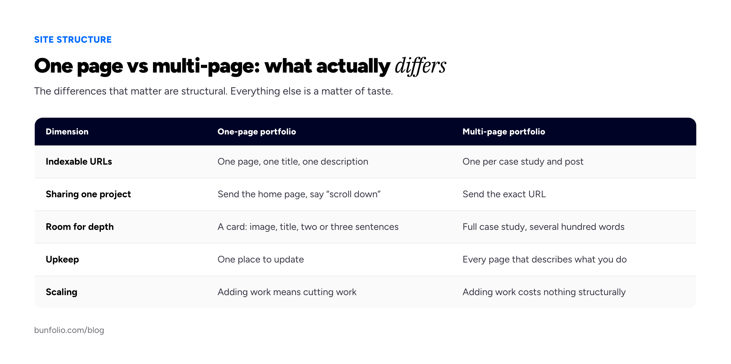
The differences that actually matter are structural, not aesthetic.
Anchor navigation and the order of your sections
If you go one-page, the navigation bar is the only map of a document that might be six screens tall. A few things make it behave well.
Keep the nav visible as the visitor scrolls, and keep it short: Home, About, Work, Contact is enough. If your menu has eight anchors, you have a site pretending to be a page.
Write real anchor links, meaning ordinary href attributes pointing at section ids, rather than click handlers that scroll programmatically. Real links work with middle-click, keyboard navigation and the back button, and they survive JavaScript failing to load.
Order matters more here than anywhere else, because order is the only prioritisation you have. Our preference is a short hero saying what you do and for whom, then work almost immediately, then about, then proof, then contact. The instinct to lead with a long biography is understandable and wrong: visitors want to know whether the work is any good before they care who you are, and your about section earns more attention once the work has done its job.
Two things to avoid: do not hijack the scroll with animations that fight the user's gesture, and do not hide content behind interactions. Both make the page harder to skim, which is the behaviour you are designing for.
Anchors remain useful to humans even though they are invisible to search engines. Sending someone yoursite.com/#contact works fine in an email; it just will not appear as a separate result in Google.
The SEO trade-off, honestly
Most articles pick a side here. The reality is narrower than either camp suggests.
A one-page site is not penalised. Google's starter guide notes that search engines "will likely understand your pages as they are right now, regardless of how your site is organized". If someone tells you a one-pager cannot rank, they are wrong: it can rank perfectly well for your own name, the query that matters most to a freelancer, and often for a tight niche-plus-location phrase too.
The trade-off is surface area, not penalties. One page carries one title, one description and one topic, so it gets one shot at one cluster of queries. Ten case study pages, each written about a different problem in a different client's language, get ten. That is not a trick, it is the arithmetic of having more specific things to say at more specific addresses.
The extra surface pays off in long, specific, low-volume searches, the kind a prospect types when they have a problem rather than a job title in mind. Nobody searches "freelance designer" and hires the fifth result, but people do search for a particular migration or accessibility fix, and a case study is the only page you own that speaks that language. Our portfolio SEO guide covers this in detail.
Two caveats, though. More pages only help if the pages are substantial: splitting one good page into five thin ones gives you five weak pages, not five chances. The surface-area argument is really an argument for writing more, and pages are just where the writing goes.
And search is rarely a freelancer's main channel. Most work arrives through referrals, communities, past clients and platforms, where the portfolio's job is to confirm a decision someone has half made already. If you are not going to publish, the SEO advantage of multi-page is largely theoretical, and you should decide on the other criteria here instead.
The hybrid most freelancers actually want
Put the two halves together and you get the structure that suits most freelance portfolios: a one-page home carrying the whole argument, plus real pages for the things that need depth.
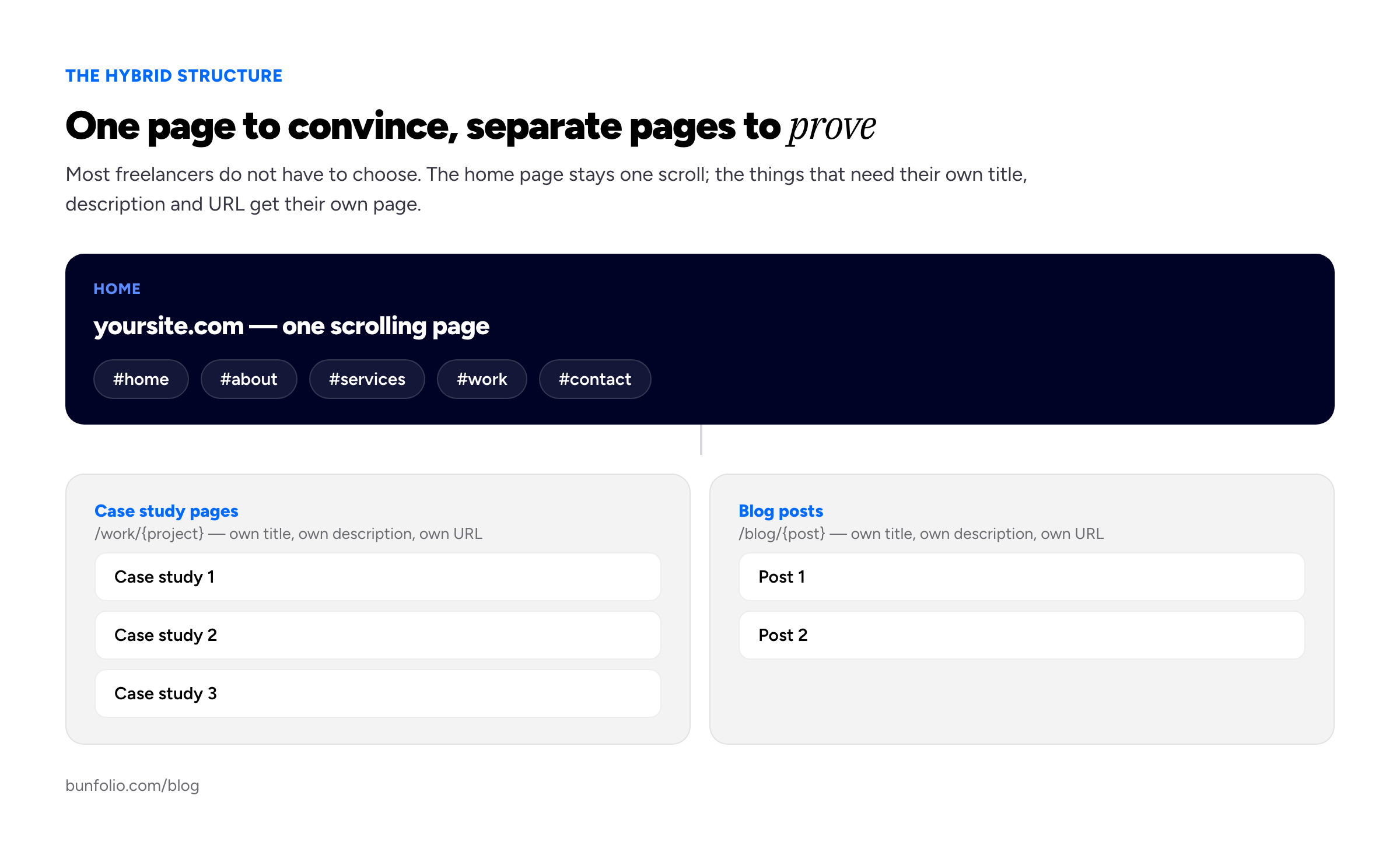
One page to convince, separate pages to prove and to publish.
The home page keeps what one-page sites are good at. A visitor arriving cold scrolls once and gets the whole story: what you do, who for, a strip of work, proof, a way to reach you.
Behind it, each case study has its own URL, title, description, and as many words as the project needs. The work section becomes a set of doorways rather than the destination: you can send one link about one project, search engines get ten specific pages instead of one general one, and your stats tell you which project people actually care about. Blog posts work the same way, listed on the home page and living at their own addresses.
Our own templates sit at the one-page end of this: each of the four generates a single scrolling page with Home, About, Services, skills and tools, Portfolio, testimonials and Contact sections and anchor navigation, and case studies render into the Portfolio section rather than onto pages of their own. That is not the only good answer, and it means the hybrid described here is not something Bunfolio builds for you. If your plan is a dozen distinct service pages targeting a dozen distinct searches, a one-page-first template is the wrong tool.
Choosing by discipline and career stage
The discipline you work in genuinely changes the answer. The examples below are invented, but the patterns behind them recur.
Developers. Hybrid, leaning multi-page. What convinces a technical reader is the reasoning behind a decision, and reasoning takes paragraphs. Jane Okafor, an invented backend contractor, has a home page saying what she builds and four case studies each explaining a migration in enough detail that a CTO can judge her without a call. That is what hiring managers look for in a developer portfolio, and it does not fit in a card.
Product and UX designers. Hybrid, firmly. UX work is unreadable without process, and process is long, which is why UX portfolios lean so heavily on individual case studies. A one-page UX portfolio nearly always undersells its author.
Visual and graphic designers. One page works well. The work argues for itself visually, the scroll behaves like a gallery, and quality is judged in seconds without a narrative. Add case study pages only where the thinking is the selling point.
Photographers. One page usually, with separate pages per series rather than per image. Structure here is mostly a question of image weight and sequencing.
Writers. Multi-page, or a hybrid with a busy blog. Writing is the product, so every published piece is both proof and a rankable page; a one-page writer's portfolio wastes the discipline's main advantage.
Career stage cuts across all of that. Your first portfolio should be one page, always, because the priority is having one at all. Two or three years in, promote your best two or three projects into full case study pages and keep the one-page home. Later, if you niche down and publish regularly, the site drifts towards multi-page on its own. Structure should follow content, never lead it.
How to decide this week
Three honest answers will settle it in about ten minutes.
- How many projects can you write eight hundred words about right now? Not how many you have worked on, but how many you could genuinely explain with permission to show them. Zero or one means one page; three or more means the hybrid.
- Will you publish something at least monthly for six months? Be sceptical of your own answer. If it is no, adding blog pages just creates a section that will visibly rot.
- Do you regularly need to send someone a link to one specific piece of work? If yes, you need separate case study URLs, and no amount of clever anchor design substitutes for them.
If you are still torn, build the one page. It is the smaller commitment, the faster launch, and the easier of the two to grow out of.
Changing your mind later without losing what you have built
People treat this decision as permanent. It is not, and the migration is only painful if you do it carelessly.
Going from one page to a hybrid is the easy direction and the common one. You are adding URLs rather than moving them, so nothing already indexed changes: the home page keeps its address, its title and whatever ranking it had, and each case study starts as a new page linked from the work section. Keep a short summary on the home page and link out from it, so the story still lands for someone who never clicks.
Collapsing a multi-page site into one page is where damage happens. The rule is simple: never delete a URL that has been linked to or indexed. Redirect it permanently to the section it became, fragment and all, so that /about sends visitors to /#about rather than a 404. Any value that page accumulated transfers; without the redirect it evaporates, along with every link anyone sent a colleague.
Update your sitemap after either move so crawlers find the new shape, and do not restructure and change domains in the same week, or you will not know which change caused what; our guide to connecting a custom domain covers that side.
Frequently asked questions
Is a one-page portfolio bad for SEO?
No, but it is limited. There is no penalty, and Google's own guidance says search engines will generally understand your pages regardless of how the site is organised. The constraint is that one page carries one title, one description, and one topic, so it competes for one cluster of queries rather than many.
How many pages should a portfolio have?
There is no correct number. A useful default is one home page, plus a page per case study you can write properly, plus a page per published post, which usually lands between one and about a dozen. Pages should exist because content needs an address, not to fill out a menu.
Do anchor sections count as separate pages in Google?
No. Fragments after a # are not treated as separate pages, and Google's URL documentation warns against using them to change page content for that reason. Anchors are excellent for humans sharing a position on a page and add nothing to your indexed footprint.
Should my portfolio be one page if I am just starting out?
Almost certainly. Early on you have limited work and limited time, and a multi-page structure mostly creates empty rooms. Build the one page, get it live, and add case study pages as the work arrives.
Will a long one-page site load slowly?
Only if you make it. The document is small; images are what cost you. Lazy-load anything below the first screen, leave the top images eager so the largest is not delayed, and keep file sizes sensible. Browser guidance puts a good largest-contentful-paint target at 2.5 seconds, measured at the 75th percentile of loads, and a disciplined one-pager clears that comfortably.
Can I keep a one-page home and still have a blog?
Yes, and it is what we would recommend to most people. The home page lists recent posts and each post lives at its own URL, so you keep the single-scroll front door and still get the publishing surface.
How we put this guide together
The technical claims here are cited rather than asserted. That fragments are not treated as separate pages and that Google advises against using them to change content comes from the Search Central URL structure documentation; that titles and meta descriptions should be unique to each page, and that search engines will generally understand your pages regardless of how the site is organised, comes from the SEO starter guide. The lazy-loading advice, including the warning not to defer images likely to be in the first viewport, comes from web.dev, and the 2.5-second largest-contentful-paint target from its LCP article.
Everything else is our judgement from building and hosting portfolio sites: the section ordering, the recommendations by discipline and career stage, the three deciding questions, and the view that most freelancers are better served by a hybrid than by either pure structure. We have deliberately not quoted conversion or bounce statistics for one-page versus multi-page sites, because the figures circulating on this topic are not traceable to any study we could verify, and a number you cannot check is worse than an argument you can weigh. Our own templates are one-page-first, a bias worth knowing about, and it is why the sections on where one page falls short are as long as they are. Jane Okafor and the other people named here are invented, as is their work.
Related reading: how to write a portfolio case study, which is what fills the separate pages this guide argues for, the portfolio SEO guide for what those pages can realistically rank for, and building a freelance portfolio that wins clients for everything the structure sits inside, and what pages a portfolio website should have for the page-by-page version of this decision.
More from the blog
September 23, 2026 · 18 min read
Portfolio vs Resume: Which One You Need, and When
A resume and a portfolio are not two formats of the same thing: one answers the screening question, the other answers "show me". This guide covers who needs which by profession, where the CV fits, and...
September 21, 2026 · 18 min read
Nursing Portfolio: What to Include, Who Reads It and How to Build One
An interview panel, a clinical ladder committee, a certification auditor and an NMC confirmer all read a nursing portfolio, and only one of them wants the binder every guide describes. What each actua...
October 3, 2026 · 16 min read
How to Make a Resume Stand Out: What to Change on the Page
A resume stands out by being the easiest one in the pile to say yes to, not by looking different. Here is how to rebuild the top of page one, turn duties into results (even without numbers), tailor ho...