
Examples
Portfolio website examples,
and why they work.
Most roundups of portfolio websites show the same forty screenshots: award-winning agency sites built by teams, on budgets, to win awards. They are lovely to scroll and close to useless to copy. You cannot rebuild a bespoke scroll animation on a Sunday evening, and if you could, it is not the thing that would win you the work.
So this page does something narrower. First, what actually separates a portfolio that wins work from one that only looks good. Then four worked examples you can open, scroll and take apart — real, complete sites rather than crops. Then a gallery of live sites built with Bunfolio, which lists only the people who have chosen to be in it, so it fills slowly and everything in it is real.
What to look for
What separates a portfolio that wins work
from one that just looks good
Read enough of them and the failures stop being about taste. Good portfolio websites are rarely the prettiest ones; the sites that lose work are rarely ugly. They are vague, or they bury the work under an introduction, or they leave a convinced visitor with nothing obvious to do next. Five things do most of the deciding.
The first screen says what you do, and who for
A stranger should be able to finish the sentence “this person does X for Y” before scrolling. “Brand designer for independent food and drink companies” does that. “Creative problem solver passionate about impactful experiences” does not — it is the sentence every portfolio has, which is why it identifies nobody. And it has to hold on every page, not just the home page: someone sent a link to one project arrives there having seen nothing else you have made, so every page is somebody’s entrance.
Work that was chosen, not accumulated
Three to six pieces suits most people, and fewer done properly beats more done briefly. A portfolio is averaged rather than summed: nobody totals your projects and awards points, they form an impression of your standard, and the weakest visible piece drags that impression down harder than the strongest lifts it. Cutting is usually the highest-value edit available to you, and it is free. We argue the numbers out in full in how many projects a portfolio should show.
Depth, rather than more thumbnails
A project card answers “can you do this kind of work”. A case study answers a more valuable question — “what will it be like to have you working on my problem?” — and one project explained end to end persuades more than eight images with a title under each. The interesting part is not the outcome but the decisions: the constraint you worked inside, the trade-off you were unsure about. Our six-part case study template gives you the skeleton and the word budgets.
Proof you did not write about yourself
Testimonials with a real name and role, numbers where you have them, clients named where permission allows. Then the about section, which is read late by a warm reader who has already decided you are capable and now wants to know what you would be like to deal with for six weeks — so it should be short, specific, and written in the first person. Most people write the opposite. Here is how to write the about page on your portfolio, block by block.
One contact route, and a clear ask
Say what you are available for — freelance projects, a full-time role, commissions — because a visitor who likes your work and cannot tell what you want will do nothing. Then give one obvious route to you and make it work. Two half-hidden routes are worse than one plain one. What deserves its own page and what is only a section is a mechanical question, and what pages a portfolio website needs works through it.
What is not on that list
Animation, a custom cursor, a clever loading screen, a bespoke grid. None of it is wrong, and none of it rescues a portfolio that has not answered the five questions above. That is the good news in this page: everything that decides the outcome is writing and editing, which you can do today, rather than front-end engineering you would have to commission.
Four worked examples
Four sample portfolio sites you can open,
not a crop of one
The most useful portfolio site example is one you can scroll to the bottom of. These four are ours — the templates every Bunfolio site is built from — and each is a complete site filled with sample content, so you can see how the sections above behave when a whole page has to hold together. Each card links to the write-up and to the live version, which needs no account.
Noir
Pure black canvas, coral highlights.
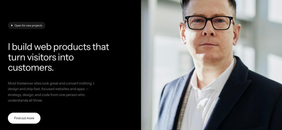
Who it fits: designers and developers who want high contrast and one striking first impression.
The decision it demonstrates: Contrast doing the pointing. One coral accent on pure black marks every link and project name, so the eye is led to the work rather than around the decoration. A dark canvas also flatters screenshots, which is why it suits interface work.
Warm
Soft off-white, warm orange details.
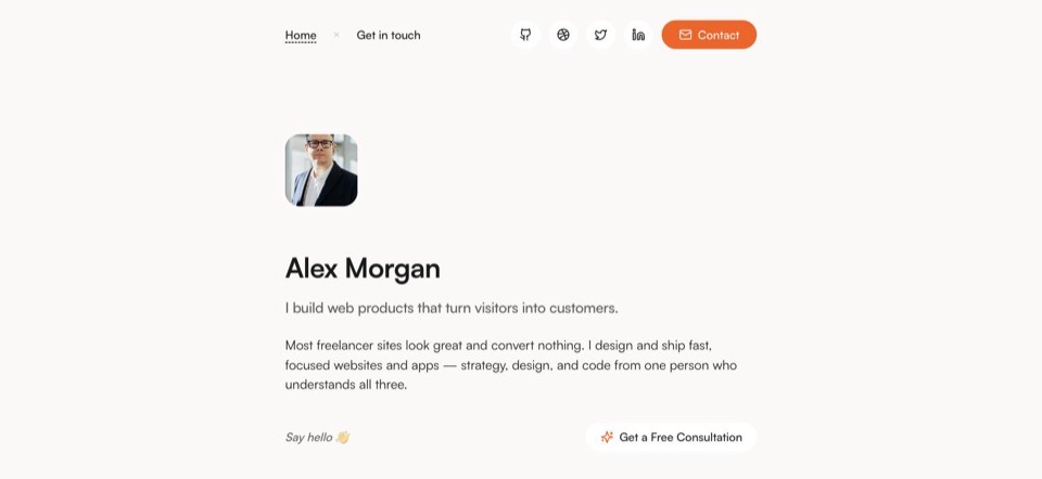
Who it fits: writers, consultants and anyone whose words do more selling than their visuals.
The decision it demonstrates: Restraint, for people whose words do more selling than their visuals. Serif headings over a generous measure, set for reading rather than for impact — the arrangement that makes a long about section and a real case study look deliberate instead of heavy.
Spotlight
Colour-shifting panels, condensed display type.
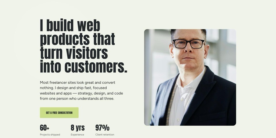
Who it fits: agencies and art directors who would rather be memorable than understated.
The decision it demonstrates: Commitment, and what it costs. The background shifts colour as visitors scroll and the display type is condensed and enormous. It is the loudest of the four, and the trade is honest: memorable is not calm.
Halftone
Violet halftone hero, oversized uppercase type.
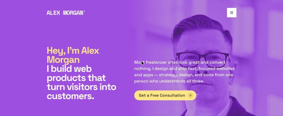
Who it fits: illustrators and graphic designers who want the work to hit first and hardest.
The decision it demonstrates: Letting the work land first. Oversized capitals run edge to edge and the images carry the page, which works beautifully if you already have strong images and badly if you do not.
The sample content in every live preview is invented for the demo — the people, projects and quotes in it are not real clients of ours.
The gallery
Real sites built with Bunfolio,
listed with their permission
Publishing a site means it is live at your own address. It is not consent to put your name, your face and your clients’ work into our marketing, so we treat those as two separate decisions and only ever show the second. That makes this list shorter than it could be, which is the right way round.
Nobody has opted in yet, so this is empty
We could fill the space with invented designers and stock photographs. Plenty of galleries do, and you can usually tell. An example you cannot click is not an example, so this section stays empty until there is something real in it, and then grows one genuine site at a time.
Until then the four templates above are the honest version of the same thing: complete sites, filled with sample content, that you can open and scroll for as long as you like without signing up. And if you build a site here and later decide you would like it listed, “Feature my site on bunfolio.com” is a switch in your website settings — one you can turn off again just as easily.
Questions
The things people ask
before they start
What makes a good portfolio website?
Clarity before craft. A stranger should learn what you do and who you do it for within one screen, see three to six pieces of work chosen rather than accumulated, and find one obvious way to contact you. The portfolios that fail are rarely ugly — they are usually vague, or they bury the work under an introduction.
How many projects should a portfolio website show?
Three to six for most people, and fewer done properly beats more done briefly. Your weakest piece sets the level a visitor assumes you work at, so cutting is usually the highest-value edit available to you. Depth matters more than volume: one project explained end to end persuades more than eight thumbnails.
What should a portfolio website include?
A hero that says what you do, an about section with something concrete in it, your services, your work, proof from people who have paid you, and a contact route that works. Everything else is optional and most of it is a distraction — a page of testimonials nobody clicks, a process diagram identical to everyone else's.
Do I still need a portfolio site if I have Behance or LinkedIn?
They serve different jobs. A profile puts you in someone else's feed on someone else's terms, and every link you earn there builds their domain rather than yours. A site of your own is the address you control, the one that survives a platform changing its rules, and the only one you can shape around a single argument for hiring you.
Can I see real examples of sites built with Bunfolio?
Yes — the gallery on this page lists live sites whose owners have chosen to be featured, and each links straight to the real thing. We only include people who opted in, so it is smaller than it could be. You can also open any of the four templates as a full live preview, filled with sample content, without signing up.
How long does it take to build a portfolio website?
The building is not the slow part — choosing what to show and writing about it is. Most people lose months to a blank canvas rather than to a tool. With your projects already chosen, a Bunfolio site takes an evening: sign in, answer the questions or paste your LinkedIn URL, pick a template, publish.
Get started
The example worth studying most
is your own
You already know which three or four projects you would show. That is the slow part, and you have done it. Sign up with Google or email, answer the questions or paste your LinkedIn URL, pick one of the four templates, and publish — free, on your own subdomain, or on a domain you already own.