
September 1, 2026 · 21 min read · Updated September 25, 2026
What Pages Should a Portfolio Website Have?
Two different questions hide behind this one, and most answers online are quietly solving the wrong one — a PDF portfolio's page count, not a website's. Here is the test that decides page or section, the five pages nearly everyone needs, and the six that usually earn nothing.
Ask the internet what pages a portfolio website should have and you get two answers shouted over each other. One set of results tells you ten to twenty, maybe thirty, with a debate about A3 versus A4. The other tells you home, about, portfolio, contact, in a list that has been copied between marketing blogs for a decade. Both are answering real questions. They are not answering the same one, and nobody says so.
The first group is talking about a portfolio document — a PDF you attach to an application, read front to back in one sitting, where "page" means a sheet. The second is talking about a portfolio website, where "page" means a URL that someone can land on cold, from a search result or a link in a message, having seen nothing else you have made. Advice about one is actively wrong applied to the other. A thirty-page website is a mistake. A three-page PDF is a mistake. This guide is about the website, and if the distinction between the two is itself the thing you are trying to settle, what a portfolio website is deals with it from the definition up.
Our interest here should be on the table before you read further. Bunfolio builds portfolio sites, so we would like you to build yours with us, and our product ships four templates with a fixed set of sections rather than an empty page builder. That is a real constraint and it shapes what we think good looks like — we will point out below where it is a limitation rather than a feature, and where the advice cuts against what our own product does easily.
Why the page count question keeps getting answered wrongly
A PDF portfolio and a portfolio website fail in opposite directions, which is why they need opposite advice.
A PDF is sequential and complete. The reader opens it at page one and moves forward. You control the order absolutely. Nothing has to reintroduce you, because they have already met you on the cover. The risk is running out of material to hold attention, so the advice — ten, twenty, thirty pages — is really advice about how much evidence a reviewer expects before they believe you.
A website is random-access and incomplete. Someone searching your name lands on your home page. Someone who was sent a link lands on a single project. Someone who found you through a search for what you do lands on whichever page happened to match, which is frequently not your home page at all. Every page is somebody's first page. The risk is not thinness; it is a visitor arriving somewhere that assumes context they do not have, finding no route onward, and leaving.
That difference produces the only rule in this article that is not negotiable: every page has to work as an entrance. Not repeat your whole site, but state enough — who this is, what they do, where to go next — that a cold arrival is never stranded. Get that right and page count becomes a much smaller decision than it looks.
The six jobs a portfolio website has to do
Before deciding on pages, decide on jobs. A portfolio site does six things; pages are only the containers you rent to hold them.
One: say who you are and what you do. In one screen, without scrolling, in words a stranger uses rather than words your industry uses. "Brand designer for independent food and drink companies" does this. "Creative problem solver passionate about impactful experiences" does not.
Two: show the work. Enough of it, chosen rather than accumulated, presented at a size where it can actually be judged.
Three: explain the work. What the problem was, what you did, what happened. This is the job most portfolios skip, and it is the one that separates a person who can do the thing from a person who has pictures of the thing.
Four: say what you want next. Freelance projects, a full-time role, commissions, collaborations. A visitor who likes your work and cannot tell what you are available for will do nothing.
Five: make you reachable, with a route that works and a rough sense of what happens after they use it.
Six: show you are still active. A site whose most recent project is four years old reads as abandoned regardless of how good the work is.
Every page you are about to consider either serves one of these six or it does not. A page that serves none of them is a page you will maintain forever for nothing.
The test that decides page or section
Here is the mechanical part. Anything you want on your site can live either as a section of a longer page, reached by scrolling or by an anchor link, or as its own page with its own URL. Four questions decide which, and one clear yes to any of them is enough.
Would anyone search for this on its own? People search "wedding photography prices Bristol". Nobody searches "the about section of a specific freelancer's website". Search demand for a topic is the strongest argument for giving it a URL, because a section cannot rank on its own — Google's documentation is explicit that you should not use fragments to change what is on a page, because Search generally does not support URL fragments. An anchor is a scroll position, not a second entry in the index.
Would anyone send this on its own? This is the test people underrate. You will paste a single project link into an email to a prospective client far more often than you will send them your home page. If a thing needs to travel by itself, it needs an address of its own.
Is it long enough to bury what comes after it? A two-thousand-word case study sitting inline on your home page does not enrich the home page; it ends it. Anything that long is a page.
Does it change on its own schedule? Things you update weekly and things you update every two years do not belong in the same file. This is a maintenance argument rather than a visitor-facing one, but it is the reason abandoned sections happen.
Four noes means it is a section. Put it on a longer page, give it an anchor, and stop thinking about it.
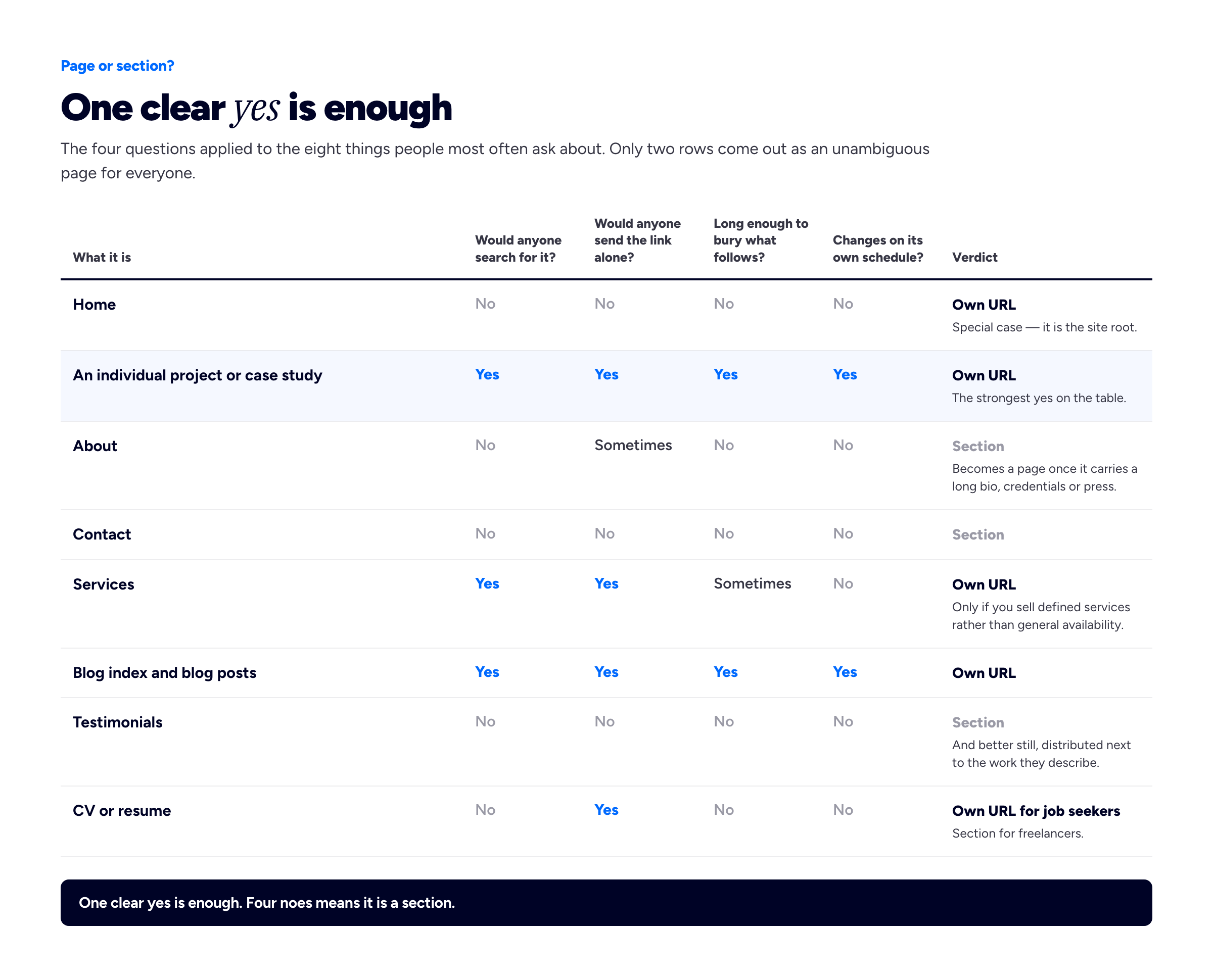
The same four questions applied to the eight things people most often ask about. Only two rows come out as an unambiguous page for everyone.
The five pages nearly every portfolio needs
Run the test across a normal freelance or job-seeking portfolio and five things survive. What follows is what each one has to contain, and what to take out.
Home. The job of the home page is to answer "what is this and is it for me" before the visitor decides to scroll, and then to get them into the work. That means, above the fold: your name, your discipline, who you do it for, and one action. Below it: your strongest three to six projects, and only then the supporting material — a short about paragraph, the tools or services, social proof, contact. The most common home page mistake is a full-screen abstract image with your name in thin type and nothing else, which spends the visitor's entire first impression saying nothing. The second most common is leading with your life story instead of your work. People decide whether to care about you after they have seen something good.
The work index. A grid or list of everything you are showing, in the order you want it seen, with your best piece first rather than your newest. If you have four projects, this can be a section on your home page and you do not need a separate page at all — a separate page whose contents are identical to a section further down the home page is a duplicate, not a structure. Once you are past about eight projects, or once you want to filter by discipline, it earns its URL. On how many belong there in the first place, we have written a whole piece on how many projects a portfolio should show; the short version is that the weakest piece sets your perceived level, so cutting is usually the highest-value edit available to you.
One page per project. This is the page most portfolios do not have and the one that does the most work. It is where job three from the list above — explaining the work — actually happens, and it is the URL you will send to clients, drop into applications and link from LinkedIn. It needs the problem, the constraints, what you did and why, and the outcome, with the images sized to be looked at rather than glanced at. Three or four of these beat twelve thumbnails with captions. Our six-part case study template is the long version of this paragraph, and showing NDA and confidential work covers what to do when you cannot name the client or the numbers.
About. For most freelancers this is a section on the home page, not a page — until it stops being. Once it carries a proper bio, a photograph, credentials, press mentions, speaking or a client list, it is long enough to bury what follows it and it becomes a page. Google's own guidance on creating helpful, reliable, people-first content asks whether it is "self-evident to your visitors who authored your content", which is the same instinct a client has when they are about to send money to a stranger. We have a full guide to writing the about page and thirty worked portfolio bio examples to adapt.
Contact. Whether this is a page or a section matters far less than whether it works. It needs one obvious route, not four competing ones; a plain email address alongside any form, because forms fail silently and people distrust them; a sentence about what happens next and how long you take; and, if you are freelance, a line about what you are currently available for. "Taking on projects from October" is worth more than a contact form with six fields.
The pages people add that usually earn nothing
These are the additions we see most often on sites that feel bigger than they are. Each has a version that works, so the question is not whether to have one but whether you should.
A services page. Worth it if you sell defined pieces of work with a shape — a brand identity package, a website audit, a day rate for editing. Not worth it if it will say "web design, graphic design, illustration, consulting" in a three-column grid of icons, which describes a capability list rather than an offer and gives the visitor nothing to say yes to. The test is whether you could write a price or a range under each item without wincing. If you could not, it is not a service yet. Related: how much to charge as a freelancer, and whether to niche down.
A blog. The strongest page type on this list and the easiest to get wrong, because an empty blog is not neutral — it is dated evidence that you started something and stopped. Add one if you will publish, and if you have something to publish that is not a summary of what everyone else in your field already wrote. If you are adding it for search reasons specifically, our portfolio SEO guide is the honest account of what that does and does not achieve. If you are not sure, leave it off. You can add it in an afternoon later; you cannot un-see a blog whose last post was in 2023.
A CV or resume page. Genuinely useful if you are applying for jobs, because a recruiter wants dates and titles in a scannable order and your project pages do not provide them. Close to useless for freelancers, where the client cares what you can do next rather than where you worked in 2019. If you want one, an HTML page beats a PDF download — it is readable on a phone and it can be found. See the career portfolio for what belongs in it.
A testimonials page. Almost always the wrong container. A page of quotes stripped from their context is the least persuasive way to use them, and it is a page nobody navigates to voluntarily. The same six quotes placed beside the projects they refer to do considerably more work. Our guide to asking clients for testimonials covers getting ones specific enough to be worth placing.
A "my process" page. Discovery, design, develop, deliver, with four icons. It describes a process every practitioner in your field follows, which means it distinguishes you from nobody. Fold the interesting parts of your actual process into the project pages, where it is attached to evidence that it worked.
A separate portfolio page when you have four projects. Worth naming because it is the single most common redundancy we see: a home page that shows all four projects, and a "Portfolio" nav item leading to a page showing the same four projects. Pick one.
So how many pages, actually
Directly, because the question deserves a number rather than "it depends": most portfolio websites should be between four and ten URLs, and the majority of that count is individual project pages rather than structural pages. If you are past fifteen and you are not running a blog, something is being padded.
By situation. Starting out or changing field: a home page carrying about and contact as sections, plus three project pages. Four URLs, and each project page is worth more than any structural page you could add instead — if you have no client work yet, building a portfolio with no experience covers what goes in them. Working freelancer: home, work index, four to six project pages, about, contact, and a services page if you genuinely sell packages. Eight to eleven. Applying for jobs: home, three or four deep case studies, about, CV. Six to seven, weighted heavily towards depth per project, because a hiring panel reads two case studies properly rather than eight briefly. Photographers, illustrators and anyone with volume: home, several galleries split by type of work rather than by shoot, about, contact, enquiry details. The split matters more than the count, because "Weddings" and "Portraits" are things people search for and "Gallery 2" is not.
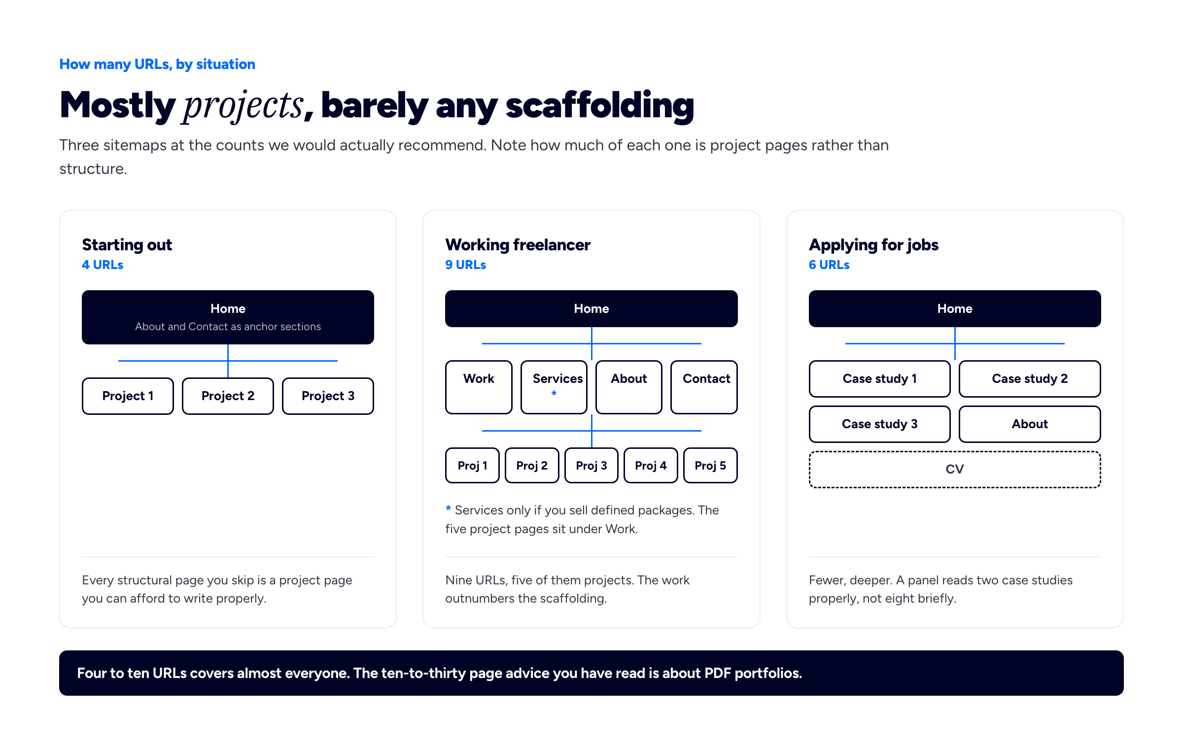
Three sitemaps at the counts we would actually recommend. Note how much of each one is project pages rather than structure.
If a source told you ten to twenty pages, check which format it meant. Almost invariably it is a PDF or print book where a page holds one image — so twenty of those is about five project pages on a website. The advice is not wrong, it is in different units.
What goes in the navigation, and in what order
Your navigation is the page list your visitors actually perceive, which makes it more important than the underlying count. Four to six items, no dropdowns at this size, and the first item should be your work rather than your story. A nav reading Home, About, Services, Portfolio, Blog, Contact puts two items in front of the only one most visitors came for.
Order by what the visitor wants, which is roughly: see the work, understand who made it, find out if they are available, get in touch. Work, About, Services, Contact. If your site is one page with anchors, the same ordering logic applies to the sections — we have written separately about one-page versus multi-page portfolios, which is the architectural version of this question and worth reading alongside this one.
Anything that has to exist but nobody browses for — a privacy policy, terms, an old CV, credits — belongs in the footer. It keeps the URL in the site without spending one of your five nav slots on it.
There is a search-side reason to keep the structure clean too. Google generates sitelinks, the indented sub-links that sometimes appear under your result, by analysing the link structure of your site to find shortcuts, and its documentation asks for a logical structure and concise, relevant internal anchor text. You cannot choose your sitelinks. You can make your site legible enough that the ones Google picks are the pages you would have picked.
The pages that earn their place in search
If being found matters to you, the page question changes shape slightly, because a URL is the unit Google indexes and ranks. One page cannot rank well for two genuinely different searches at once. A single home page trying to serve "brand designer Manchester" and "packaging design for drinks brands" will usually serve neither, where two pages might serve both.
This is the honest argument for a services page or for splitting galleries by type of work: not that more pages are better, but that each distinct thing people search for needs somewhere to land that is about that thing. It is also the argument against the padding pages above — a process page has no search demand behind it, so it adds a URL without adding a way in.
While you are creating those URLs, make them readable. Google's URL structure guidance asks for readable words rather than long ID numbers, which in practice means /work/riverside-bakery-rebrand rather than /p?id=1487. Our portfolio SEO guide covers the rest, and connecting a custom domain covers the one structural decision that is genuinely hard to reverse later.
Building this in an afternoon
The order matters, because doing it in this sequence stops you designing pages you will delete.
Write the one-line answer to "who are you and what do you do, for whom" first, in a text file, before you open any tool. Then choose the three to six projects that survive the cut, and write one project page properly — problem, approach, outcome — for your strongest. That single page will tell you more about what your site needs than any amount of layout work. Then repeat it for the others, and only then build the home page, which is mostly an index of what you now have. Add about and contact as sections. Publish it.
Everything else on this page is an addition you make later, when you have a reason. A four-URL portfolio that exists beats a nine-URL one that is still in drafts, and the difference between them is usually four months.
This is also, to be transparent about the product, roughly the shape Bunfolio produces by default, with one difference: four templates, a fixed set of sections, and everything — projects and case studies included — on a single page rather than on URLs of their own. That constraint is genuinely helpful if what has been stopping you is choosing a structure, and genuinely limiting if you want an unusual one — an illustrator wanting eight differently-designed galleries, or anyone who wants a page type we do not have, is better served by a page builder, and we would rather say so here than after you have spent an evening.
Frequently asked questions
What pages should a portfolio website have?
Five things, though not all of them need to be separate pages: a home page, your work, an individual page for each project you want to be able to send on its own, an about section or page, and a contact route. Everything else — services, blog, CV, testimonials — is conditional on your situation rather than standard. The reliable test is whether a thing would be searched for, linked to on its own, is long enough to bury what follows, or changes on its own schedule.
How many pages should a portfolio website have?
Four to ten URLs suits almost everyone, and most of that should be individual project pages rather than structural ones. Someone starting out needs about four: a home page carrying about and contact as sections, plus three projects. An established freelancer typically lands between eight and eleven. Past fifteen, without a blog behind it, something is being padded.
Is 30 pages too long for a portfolio?
For a website, yes, considerably. For a PDF or print portfolio, no — thirty is within the normal range, and that is where the number you have read comes from. The two formats are measured in different units: a PDF page usually holds one image, so a thirty-page book is roughly five or six project pages on a website. Check which format any page-count advice is describing before you apply it.
Does every project need its own page?
Every project you would ever send someone a link to, yes. That is the point of a URL. Projects you are showing for range rather than depth can sit as items in a grid with a caption and no page behind them, but be aware that a grid item cannot be sent, cannot be found in search, and cannot explain itself — so if a piece is doing important work for you, give it a page.
Do I need a services page?
Only if you sell services with a defined shape, such as a brand identity package or a fixed-scope audit. If the page would list disciplines you are capable of — "web design, illustration, consulting" — it is a capability list rather than an offer, and it belongs as a line on your home page instead. A useful test: could you write a price or a range under each item without wincing? If not, it is not a service yet.
Should my portfolio have a blog?
Only if you will actually publish. A blog is the strongest page type available for being found, and an abandoned one is worse than none, because a visible "last updated 2023" is evidence about you rather than a neutral absence. You can add one later in an afternoon, so when in doubt, launch without it.
Is a contact form better than just an email address?
Offer both, and treat the email address as the primary one. Forms fail silently — a misconfigured one loses enquiries for months without telling you — and some visitors will not use them because they want a copy of what they sent. If you use a form, keep it to name, email and message, send yourself a test through it after every change to your site, and put a line beside it saying how quickly you reply.
Where do testimonials, press and awards go?
Next to the work they relate to, not on a page of their own. A quote about a rebrand is persuasive on the rebrand's project page and generic on a wall of quotes. Awards and press logos work as a single strip on the home page. The exception is a long client list, which can justify its own page once it is long enough that a strip would look cluttered.
How we put this guide together
The conflict of interest first: Bunfolio builds portfolio websites, this article is published by Bunfolio, and a reader who follows it may well build their site with us. What we did about that: recommended a page builder over our own product for anyone wanting an unusual structure, described our fixed templates as a limitation as well as a benefit, argued for fewer pages rather than more when more pages would suit a site builder's interests better, and told you to launch without a blog.
Most of this article is our own recommendation and is labelled that way. The four-question page-or-section test, the four-to-ten URL range, the situation-by-situation counts in the sitemap diagram, the ordering of navigation items, the judgement that testimonials pages and process pages rarely earn their keep, and the afternoon build sequence are Bunfolio's views. They come from running a portfolio platform and looking at what published sites actually contain, not from a study, and you should treat them as informed opinion rather than fact. Reasonable practitioners disagree with several of them.
The factual claims about search behaviour come from Google's own documentation, checked at the time of writing and linked so you can re-check it: Google's URL structure guidance for the advice to use readable words rather than long ID numbers, and for the statement that Search generally does not support URL fragments; Google's sitelinks documentation for sitelinks being automated, generated by analysing a site's link structure, and not directly choosable by the site owner; and Google's guidance on creating helpful, reliable, people-first content for the question of whether it is self-evident to visitors who created the content.
We have deliberately cited no statistics about visitor attention spans, bounce rates, how many seconds a hiring manager spends on a portfolio, or what percentage of clients check an about page. Numbers of that kind circulate constantly in this subject area and we could not trace a single one of them to a primary source, so they are not here. Where we describe what portfolios typically contain, that is our observation and is worded as such. The PDF page-count ranges we refer to are described as what other sources recommend, not as our own advice; we have not reproduced any source's copy. Riverside Bakery and every other example in this article is invented.
Related reading: one-page versus multi-page portfolios, how to write a portfolio case study, how many projects your portfolio should show, how to write the about page, and the portfolio SEO guide, and the teaching portfolio for how the same section problem is solved in education.
More from the blog
September 28, 2026 · 15 min read
How Long Should a Cover Letter Be? Words, Pages and Paragraphs
One page is the published guidance and four or five short paragraphs is the shape. Where a 250–400 word target comes from, when faculty, federal, emailed and form applications change it, what to cut,...
September 2, 2026 · 29 min read
How to Build an Interior Design Portfolio
Three readers want different things from the same project. How to photograph a finished space, what before-and-after really requires, how much of the drawing package to show, and the credit line that...
August 17, 2026 · 27 min read
The Architecture Portfolio: The Book, the Sample and the Web Version
Architecture is the discipline where the portfolio is most formalised — and most people are trying to make one document do three incompatible jobs. Here is what belongs in the full book, the short sam...