
August 17, 2026 · 27 min read
The Architecture Portfolio: The Book, the Sample and the Web Version
Architecture is the discipline where the portfolio is most formalised — and most people are trying to make one document do three incompatible jobs. Here is what belongs in the full book, the short sample a firm's advert caps at five megabytes, and the version that lives at a URL.
Architecture is the discipline where the portfolio is most formalised. A developer can get away with a README. An illustrator can post a grid of images and be judged fairly. An architect is expected to produce a bound, paginated, typeset document with a cover, a contents page, consistent margins and a defensible sequence — and that document is read by people who spend their working lives making exactly that kind of artefact. The book is not a container for the work. It is a piece of work, laid out by someone whose profession is layout.
That expectation is old and it is not going away, but it now sits awkwardly next to how applications actually move. Firms ask for a PDF under a file-size cap. Recruiters forward it internally. Graduate schools want a specific page count uploaded to a portal. Meanwhile the thing you can actually put in an email signature, in a CV header or on LinkedIn is a link, and a link behaves differently from an attachment in every way that matters.
So the honest answer to "how do I make an architecture portfolio" is that you are making three of them out of one body of material, and the mistakes people make are mostly mistakes of not knowing which one they are working on. This guide covers all three: what each is for, what goes on a project spread, how to credit work you did not do alone, and how to get the file small enough to send without turning your section drawings to mush.
You need three portfolios, not one
Almost every architecture portfolio problem we see is a version of one document being asked to do three incompatible jobs. Separate them and most of the difficulty dissolves.
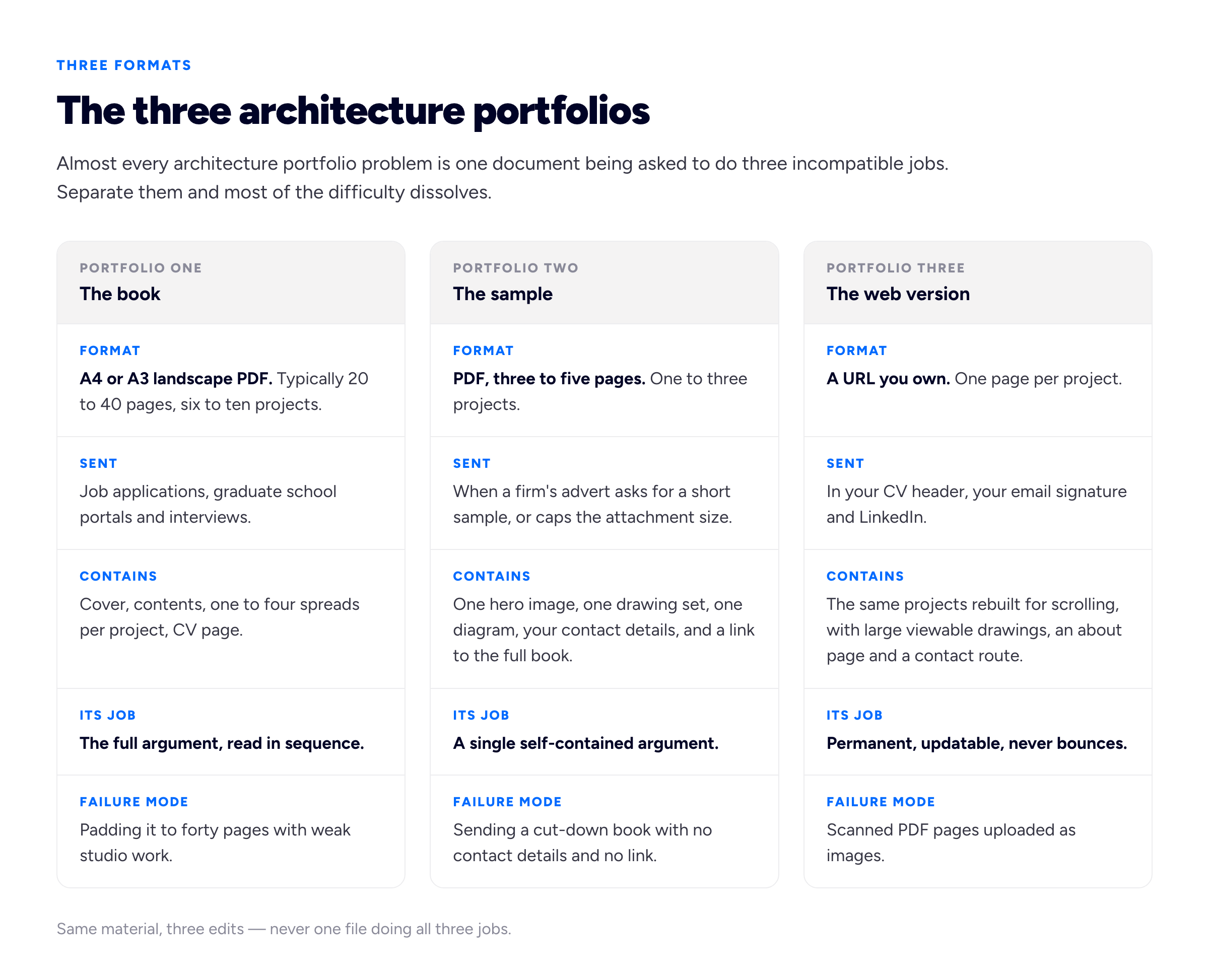
One body of work, three deliberate edits. The failure row is where most portfolios actually go wrong.
The book
This is what people mean by an architecture portfolio: a landscape PDF, usually A4 or A3 proportioned, typically twenty to forty pages, six to ten projects, read front to back. It goes to job applications, to M.Arch admissions portals, and onto a table in an interview room where somebody turns the pages while you talk.
Twenty to forty is our recommendation rather than a rule anyone enforces, and the reasoning is about density rather than length. Below about twenty pages you cannot give a project the three or four spreads it needs to be understood, so you end up with a set of single-page summaries that prove you can render but not that you can develop a building. Beyond forty, you are including projects to fill space, and a reviewer who reaches page thirty-two and finds a weak second-year studio project revises their opinion of the strong ones. Six good projects at four spreads each is a better book than twelve at two.
The sample
This is the one people get wrong most often, because it is not a document they were taught to make. A great many job adverts ask for a short sample — three to five pages, sometimes a single page — and attach a hard file-size cap: five megabytes, ten megabytes, occasionally two. The cap is not arbitrary. Corporate mail gateways reject or quarantine large attachments, application portals impose upload limits, and a practice receiving two hundred applications does not want two hundred forty-megabyte files landing in a shared inbox. Gmail alone caps outgoing attachments at 25MB, and plenty of corporate systems are stricter than that.
The sample is not the book with pages deleted. It is a self-contained argument: one hero image, one legible drawing set, one diagram that explains the idea, your name and contact details, and a link to the full book and the web version. If it is read alone, in a hurry, on a laptop, it should still make the case. And it must carry a route back to you — a sample with no contact details and no URL is a dead end, and we have seen a surprising number of them.
The web version
The third portfolio is a URL. Its advantages over a file are unglamorous and decisive: it never expires, it never bounces, it has no size cap, it updates in place after you have already sent it, it works on a phone, and it can be found by someone who half remembers your name eight months later. The book proves you can compose a page. The link is what actually gets passed around.
It is not a PDF embedded in a page, and it is not scanned spreads uploaded as images. It is the same projects rebuilt for scrolling: one page per project, a hero image at the top, drawings large enough to read or clickable to enlarge, the diagram sequence in order, and a short piece of writing that a PDF caption has no room for. Setting one up is a weekend at most — ours are free on a subdomain, and you can point a custom domain at it later without rebuilding anything.
What architecture portfolio examples can and cannot teach you
People search for architecture portfolio examples hoping to find a layout to copy, and layout is the least transferable thing in them. What you can usefully take from another person's book is countable: how many projects, how many spreads each project gets, whether the first image on a spread is a render or a drawing, whether there is a scale bar, how long the captions are, where the role and credits sit, how the diagrams are sequenced. Those are decisions you can make yourself tomorrow. The typeface and the grid are the part you should be making from scratch anyway, because a grid borrowed from a book with different image proportions will fight you on every page.
Spreads, not pages
The single most useful shift in thinking is this: your portfolio is not read as pages, it is read as spreads. Two facing pages arrive in the eye at once, and they compose or they do not. A beautiful left page next to a crowded right page is a bad spread, no matter how good the left page is on its own.
That has concrete consequences for how you set the document up:
- Work in facing pages from the first minute. Set the document up with facing pages and design across the pair. If you lay out page by page and only see the pairs at export, you will discover that half your compositions collide at the centre.
- Use one grid, and use it everywhere. A twelve-column grid with a consistent gutter is plenty. The grid is what makes a set of visually different projects read as one book — and inconsistent margins are the fastest tell that a book was assembled rather than designed.
- Keep the outer margin generous and the inner margin honest. If the book will ever be printed and bound, content near the gutter disappears into the spine. If it will only ever be a screen PDF, the gutter is imaginary — but a spread with a full-bleed image running straight through the middle still reads as two halves of a photograph rather than one image.
- Do not put anything critical across the centre. Not a title, not a north arrow, not the key detail of the section you most want them to see.
- Fix the furniture. Folio number, project name, page count — same position, same size, every spread. It costs nothing and it is the difference between a book and a stack of pages.
There is one genuine decision to make at export: single pages or spreads. Exporting spreads preserves the composition and reads well on a laptop, which is where most reviewing happens, but each PDF page becomes very wide and is nearly unreadable on a phone. Exporting single pages is safer for printing and for portals that render page by page, but it breaks anything you composed across the pair. Our recommendation is to pick the screen as your target, design in a landscape format so a spread is not absurdly wide, and keep every individual page strong enough to survive being seen alone.
What actually goes on a project spread
A project in an architecture portfolio has to answer four questions in a fixed order: what is it, how is it made, why is it like that, and does it exist as an object. Each has its own kind of image, and the reason weak books feel thin is almost always that one of the four is missing — usually the drawings, occasionally the diagrams, very often the models.
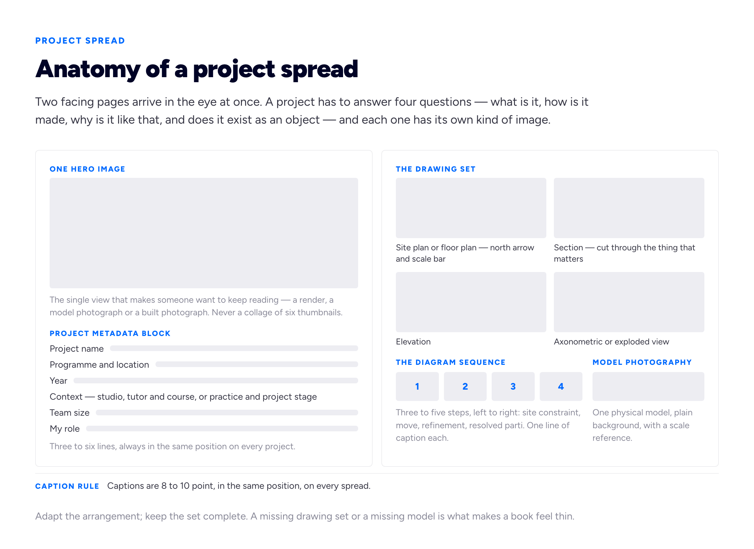
The four questions a spread has to answer, and where each one lives. Adapt the arrangement; keep the set complete.
The hero image
One image per project earns the top slot: the view that makes a reviewer keep reading. It can be a render, a model photograph or, if you are lucky enough to have it, a photograph of something built. What it must not be is a grid of six small thumbnails, which is what happens when you cannot decide. Choosing is part of the demonstration.
The drawing set
This is where architecture portfolios separate from every other kind of portfolio, and where students under-invest most. A reviewer wants plan, section, elevation and an axonometric or exploded view, because those are the instruments of the discipline and they cannot be faked by a rendering engine.
Practical requirements, all of which get missed: a north arrow and a scale bar on every plan; a stated scale that is actually true at the printed size; line weights that differentiate cut from seen from beyond; a section cut through the part of the building that is interesting rather than through the corridor; poché that reads at the size the drawing is placed. If a drawing is placed so small that the line weights collapse, it is not evidence, it is texture. Either place it larger, crop to the part that matters, or leave it out.
The diagram sequence
Three to five diagrams, in order, explaining how you got from the site to the thing. Constraint, move, refinement, resolution. One line of caption each. This is the part of a portfolio that demonstrates thinking rather than output, and it is what graduate admissions readers are most explicitly looking for.
The common failure is diagrams that are decorative rather than explanatory — a sequence of coloured blobs that could belong to any project. The test is simple: cover the captions and ask whether a stranger can tell what changed between step two and step three. If not, the sequence is illustration, not argument.
Model photography
Physical models are the most under-used asset in a student portfolio and the cheapest way to make a book feel like the work of an architect rather than a visualiser. A model photographed properly — plain background, diffuse light, one or two angles, in focus, with something in shot to give scale — is evidence that you made an object, resolved it in three dimensions, and dealt with material. A render is a proposal about how something might look. A model is a thing that happened on your desk.
Take the photographs while the model still exists. Every architecture student has a story about the model that went in a skip after the review, undocumented.
Drawings, renders and built photography
These three carry different weight and it is worth being explicit about the hierarchy, because it explains why beautiful books sometimes lose to plain ones.
Photographs of built work are the strongest evidence available, because a building that exists survived cost, coordination, consultants, regulations and a contractor. Almost no student has any, and that is fine and expected. Getting those photographs to read is a craft in itself, and the interiors are usually the hardest part of it — the styling, the shot list and the hour of the day are worked through in our guide to shooting an interior design portfolio.
Drawings are the second strongest, and they are the ones you control completely. A well-constructed section says more about your competence than any render, because it requires you to have decided how the thing is actually built. This is the reason a portfolio of confident hand and CAD drawing can beat a portfolio of glossy visuals: the drawings are harder to produce without understanding.
Renders are the weakest per unit of effort, and the most oversupplied. Every applicant has them, engines and asset libraries do more of the work every year, and an experienced reviewer discounts them accordingly. That does not mean cut them — one strong atmospheric view per project earns its place — but a book that is eighteen renders and three drawings reads as a visualisation portfolio, which is a different job with a different pay scale.
The student book with no built work
If you are assembling an architecture student portfolio, you are not pretending you have built anything, and nobody expects you to. The substitutions that actually work are: more drawings and more resolved ones; physical models, photographed properly; a detail — one wall section, one junction, drawn at 1:20 or 1:10 — which is the single most persuasive page a student can include, because it shows you have thought past the shape; and any real construction contact you have had, including a competition entry, a live-build project, a pavilion, a summer job on site, or a self-build for a family member. Real constraints beat imaginary ones even when the project is tiny. We work through the general version of this problem in our guide to building a portfolio with no experience.
Crediting: the discipline's biggest integrity trap
Architecture is a team practice, and almost nothing in a portfolio was made alone. Studio projects are often done in pairs or groups. Professional work is done by an office, for a client, under a director, with consultants, and the drawings belong to the practice. So every architecture portfolio contains an implicit claim about authorship, and a great many of them overclaim without ever intending to.
The trap is not that people lie. It is that they say nothing, and silence in a portfolio is read as sole authorship. A spread showing a competition scheme with your name on the cover and no other information is a claim that you designed it, whether or not you meant it that way.
The fix is a fixed metadata block on every project, in the same position, with a role line that is specific:
- Studio work, done alone. "Year 4 studio, tutor named, individual project." Nothing more required.
- Studio work, done in a group. "Group of three. My contribution: site strategy, the housing typology studies, all sections, the physical model." Naming what you did is not a confession, it is a demonstration that you know what your own hands produced.
- Office work. "Practice name, project name, RIBA Stage 3, team of nine. My role: assistant architect — developed the bay study, produced the general arrangement plans and the 1:20 façade details." Do not put the practice's hero render on your cover as if it were yours.
- Work you only touched. If you drew the stair and nothing else, show the stair.
Two further obligations that are easy to forget. First, permission: drawings produced in an office are usually the practice's intellectual property, and confidential or unbuilt schemes may be commercially sensitive. Ask before you publish, and ask specifically about the web version rather than assuming a PDF permission covers a public URL. If the answer is no, describe the project in words and show the parts you can. Second, credit your collaborators by name where you can. It costs you nothing and it reads as professional maturity.
The reason to be scrupulous is not only ethical. It is that the interview consists of somebody opening your book at a page and asking you to explain the drawing. If you did not produce it, that conversation goes badly in a way that is remembered.
Issuu, PDFs and the case for your own URL
A great many architecture portfolios end up on Issuu, and enough people search specifically for an Issuu architecture portfolio that it is worth being straight about what the platform does well and where it stops.
What it does well: it turns a PDF into a page-turning reader that anybody can open in a browser without downloading forty megabytes, it embeds in other pages, it has an audience of people browsing exactly this kind of document, and it costs nothing to try. As a way to make a book viewable rather than downloadable, it works.
Where it stops: the reader interface is theirs, not yours, and it frames your work in their chrome. The address is theirs too, which means your portfolio's permanent identity is a profile on somebody else's platform. Updating means re-uploading, and the old version may keep circulating. Text inside a placed PDF is not doing much for you in search. There is no analytics story worth acting on, no contact form, no way to structure an enquiry. And the fundamental limitation is that a page-turner is a book on a screen — it is not designed for someone reading on a phone, which is where a real share of your links get opened.
Our position is that Issuu is a viewer, not a home. Publish there if you like the reader, and keep the definitive version at an address you own, such as a free portfolio website on your own name. The practical argument is boring and wins anyway: a link that never expires beats a forty-megabyte attachment. Attachments bounce, get stripped by gateways, sit in a downloads folder at the version you sent in March, and cannot be updated after you spot the typo on page nine. A URL in your CV header, your email signature and your LinkedIn profile is one thing you maintain once.
Getting the PDF under the cap without ruining the drawings
This is the mechanical problem that defeats people, and it is worth solving properly once.
Architecture books balloon for four reasons, usually all at the same time: renders placed at full resolution straight out of the engine, at four or five thousand pixels wide, in a slot two hundred millimetres across; scanned or photographed material at camera resolution; an export preset built for a commercial printer, which embeds everything at 300 pixels per inch and downsamples nothing; and vector linework exported from CAD with tens of thousands of individual paths, hatches and unpurged layers, which inflates a file even with no images in it at all.
What to do about each:
- Export for screen, not for press. Use the smallest-file-size or interactive export preset as your starting point and adjust upward if the drawings suffer. Adobe documents what each preset changes in its PDF export reference; the ones that matter are image downsampling, compression quality and whether transparency is flattened.
- Downsample raster images to roughly 150 to 200 pixels per inch at their placed size. An image placed 200mm wide does not need to be 5,000 pixels across. This one change usually does most of the work.
- Simplify the linework before you place it. Purge unused layers, delete anything outside the drawing frame, reduce hatch density, and flatten construction geometry. Vector drawings should stay vector — that is what keeps them sharp when someone zooms in — but they should be clean vector.
- Check the result at 100 per cent on screen, not at page-fit. The specific failure to look for is compression artefacts around thin black lines and small type. If the section looks like a photocopy, you have gone too far.
- Keep two exports. A full-quality version for printing and interviews, and a capped version for sending. Name them so you never attach the wrong one.
- Name the file properly.
Surname_Firstname_Portfolio_2026.pdf, notportfolio_final_v7_REAL.pdf. Somebody is putting it in a folder with two hundred others.
One more thing worth doing, because it takes two minutes: make the URL on your cover page a live hyperlink in the PDF, and put it in the footer of the last page too. The whole point of the book is that it leads somewhere.
Typography, the cover, and the danger of over-designing
The most common way a talented person makes a worse portfolio is by designing the book instead of the work. Gradient backgrounds, three typefaces, rotated captions, full-bleed colour fields behind drawings, a cover with a graphic identity for a person who does not need one. It reads as decoration applied to hide thinness, even when the work underneath is strong.
A restrained set of defaults that will not embarrass you:
- One typeface, two or three weights. A clean grotesque or a well-made serif. The typeface is not the place to express range.
- Small captions, consistently placed. Around 8 to 10 point, same corner, every spread. Captions are read; body paragraphs mostly are not.
- Very little body copy. Fifty to a hundred words of project text is plenty in the book. The long-form writing belongs on the web version, where there is room — the structure for that is in our guide to writing a portfolio case study.
- White or near-white pages. Dark books look striking in a preview thumbnail and swallow line drawings.
- A quiet cover. Your name, the word Portfolio, a year, and one image — or no image at all. The cover's job is to be unembarrassing and to carry your contact details and URL, not to be the best page.
- A contents page if the book is over about twenty pages. With page numbers that are correct.
On architecture portfolio templates
Templates are a reasonable starting point and a poor finishing point. What a template genuinely gives you is a grid, a margin set, a type scale and a caption position — the decisions that are tedious and that you are unlikely to improve on at two in the morning. What it cannot give you is a sequence, a set of image proportions that match your actual drawings, or a cover that is about your work. The characteristic failure of a templated book is images cropped to fit the frames rather than frames built for the images, which is visible immediately to anyone who lays out documents for a living. Take the grid, rebuild the frames.
Graduate school and practice want different edits
The same material makes two different books, and sending one to both audiences costs you.
An M.Arch or postgraduate admissions reader is assessing potential and intellectual position. They want to see how you think: the diagram sequences, the research, the projects where you set your own brief, the writing, the experiments that did not fully resolve but went somewhere interesting. Range is an asset here. Include hand drawing and physical models. Lead with the project that has the strongest argument, even if it is not the most beautiful one, and let the sequence build an intellectual position rather than a service offer. Many programmes specify an exact page count and file size — meet those numbers precisely, because the first thing an admissions system does is check them.
A practice is assessing whether hiring you reduces their workload within about three months. They want production evidence: technical drawing, detail, coordination, software you can actually use unsupervised, drawings at real scales, and any experience of a live project. Depth beats range. Lead with the project closest to the work the office does — if the practice does housing, the housing project goes first, and the sculptural pavilion moves back or comes out entirely. Name your software honestly and specifically, including versions of competence: what you can produce alone versus what you have used.
Maintaining two edits is less work than it sounds if you keep the source document modular — one project per section, in a fixed layout — so producing a variant is reordering and deleting rather than rebuilding. And the web version can carry everything, with the two edits pointing at it. There is more on deciding what stays and what goes in our guide to how many projects a portfolio should show, and the personal half of the book — the biography, the position statement, the CV page — is covered in our guide to the portfolio about page.
A pass before you send it
Open the exported PDF on a machine that is not the one you made it on, and answer these honestly.
- Does every plan have a north arrow and a scale bar, and is the stated scale true at the placed size?
- Is there at least one section per project, cut through something worth cutting through?
- Can you read the line weights at 100 per cent, without artefacts around thin lines and small type?
- Does every project carry a role line that a stranger could not misread as sole authorship?
- Is there at least one physical model photographed on a plain background?
- Does one detail drawing appear anywhere in the book?
- Do the folios, project titles and captions sit in the same position on every spread?
- Does anything critical fall across the gutter?
- Is the file under the cap the advert asked for, and named with your surname first?
- Is your email address and a live link to the web version on the cover and the last page?
- If someone read only the first spread, would they keep going?
Most books fail three or four of these, and every one of them is an evening's work rather than a rebuild.
Frequently asked questions
How many pages should an architecture portfolio be?
For the full book, twenty to forty pages covering six to ten projects is our recommendation — enough to give each project three or four spreads without padding. If an employer or a graduate programme states a page count, that number overrides everything here and should be met exactly. For the short sample a firm asks for alongside an application, three to five pages.
What file size should an architecture portfolio PDF be?
Whatever the advert says, and where nothing is specified, aim under about 10MB for the full book and under 5MB for the sample. The caps exist because mail gateways and application portals reject large attachments. Get there by downsampling placed images to roughly 150 to 200 pixels per inch at their final size and cleaning up CAD linework — not by compressing so hard that the drawings degrade. Keep an uncompressed version for printing.
How do I make an architecture portfolio if I have no built work?
Nobody expects a student to have built work. Substitute depth for construction: more resolved drawings, at least one detail at 1:20 or 1:10, physical models photographed properly, and diagram sequences that show real reasoning. Any brush with real constraints — a competition entry, a live-build, a pavilion, a small self-directed project — counts for more than another speculative tower.
Should I use Issuu for my architecture portfolio?
It is a good viewer and a poor home. Issuu makes a PDF readable in a browser without a download and puts it in front of people browsing that kind of document, which is a real benefit. But the interface, the address and the audience relationship are the platform's, updating means re-uploading, and it reads badly on a phone. Use it as a mirror if you like it; keep the definitive version at your own URL.
Do I still need a PDF if I have a portfolio website?
Yes. Applications ask for a file, interview panels put a book on a table, and some portals accept nothing else. The two are not competing formats — the PDF is what you submit and the site is what you link. Make them the same work in the same order so nobody encounters two different versions of you.
How do I credit team or office work in my portfolio?
With a fixed metadata block on every project stating the context, the team size and your specific role — "team of nine; I developed the bay study, produced the general arrangement plans and the 1:20 façade details". Naming your contribution precisely is read as competence, not modesty. Check with the practice before publishing office drawings, and ask specifically about a public web page rather than assuming permission for a PDF covers it.
Is a graduate school portfolio different from one sent to firms?
Same material, different edit. Admissions readers are assessing how you think, so lead with argument, research, hand drawing and models, and allow range. Practices are assessing whether you can produce, so lead with the project closest to their work, favour technical depth over range, and be exact about software. Keep the source file modular so producing each edit is reordering rather than rebuilding.
What software should I use to make an architecture portfolio?
Any page-layout tool with facing pages, master pages and a grid — InDesign is the default in the discipline, Affinity Publisher is a capable one-off purchase, and open-source layout tools work too. What matters far more than the tool is that you set up facing pages and a grid before you place the first image, and that whatever you use can export a PDF with controllable image downsampling. Presentation software is a poor fit, because it fights you on margins, typography and export control.
How we put this guide together
Bunfolio builds portfolio sites, so we spend our time looking at how people present work and where those presentations fail. Most of the recommendations above are our judgement rather than sourced fact, and we would rather name them than let them pass as established practice: the twenty-to-forty page range, the six-to-ten project count, the three-to-five page sample, the four-part structure of a project spread, the hierarchy that puts built photography above drawings above renders, and the position that Issuu is a viewer rather than a home are all ours. An experienced tutor or a hiring director could reasonably disagree with any of them, and a stated requirement from a specific firm or programme always outranks a general recommendation from us.
The two claims we have sourced are the ones you can check. The 25MB outgoing attachment limit is Gmail's documented cap; corporate mail systems and application portals are frequently stricter, which is why file-size caps appear in adverts at all. What the different PDF export presets actually change — image downsampling, compression, transparency flattening — is set out in Adobe's own export documentation, and is worth reading once rather than guessing at.
We have deliberately not quoted a figure for how many seconds a reviewer spends on a portfolio, what percentage of applications are rejected on file size, or how many books a hiring director sees in a season. Numbers for all three circulate confidently, and we could not trace any of them to a study with a stated method and a published sample. Where this guide describes what reviewers do, that is an opinion offered as one. The file-size figures we give are practical working targets, not measurements; the page counts are recommendations, not norms anyone enforces.
Every project, practice, role line and caption used as an example here is invented for illustration. We have not named, ranked or reproduced any real architect's or student's portfolio: architecture portfolio examples are most useful studied for what you can count in them — projects, spreads, drawing types, caption length — and we are not in a position to publish judgements about individual people's work. The comments on crediting and on office intellectual property are general guidance rather than legal advice; if the ownership of drawings you want to publish is genuinely unclear, ask the practice in writing.
Related reading: how to write a portfolio case study for the long-form writing on the web version, building a portfolio with no experience for the student book, what pages a portfolio website should have for structuring the online version, the art portfolio website guide for the image-handling side, and the fashion design portfolio for the same book-versus-sample-versus-web split solved in another discipline.
More from the blog
August 21, 2026 · 18 min read
Model Portfolio Website: Building a Book That Books Work
Your book is a technical document with a conventional structure, read quickly and rejected faster. The eight shots it needs, why stats accuracy is not optional, and which direction the money should al...
September 5, 2026 · 16 min read
The Illustration Portfolio: Show One Market, Not Your Range
An art director opens your portfolio with a brief already in their head, looking for a prediction rather than an appreciation. Why showing range costs commissions, how the first three images decide it...
September 7, 2026 · 15 min read
Makeup Artist Portfolio: The Photograph Is the Product
A flawless face shot under salon spotlights arrives orange, blurred and texture-free — the makeup was excellent and the evidence is worthless. The three books this discipline needs, the retouching lin...