
Templates
Halftone portfolio template
Violet halftone hero, oversized uppercase type. A loud, graphic portfolio for designers and illustrators who want the work to hit first and hardest.
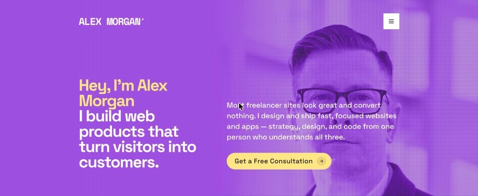
The preview is the real template filled with sample content. Your site replaces every word and image in it.
How it is designed
Three decisions carry the look. They are fixed: Halftone is a finished design, not a starting point you restyle.
Type
Oversized uppercase type that runs edge to edge and wraps mid-word when it has to.
Colour
White paper, violet halftone texture in the hero and a butter-yellow card behind the work.
Motion
Restrained. The halftone dot pattern shifts on load; everything else holds still.
The palette
The four colours the template builds everything else from.
Canvas
#FFFFFF
Page backgroundInk
#1D1D1B
Headings and body copyAccent
#CC66DD
Links and project namesCard
#FFE584
Surfaces on the canvas
What is on the page
One long scrolling page. It opens on your name, your headline, the line under it and your photo — the screenshot above is that opening screen with sample content in it — and then runs through six blocks, all fed from a single profile you fill in once, by hand or by pasting your LinkedIn URL and correcting what it gets wrong.
About you
Your bio, and the three or four numbers you want to lead with — years working, clients, projects shipped. You write the number and its label, so they say whatever is true of you.
Services
What you take on, each one a short list of what is included, so someone can see the shape of an engagement before they email you.
Skills and tools
Your skill tags and the software you work in. Tools we have a mark for are drawn with their own brand logo; anything else renders as a text tile rather than a missing icon.
Work
Each project carries a cover image, a category, a description and an optional link out. You add, edit and reorder them on their own screen, and the order you set is the order visitors see.
Testimonials
A quote, who said it, and their role. Leave the list empty and no template renders the section — you get a shorter page, not an empty heading.
Contact
Your email, location, phone and profile links, plus a message form behind a button pinned to the corner of the page, so a visitor can write to you from anywhere on it. Enquiries are saved to your account and listed under Leads, not left to an inbox filter.
All four templates read that same profile, and all six blocks appear in all four. What changes is the arrangement: one gives testimonials a section of their own, another folds them into its closing panel; one stacks projects as full-height cards that pin as you scroll, another lays them out as a strip you swipe through. That is the honest description of the choice in front of you — you are picking a treatment, not a feature set.
The list above is the whole surface. There is nothing else to fill in, no second page type to keep up to date, and no section that only appears once you have paid for it.
What you can change
The line between your content and the template’s design is drawn deliberately, and it sits in the same place for all four. It is worth knowing where before you start.
Yours to change
Your words and pictures. Every heading, paragraph, statistic, project and quote stays editable after the site is live — from the website screen in your dashboard, or by describing the change in the chat there and letting it rewrite the section for you.
Your photo and your logo. Swap the hero photo whenever you like. Halftone also renders an uploaded logo in the top bar, and falls back to your name when there is none.
Not the accent colour. The four accent presets in your settings — coral, lime, sky and violet — recolour the dark template only. Halftone keeps the palette above whichever preset your account has saved.
The template itself. One setting, and reversible. Your content is stored apart from the design, so switching re-renders the same profile in a different look rather than asking you to write it again.
Where it lives. Publish and unpublish whenever you want, rename the free subdomain you were given when you signed in, or point a domain you already own at the same site.
Fixed by the template
The order and the set of sections. No drag-and-drop, no page builder. You cannot lift your work above the fold, hide the services block or add a section of your own.
The type, the colour and the motion. The three decisions above are the template. Changing them would make it a different one — which is what switching template is for.
The layout. Column widths, card shapes, the spacing between blocks. They are fixed, and fixed the same way for every site running Halftone.
The code. There is no custom CSS and no theme file to edit, and nothing to host or deploy. The trade runs both ways: there is also nothing here you can break.
That right-hand column is a real limit, not a phase we are working through. If arranging the page is the part you actually want to do, no template here will satisfy you and it is better to know now. If it is the part that has kept your portfolio unpublished for two years, it is the point.
How it reads on a phone
Your link will mostly be opened on a phone — in a message, in a job application, in a bio. There is one site and one address behind it: the same page serves every screen, so there is no mobile version to keep in step.
On a narrow screen the layout collapses to a single column. Split rows stack, project images run the full width, and display type steps down to a smaller size rather than being shrunk — so headings stay as crisp as they are on a desktop. Nothing is dropped to make room: where a layout genuinely cannot survive the narrower column it is swapped rather than deleted, so a wide grid becomes a strip you swipe and a floating cluster becomes a row that scrolls past. The contact button stays in the corner at every width.
Scroll-driven effects check your visitor’s reduce-motion setting first and hold still when it is switched on, which also spares a slower phone the work. The one thing worth checking yourself before you publish is your headline: Halftone sets it large, and a long one takes more lines on a phone than it does here. Open the live preview on your own handset — it is the same code your visitors will get.
Who it suits, and who it does not
Halftone is built for illustrators and graphic designers who want the work to hit first and hardest.
If that is roughly the work you want to show, you will not spend any time fighting the design. You add your projects, your writing and your links; the template decides how they look. Halftone commits to one look — violet halftone hero, oversized uppercase type — and that commitment is what makes it work.
It is the wrong choice in two cases. The first is wanting to art-direct the page yourself: see the fixed column above, because that is the whole answer. The second is having little to show yet. The page is built around work — projects with covers, a few numbers, a line from someone who has hired you — and while empty blocks drop out rather than sitting there blank, one project and no testimonials still reads as one project and no testimonials. Spend the evening on the content instead; the site takes minutes once you have it.
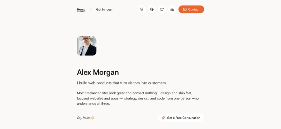
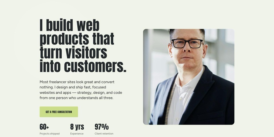
And if violet halftone hero, oversized uppercase type is not the first impression you want to make, do not try to soften it — Halftone makes that impression whatever you put in it. The useful question is not which of the four is best but which first impression fits your work: Noir is pure black canvas, coral highlights; Warm is soft off-white, warm orange details; Spotlight is colour-shifting panels, condensed display type. All four hold the same content, so the decision is only ever about the impression — and it is one click to change your mind.
The other three templates
Same sections, same content, a different design. Have a look before you decide.

Put your
own work in it
Sign up with Google or email, answer a handful of questions, and your site goes live on a free subdomain in the Halftone template. It costs nothing, and you can change template whenever you like.