
August 7, 2026 · 25 min read · Updated September 25, 2026
Art Portfolio Website: Curation, Sequencing and Image Handling
Two audiences want opposite things from an art portfolio. How to curate when you are judged on your weakest piece, what order to put the work in, and the image settings that decide whether anyone waits for it to load.
An art portfolio website has a problem that a developer's or a marketer's portfolio does not. Most freelancers have to prove work that nobody can see — the invisible reasoning behind a redesign, the migration that took four months and produced no visible change. An artist has the opposite difficulty. The work is right there, fully visible, and the whole judgement happens in the time it takes to scroll a grid. Nothing needs explaining. Everything needs choosing.
Which means the skills that make an artist portfolio website work are not writing skills or design skills. They are curation, sequencing and image handling — deciding what goes in, deciding what order it goes in, and getting it onto a screen at the right size and the right colour without making the person wait. This guide is about those three things, plus the two questions artists ask more than any others: what to do about people stealing images, and where the work should live when Instagram already exists.
Two audiences want opposite things from an art portfolio website
This is the point almost every generic portfolio guide misses, and it is the reason so many artists' sites underperform despite containing genuinely good work.
There are two quite different people who might open your site, and what impresses one actively worries the other.
The first is hiring for a job. An art director at a studio, a publisher's commissioning editor, an agency producer. They have a brief in hand and a deadline. Their question is not "is this person talented" — they assume talent, they see a lot of it — but "can this person produce this specific thing, repeatedly, at this standard, inside our house style, without me having to art-direct every frame." They are looking for evidence of reliability in a narrow lane. Variety reads to them as uncertainty about what you actually do.
The second is buying you, not a service. A gallerist, a collector, a curator, or a private client commissioning a piece. Their question is "does this person have a point of view I want to be associated with, and is the body of work coherent enough that it will still mean something in five years." They are looking for a sensibility that holds across pieces. A tightly on-brief commercial set reads to them as work-for-hire, which is not a criticism, but it is not what they came for.
A single undifferentiated gallery labelled "Work" serves neither of them. The art director has to hunt through personal pieces for the three that resemble their brief. The collector has to hunt through client work for the ones that are actually yours. Both give up quickly, and neither tells you why.
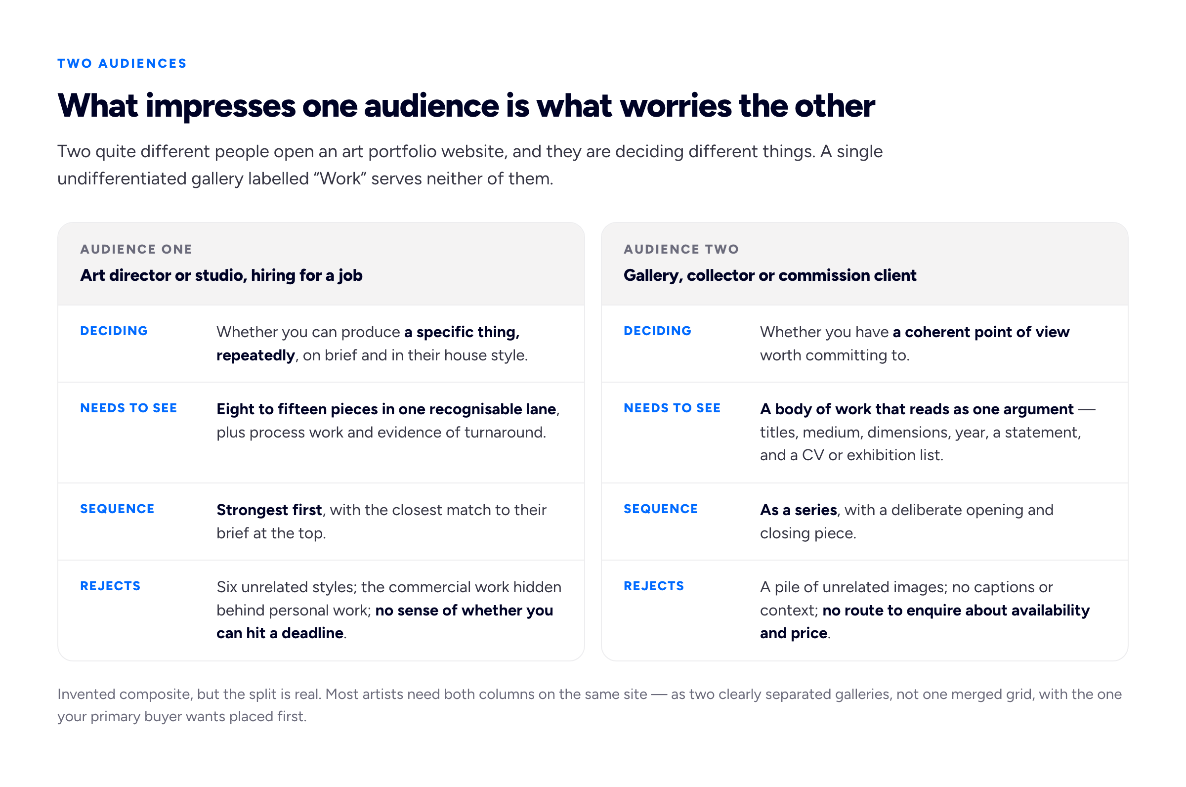
Invented composite, but the split is real. Most artists need both columns on the same site — as two clearly separated routes, not one merged grid.
The fix is structural and takes an afternoon. Split the work into two or three named galleries where the names describe the audience's question rather than your chronology: Commissions and Personal work, or Editorial illustration, Book covers and Paintings. Then put the one your primary buyer wants first. If you get most of your income from commissions, that gallery is the home page and the personal work is one click away. If you are building towards representation, invert it.
What art portfolio website examples can and cannot teach you
People search for art portfolio examples hoping to find a layout to copy. That is the least useful thing to take from them. Layout is close to irrelevant in this field — a plain grid on a dark background has carried an enormous number of careers — and the sites you admire are almost always working because of the edit, which is invisible when you only see the result.
When you do look at other artists' sites, look at the things you can actually count. How many pieces are in the first gallery. Whether the pieces are the same kind of thing or different kinds. Whether there is a caption under each one and what it says. Where the contact route is. How long the page took to load on your phone. Those are transferable. The typeface is not.
Curation: your portfolio is judged on its weakest piece
"Only show your best work" is the standard advice and it is under-specified to the point of uselessness, because nobody thinks the work they are including is bad. It all cleared some internal bar or it would not be on the shortlist.
The version that actually changes decisions is this: a portfolio is not averaged, it is judged on its floor. A viewer who sees ten strong pieces and two mediocre ones does not conclude that you are strong with occasional lapses. They conclude that the mediocre ones represent what you produce when you are not lucky, and they price the risk accordingly. Removing the two weak pieces makes the portfolio better in a way that adding two more strong ones would not.
So the operative question for every piece is not "is this good" but "would I be happy for this to be the piece a client judges me on." Anything that fails that goes.
How many pieces
For a hiring audience, eight to fifteen in the lead gallery. Below eight the set looks thin and the viewer cannot tell whether the good pieces were repeatable. Above fifteen you are asking for attention you have not earned yet, and the marginal pieces start dragging the floor down. For a collector or gallery audience the number is lower and the coherence matters more — a single series of eight to twelve pieces that clearly belong together will do more than thirty individually decent images. We go into the reasoning across disciplines in our guide on how many projects a portfolio should contain.
An exception worth naming: if you are pitching for high-volume production work — mobile game assets, stock illustration sets, licensing — a larger body is genuinely evidence, because the buyer's risk is throughput rather than quality. Show the volume, but show it as a separate labelled set rather than mixing it into the lead gallery.
How to cut
Cutting your own work is hard because you remember what each piece cost you. Three passes, on different days, get most people there:
- Pass one, cut on execution. Anything where the drawing, the values, the anatomy or the finish is visibly weaker than the rest goes, regardless of how good the idea was. Ideas do not survive weak execution in a grid viewed at thumbnail size.
- Pass two, cut duplicates. If two pieces demonstrate the same thing — same subject, same palette, same problem solved the same way — keep the better one. Two near-identical pieces read as one piece plus filler.
- Pass three, cut what does not belong. This is the one people refuse. A genuinely good piece that does not fit the argument the gallery is making is still a cut. Move it to a different gallery or leave it out.
If you cannot do this to your own work, and many artists cannot, give someone whose eye you trust a contact sheet and ask them to pick twelve. You do not have to accept their edit. The gap between their twelve and yours is the information.
Sequencing so a set reads as a body of work
A pile of images and a body of work can contain exactly the same pieces. The difference is order.
Open with your single strongest piece — not the newest, not the one you are proudest of for personal reasons, the one that would most reliably make a stranger stop. Close with the second strongest, because the last image is what people carry away. In between, arrange for rhythm rather than chronology: alternate density, alternate palette temperature, put a quiet piece after a loud one. If the set is a series with an internal logic — a narrative, a set of variations, a progression of scale — let that logic drive the order and say so in one line of text above the grid.
Sequence before you make the final cut, not after. Once the set is in order, the two weakest pieces become obvious in a way they never are in an unordered grid.
Range versus consistency, and when range destroys you
The most common self-inflicted wound in an artist portfolio website is showing everything you can do. It feels like demonstrating capability. To a hiring audience it reads as an artist who has not decided what they are, which is a real risk to them: if your six styles are all competent, they have no way of knowing which one they will get, and they will hire someone whose work all looks like one thing.
Art directors hire for a look. They have a brief, they have a house style, and they are matching. If your portfolio contains one page of the thing they want plus five pages of other things, the match is weaker than a portfolio containing only that thing, even if yours is better.
So the plain version: range helps when the range is the product; it hurts when the buyer is matching a style.
Range genuinely helps if you are selling versatility itself — a studio-side generalist, a production artist expected to work in whatever the project needs, a storyboard artist, someone doing visual development across a whole project. It helps if the work is unified by subject or sensibility even though the media differ. And it helps for a collector audience, where a body of work that moves across media but holds a consistent preoccupation is exactly what reads as an artist rather than a supplier.
If you genuinely work in two unrelated modes — moody personal painting and cheerful commercial vector, say — the honest solution is two galleries with two names, and being willing to send a client a direct link to the relevant one. Some artists go further and run two sites. That is defensible, and it costs nothing on a free subdomain, but it doubles the maintenance and halves the search presence for your name, so do it only when the two audiences genuinely never overlap.
Process work: the thing that gets a concept artist hired
For most disciplines, finished pieces are the portfolio and process is optional garnish. For concept art it is close to inverted.
A concept artist is not hired to produce one beautiful image. They are hired to solve a design problem under direction, generate options, take notes, and iterate without collapsing. A single polished key frame proves none of that. Thumbnails, silhouette explorations, a page of variations on a prop, a callout sheet showing the same character from three angles, the ugly middle stages — these are the evidence. Showing eight thumbnails and the chosen direction tells an art director more about whether you can do the job than the finished render does.
The same is true, more mildly, of character design, visual development and anything with a functional brief attached. If someone is going to direct you, they want to see that you can be directed.
Process is a liability in three situations. First, when it is padding — six process shots for a piece nobody asked about, used to make a thin portfolio look fuller. Second, when the process is more interesting than the outcome, which invites the reader to notice that the finished piece did not land. Third, for a gallery or collector audience, where a wall of working sketches undermines the finality that a body of work is supposed to have. Fine art has its own conventions about studio process, and they are not the same as a studio pipeline's.
Keep process behind the finished piece, not in front of it. The click-through page for a piece is the right home for it: outcome first, then the route there. Our guide to writing a portfolio case study covers the structure, which transfers directly even though it was written for designers.
Getting the images right, which is where most sites lose
For an artist the images are not illustrations of the work. They are the work, as far as a visitor is concerned, and a badly exported file is a badly presented painting. Three things go wrong, in this order of frequency.
Colour profile. Export sRGB. If you work in Adobe RGB, Display P3 or ProPhoto — and if you paint digitally or scan properly, you may well be — a file that keeps that profile, or worse, that has the profile stripped and the numbers left alone, will render flat, dull and slightly wrong in a meaningful share of browsers and phone apps. The cruel part is that the artist almost never sees it, because their own machine is colour-managed and handles the file correctly. Convert to sRGB on export, embed the profile, and check the result on a phone you have not calibrated.
Size. Use two sizes per piece: a display image sized for how it actually appears in the gallery, and a larger click-through for people who want to look properly. Exporting one enormous file and letting the browser scale it down means every visitor pays for pixels they never see.
Weight. A gallery of twenty images at three megabytes each is sixty megabytes, and on a phone on mobile data that is not a slow page, it is an abandoned one. The viewer leaves before the work renders, which means the curation you agonised over never gets seen at all.
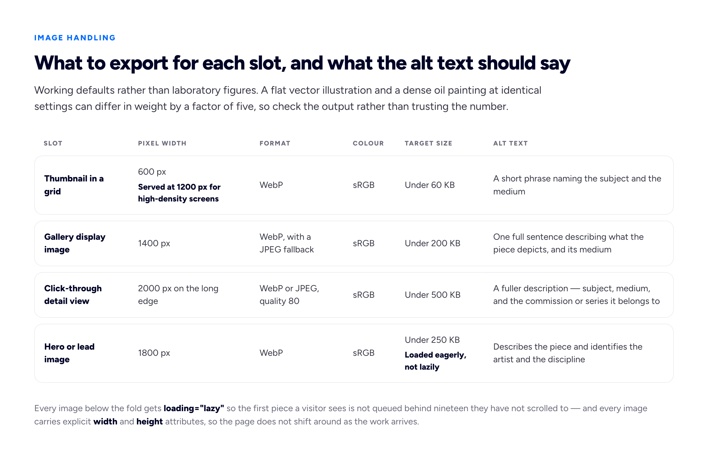
Working defaults rather than laboratory figures. A flat vector illustration and a dense oil painting at identical settings can differ in weight by a factor of five, so check the output rather than trusting the number.
Two mechanical details that matter more than they look. Set loading="lazy" on every image below the fold and leave the hero eager, so the first thing a visitor sees is not queued behind nineteen images they have not scrolled to. And set explicit width and height attributes on every image, so the page does not shuffle around as things arrive — layout shift is measured, and it is also the single most irritating thing a gallery can do to someone trying to look at a picture.
Then alt text, which artists skip more than any other group because the image "speaks for itself". It does not speak to two important readers. A screen reader user gets nothing but the file name. A search engine cannot see the picture either, and image search is a real route to an art portfolio website — descriptive file names and real alt descriptions are how you become eligible for it. graphite-portrait-study-hands.webp beats final_v3_FLAT.webp, and "Graphite study of a pair of hands resting on a folded newspaper, A3, 2025" beats "artwork". Write the alt as a sentence you would say to someone describing the piece over the phone. Our portfolio SEO guide covers the rest of the fields, and our guide to choosing portfolio images covers which frame should lead a piece in the index grid.
What each discipline has to prove
Illustration portfolio
An illustration portfolio has to prove that you can solve a brief, not just draw well. That means published or realistic-looking applied pieces — an editorial illustration alongside the headline it ran with, a book cover as a cover rather than a flat artwork, a packaging illustration on the packaging. Showing the drawing alone loses half the argument, because the buyer's real question is whether it will work in their context with type on top of it.
Rejected for: a set of unrelated personal drawings with no applied context, so the commissioner cannot tell whether you have ever worked to a brief, a word count, or a deadline.
Concept art portfolio
A concept art portfolio has to prove design thinking under direction: iteration, variation, believable functional design, and enough craft to communicate quickly. Show sheets rather than single images — a prop explored six ways, a character turnaround, an environment with a callout of the detail that makes it work. Say what the constraint was, in one line, even if the project is invented for practice: "self-directed brief, a mining rig that has to read as functional at silhouette size."
Rejected for: five heavily rendered hero images and nothing else, which reads as an illustrator who wants to be a concept artist rather than someone who can survive a note session.
Fine art
Fine art has to prove coherence and seriousness. That means work presented as work — title, medium, dimensions, year — a body rather than a selection, and installation or in-situ shots where the scale matters, because a six-foot canvas and an A4 study look identical in a grid. It also means the surrounding apparatus: statement, CV, exhibitions, availability.
Rejected for: images with no captions, no scale and no sense of a project, so a curator cannot tell whether they are looking at an artist or a portfolio of practice pieces.
Digital art
People searching for how to make a digital art portfolio usually already have a large body of work, spread across a social feed, in wildly varying quality. The job is almost entirely subtraction, plus the colour and export discipline above, which digital work is unusually sensitive to — a piece painted on a wide-gamut display and exported carelessly can arrive muddy on the viewer's phone. Beyond that, digital art benefits from making the medium legible: naming the tools, and where the piece is 3D, showing wireframe or clay renders alongside the beauty shot, because for 3D the topology is part of what is being assessed.
Rejected for: an undifferentiated feed dump of two years of output, where the strong pieces are present but buried, and for wide-gamut exports that look wrong to everyone except the artist.
Captions, and why "Untitled, 2024" loses commissions
Every piece should carry, at minimum: title, medium, dimensions, year. That is the standard convention and it costs one line. "Low Tide, oil on linen, 120 × 90 cm, 2025."
For commissioned work, add the client and one sentence of brief. "Cover illustration for a weekly magazine's climate issue; the brief asked for optimism without cliché, delivered in nine days." That sentence does three jobs at once: it proves the work was commissioned rather than self-directed, it demonstrates that you understood a brief, and it quietly answers the turnaround question. If a client's name is under an agreement you cannot break, describe the sector instead — "a national broadsheet" — which is covered in more depth in our guide to showing confidential work.
The reason bare captions cost commissions is specific. A visitor who likes a piece has a follow-up question — how big is it, can I get one like it, is it available, could you do this for me — and a caption that answers nothing forces them to compose an email to ask. Most people do not compose the email. Dimensions alone convert browsers into enquirers, because scale is the thing an image on a screen cannot convey and the thing a buyer needs to know first.
Protecting the work honestly
This is the question artists ask most, and the honest answer is less satisfying than the products sold to address it.
Right-click blocking does not work. It is defeated by a screenshot, by the browser's developer tools, or by turning off JavaScript. What it reliably does is annoy the art director who was trying to save your image to a mood board to show their editor, which is a thing you want to happen.
Visible watermarks have a real cost. A watermark small enough not to damage the piece is trivially cropped out. A watermark large enough to be uncroppable is large enough to be the first thing a commissioner sees, and it degrades the work at the exact moment it is being judged. There are contexts where it is worth it — a photographer supplying proofs, an artist whose work is being lifted at scale by print-on-demand sellers — but for most artists, most of the time, it costs more attention than it saves theft. Bunfolio's templates do not add one, and we would not recommend adding one by hand.
Resolution is the practical protection. A 2,000-pixel file is enough to look excellent on any screen and not enough to print large at a quality anyone would sell. That removes the commercially damaging use without touching the viewing experience, and it is the only measure on this list that costs the viewer nothing.
On the legal side, stated carefully. In countries party to the Berne Convention — which is most of the world — copyright in an original work arises automatically at the moment of creation, with no requirement to register it or attach a notice. That is the baseline. Separately, some jurisdictions attach real benefits to formal registration: in the United States, for instance, registration with the Copyright Office is connected to what you can pursue and recover in an infringement action. A visible copyright line on your site, with your name and a contact address for licensing enquiries, is cheap and occasionally turns a would-be lift into a paid licence. None of this is legal advice, and for anything with money attached you want a lawyer in your own jurisdiction rather than a portfolio guide. If you licence work regularly, the separation between fee and usage rights belongs in your contract, not on your website.
What fine art needs that commercial work does not
An artist statement that is not fog. The genre has a bad reputation because so much of it is unfalsifiable — work that "interrogates liminal spaces of embodied memory" could be any work at all. A statement earns its place when a reader could pick your pieces out of a group show having read it. Say what you make, physically. Say what you are actually interested in, in words you would use out loud. Say what changed recently. Three paragraphs is plenty, and the test is whether removing your name would leave it attributable. Our guide to writing an About page covers the voice, though the fine art conventions differ.
A CV and exhibition list. Reverse chronological, plainly formatted, with solo and group shows separated, plus education, residencies, awards, collections and press. Curators read this before the statement. If it is short, it is short — an honest four-line CV is better than padding, and everyone can tell the difference.
Availability and enquiries. Mark pieces as available, sold, or in a private collection. "Sold" is not an embarrassment; it is the strongest social proof a painter has, and a page where several pieces are marked sold tells a new buyer that other people have committed money.
Pricing, or deliberately not pricing. Both are defensible and the choice depends on where you sit. If you sell directly to private buyers, published prices remove the enquiries you were never going to convert and reduce the friction for the ones you would. If you are represented, or working towards it, prices on your own site can undercut a gallery's structure and are usually a conversation to have with them first. If you take commissions, publishing a starting figure — "commissioned portraits from £1,200 depending on scale", invented for illustration — does most of the filtering without committing you. What is not defensible is silence plus a contact form, which asks the buyer to expose their budget first.
Where the portfolio should live
Artists get more direct enquiries from platforms than most freelancers do, which makes the argument for a site of your own feel weaker than it is. It is not weaker. It is different.
Instagram is the best discovery channel most artists have and a poor portfolio. It crops, it compresses, it orders by recency rather than quality, it buries the work behind an algorithm you do not control, and nobody has ever found an illustrator by searching it for "children's book illustrator, watercolour". Its job is to bring people to you.
ArtStation is where studio recruiters actually look for concept art, games and 3D work, and if you want that kind of job you need to be on it. It is also a house style: everyone's work is presented identically, in the same grid, with the same conventions, which makes it excellent for being compared favourably and poor for being distinctive.
Behance carries more weight for commercial illustration, branding-adjacent work and agency-facing artists than for fine art, and it inherits Adobe's search presence. The same trade-off applies: distribution in exchange for uniformity. We compared the platforms with owned sites in more detail in Behance and Dribbble versus your own portfolio website.
The honest summary is that platform galleries are distribution channels, not homes. Be on the ones your buyers use, and keep the definitive version somewhere you control — where the edit is yours, the sequence is yours, the captions exist, nothing is cropped, and the URL still works when a platform changes its terms or an account is suspended by an automated system at three in the morning. A domain you own also means the art director who saw your work eight months ago can find you again by typing a name they half remember, which is the single most underrated function of a portfolio site. Ours are free on a subdomain, and a custom domain can be pointed at them later without moving anything.
A realistic build plan
Most of this is choosing, not building. A working plan for someone who has the art already:
- Session one, decide the audience. Which of the two columns is your primary buyer this year. Write it down. Every later decision resolves against it.
- Session two, shortlist. Pull every candidate piece into one folder. Do not cut yet. Just gather.
- Session three, cut and sequence. Three passes, then order the survivors, then cut the two weakest that the sequence exposed. Aim at eight to fifteen.
- Session four, export. Two sizes per piece, sRGB, sensible file names. This is an hour of tedium and it is the hour with the highest return on the list.
- Session five, write. Caption every piece — title, medium, dimensions, year, plus client and brief for commissions. Then the About or statement, then the CV if you need one.
- Session six, publish and check on a phone. On mobile data, cache cleared. Time how long until the first piece is fully visible, and find your own contact route as if you were a stranger.
That is a weekend, not a project. The failure mode is spending the weekend on the design instead, which is the only part of the list that does not change whether you get hired.
How we put this guide together
The section on copyright, watermarks and resolution is general information, not legal advice. Copyright law differs by country and the consequences of getting it wrong are financial; for anything significant — a licensing deal, an infringement you want to pursue, work made under commission where ownership is unclear — take proper advice in your own jurisdiction. Two primary sources are worth reading directly rather than through summaries: the Berne Convention at WIPO, which is where the principle that copyright arises on creation without formality comes from, and the United States Copyright Office, which sets out what registration does and does not add for anyone whose work touches the US.
Several parts of this guide are our own judgement rather than established fact, and we would rather name them than let them pass as received wisdom. The two-audience split at the top, the curation rules — judging a portfolio on its floor, the eight-to-fifteen range, sequencing before the final cut — the per-slot image recommendations in the table, and the position that watermarks usually cost more attention than they save theft are all ours. They come from working with freelancers building portfolios on Bunfolio and watching which sites produce enquiries, and from the recurring patterns in what persuades a buyer versus what merely impresses another artist. Someone with a different practice could reasonably disagree with any of them, particularly the watermark position if their work is being lifted at scale.
The technical recommendations lean on documentation you can check. The behaviour of the loading attribute and the reason explicit width and height prevent layout shift are documented in MDN's reference for the image element; the case for sizing and prioritising the lead image is set out in web.dev's guidance on Largest Contentful Paint; the file-naming and alt-text advice follows Google's image SEO documentation, and the accessibility side of alt text is covered properly in the W3C WAI images tutorial. The pixel dimensions and file-size ceilings themselves are our working defaults, not measurements from a controlled test.
We deliberately did not quote a figure for how long an art director spends looking at a portfolio before deciding. Numbers for this circulate widely — a few seconds, eight seconds, thirty — and we could not trace any of them to a primary study with a stated method, so we described the behaviour instead of inventing a measurement. A number we could not source would be worth less to you than the admission that we could not source it. Every artist, brief, caption, price and project in this guide is invented for illustration, and we have deliberately not reproduced, linked or ranked any real artist's portfolio: art portfolio website examples are best studied for their structure, and we are not in a position to publish judgements about individual artists' work.
Related reading: how many projects your portfolio should show, building a photography portfolio website, Behance and Dribbble versus your own site, the illustration portfolio if you are commissioned rather than selling finished work, and what a freelance artist is for how pay and usage rights work once someone does commission you.
More from the blog
September 15, 2026 · 16 min read
How to Make an Art Portfolio for School, Studios, Galleries and Clients
The same artist needs a different portfolio for an art school, a studio, an open call and a commission client. How to choose and cut pieces for each, photograph and caption the work, and build a portf...
August 21, 2026 · 18 min read
Model Portfolio Website: Building a Book That Books Work
Your book is a technical document with a conventional structure, read quickly and rejected faster. The eight shots it needs, why stats accuracy is not optional, and which direction the money should al...
July 10, 2026 · 18 min read
Do Freelancers Actually Need a Website? An Honest Answer
Written by a company that sells websites, so it starts with the freelancers who genuinely do not need one. What a site does that a profile structurally cannot, the minimum version worth publishing, an...