
August 9, 2026 · 13 min read
How to Build a Photography Portfolio Website
Photography sites fail twice over: too many frames, shipped too heavy. Four passes for cutting a gallery, export settings by slot, and an honest answer about watermarks.
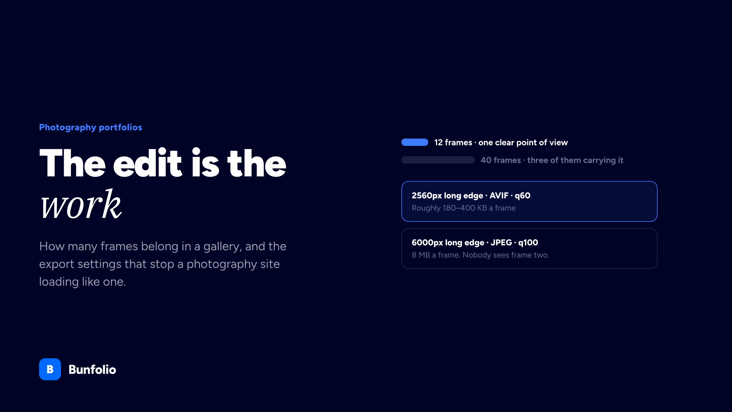
A photography portfolio site fails in two ways, and they pull in opposite directions. It shows too much — ninety frames where twelve would have made a stronger argument — and it ships those frames too heavy, so the person you were trying to impress sees a grey rectangle for four seconds and leaves. The first is an editing problem, the second is an export problem, and almost every underperforming photography site in existence has both.
Neither is a design problem, which is why redesigning the site rarely fixes it. This guide covers what your site is actually for, how to cut a gallery down to the frames that carry it, how to structure the galleries so a buyer finds the right one, the export settings that keep a photography site fast, and the practical questions — watermarks, licensing, pricing pages — that photographers ask and most portfolio advice ignores.
Decide what the site is for first
Three quite different jobs get bundled under "photography portfolio", and a site trying to do all three does none of them well.
Getting commissioned — by art directors, picture editors, brands, couples, agencies. This site is a filter: the visitor already knows what they need and is checking whether you shoot it, at what standard, and whether you are available. Speed of judgement is everything, so the work must be sorted by the thing they are shopping for.
Selling prints or licences — a shop, essentially, with different requirements: sizes, editions, delivery, returns policy, and a checkout that works. The editing is looser here because browsing is part of the point.
Building an audience — a body of personal work you want people to spend time inside. Sequencing matters more than navigation, and the visitor is not shopping at all.
Most working photographers need the first, sometimes with a small version of the second. Be explicit about which, because it determines the answer to nearly every subsequent question. A commissioning site with a thirty-frame personal series on the home page is asking an art director to do a job they will not do. One job that is not on this list and gets confused with it is the sitter's own book: a model's own portfolio website is read as casting material — range, accuracy, digitals — rather than as an argument about who took the picture.
The edit is the work
The best single improvement available to most photography sites is deletion. Not because the extra frames are bad — they are usually fine — but because a set is read as an argument, and every frame that does not advance the argument weakens it. Anyone can take a good photograph occasionally. Choosing which twelve to show is the skill being assessed.
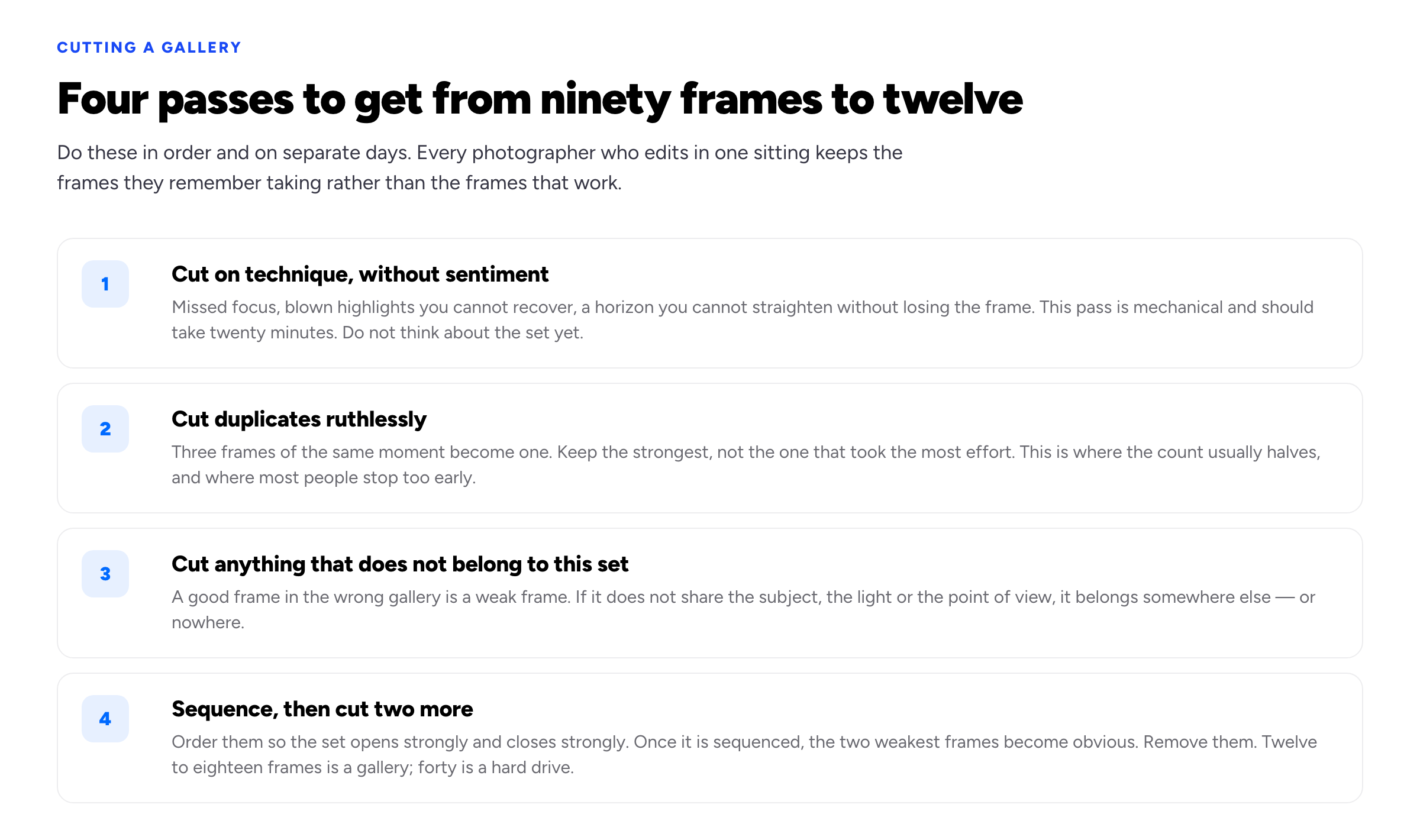
Four passes, ideally on different days. Editing in one sitting keeps the frames you remember taking.
The pass people find hardest is the third. A genuinely good photograph that does not belong to the set is still a cut, because it breaks the point of view the other frames are building. Put it in a different gallery, or in none.
The pass people skip is the fourth. Once a set is sequenced — opening frame, closing frame, and a rhythm in between — the two weakest images become obvious in a way they were not when the set was an unordered grid. Sequence first, then cut. Twelve to eighteen frames is a gallery. Forty is a hard drive with a URL.
If you cannot cut your own work, and many photographers cannot, hand a contact sheet to someone whose eye you trust and ask them to pick fifteen. You do not have to accept their edit. You will learn something from the gap between theirs and yours.
Structure galleries by what people are shopping for
The default structure is chronological or by shoot: "Iceland 2025", "Marta & Tom", "Studio work". That structure makes sense to you and to nobody else, because it is organised around your memory rather than the visitor's question.
Organise by the thing a commissioner is looking to buy. For most photographers that means genre and use: Portraits · Editorial · Food · Interiors · Personal, or Weddings · Elopements · Couples. Four or five galleries is plenty; more than seven suggests you have not decided what you shoot, which is a positioning problem rather than a navigation one and is worth resolving before you touch the site. Our guide on niching down covers the trade-off.
Two structural details that matter more than they look:
- Put the strongest gallery first and the strongest frame first inside it. Do not save the best image for the end of a set; most people never reach the end of a set. The frame that opens a gallery is doing a different job from the frames inside it, which our guide to choosing portfolio images goes into.
- Caption sparingly but caption something. Client, brief, and what the commission was for, on the gallery rather than on every frame. "Shot for a national supermarket's autumn campaign, six SKUs in two days" tells a buyer something no image can.
The technical part, which is where sites actually lose people
Photography sites fail Google's page-experience thresholds more consistently than any other kind of portfolio, and it is always for the same reason: the images are exported for print and served to phones.
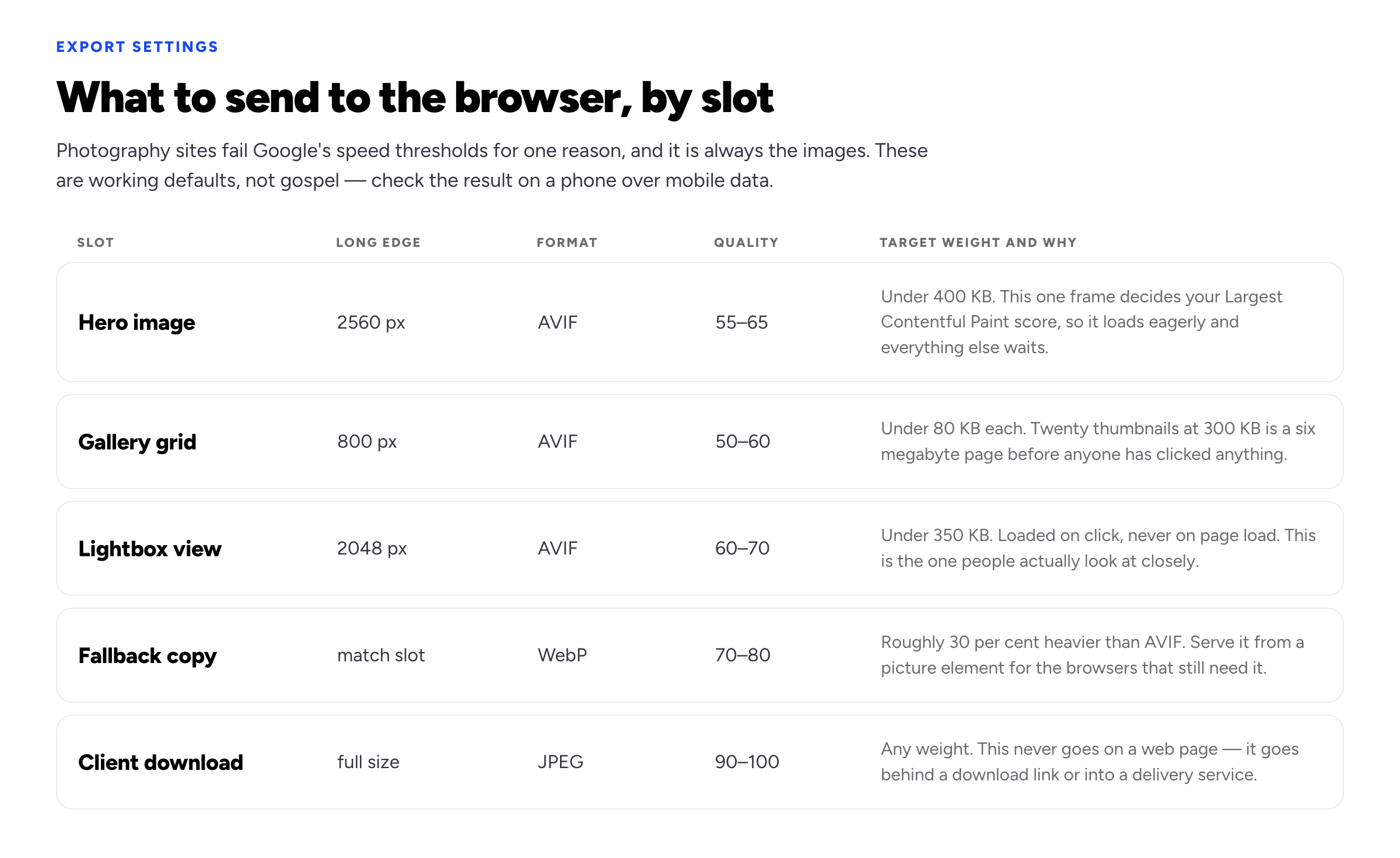
Working defaults. Verify the result on a phone over mobile data, not on your desktop over office wi-fi.
Three things to understand behind that table.
Format. AVIF produces substantially smaller files than JPEG at visually equivalent quality, and browser support is now broad. WebP is the sensible fallback. Serving a JPEG straight out of Lightroom at quality 100 is the single most common cause of a slow photography site, and the quality difference at these display sizes is invisible.
Dimensions. Export at roughly the size the image will be displayed, allowing for high-density screens — so a frame shown 1,280 pixels wide wants a 2,560 pixel export, not a 6,000 pixel one. The browser will scale a 6,000 pixel image down and it will look identical, having cost your visitor eight megabytes to find that out.
Colour. Export in sRGB. Files tagged Adobe RGB or ProPhoto render with visibly flat, desaturated colour in a meaningful share of browsers, and the photographer is usually the last person to notice because their own machine handles the profile correctly.
Beyond the exports: set explicit width and height attributes on every image so the page does not jump as they load, lazy-load everything below the fold while loading the hero eagerly, and be sceptical of gallery libraries that block rendering. Google's Core Web Vitals are the thresholds this is measured against, graded at the 75th percentile of real visits — which means the slower quarter of your audience, on older phones, decides your score. None of these export rules transfer if you also shoot motion, because a reel is hosted rather than exported — the video editor's version of this problem is about players, poster frames and where the file lives. Our portfolio SEO guide goes through the rest.
Watermarks, right-click blocking, and theft
Photographers ask about this more than any other single topic, so here is a direct answer: visible watermarks and right-click blocking cost you more than they save.
Neither prevents anything. A screenshot defeats right-click blocking in one keystroke, and a watermark large enough to be uncroppable is large enough to ruin the frame for the art director you were trying to impress. What they reliably do is signal defensiveness and degrade the work at exactly the moment it is being judged.
What is worth doing instead:
- Keep the web copies small. A 2,048 pixel image is unusable for print, which removes the commercially damaging use case without touching the viewing experience.
- Embed your metadata. Author, contact and copyright fields in the IPTC data, using something like the IPTC Photo Metadata standard. It survives most casual reuse and makes ownership demonstrable later.
- Put a plain licensing line on the site. One sentence stating that images are not licensed for reuse and giving an email address for enquiries turns some would-be lifting into a paid licence.
- Register your work where that applies in your jurisdiction. Copyright generally exists automatically on creation, but formal registration materially changes what you can recover in some countries, including the United States. That is a question for a lawyer in your jurisdiction, not for a portfolio guide.
Licensing, pricing and the money page
A commissioning site needs to answer the money question, and most do not. The visitor's next question after "is this the right photographer" is always "can I afford them", and if the site is silent they either email to find out — which filters out the busy ones — or they move on.
You do not have to publish a full rate card. A starting figure removes the wrong enquiries at no cost: "Editorial commissions from £900 a day, licensing quoted per use." For portrait and wedding work, where the buyer is a consumer rather than a business, publish packages and what is included; consumers filter almost entirely on this, and hiding it does not raise your price, it just moves the rejection later.
Be explicit that the fee and the licence are separate things, because clients who have not commissioned photography before assume they are buying the images outright. A short usage note — territory, duration, media — prevents the awkward conversation where a client uses a two-year web licence on a billboard. This is the same territory as the contract clauses every freelancer needs, with the specifics that photography adds.
Your site, Instagram, and the platforms
Photographers get more direct enquiries from social platforms than most freelancers do, which makes the argument for a site feel weaker than it is. It is not weaker; it is different.
Instagram is a discovery channel and a terrible portfolio: it crops your work, compresses it hard, orders it by recency, sits behind an algorithm you do not control, and cannot be searched by anyone looking for "food photographer Bristol". Its job is to bring people to you. Your site's job is to convert them — with the full edit, the captions, the licensing terms and the contact route — and to rank for your name when the art director who saw your work six months ago tries to remember it.
Practically: link the site from every profile, and make sure your site works when someone arrives on a phone from a link in a direct message, because that is the most common path. A custom domain matters more here than in most fields, because photographers get recommended verbally and a name someone can remember and type is doing marketing work while you sleep.
Being found: image search and local queries
Photographers have one search channel most freelancers do not, and most photography sites forfeit it entirely. Your images can rank in image search, and that is a real source of enquiries — but only if the page tells a crawler what it is looking at, because it cannot see the photograph.
Four things do nearly all of the work here:
- Descriptive file names.
bristol-restaurant-interior-evening.avifrather thanDSC_4417.avif. This costs nothing at export time and is a genuine ranking input for image search. - Alt text that describes the photograph and its context. Written first for people using screen readers, which is reason enough. "Chef plating a dish in a low-lit open kitchen, shot for a restaurant group's menu launch" is useful to both audiences; "photography" is useful to neither, and a string of comma-separated keywords is actively counterproductive. Google's image SEO documentation is short and worth reading once.
- Real text on the page. A gallery with no prose has nothing to rank. Two or three sentences of context per gallery — what the commission was, what was involved, where it was shot — gives a crawler something to work with and gives a human something to read.
- Location, stated plainly. "Food and interiors photographer based in Bristol" in your heading and title tag is what makes you eligible for the local queries people actually type. This is the most achievable ranking available to a photographer, and it is lost by every site whose home page says only the photographer's name.
What is not worth your time: keyword-stuffed captions, a blog you will abandon after four posts, and chasing head terms like "photographer" on their own. The realistic targets are your own name, your genre plus your city, and image search for the specific things you shoot.
A five-minute audit
Run this on your existing site before rebuilding anything. Most photography sites fail three or four of these, and every one is fixable without a redesign.
- Open the home page on a phone, on mobile data, with the site's cache cleared. Time how long until the first photograph is fully visible. Over four seconds means the export settings are the problem, not the design.
- Count the frames in your largest gallery. Over twenty-five, and the edit is doing you damage.
- Check one image's file size in your browser's network panel. Over 500 KB for a gallery image means nothing else on this list matters yet.
- Ask someone who does not know your work what you shoot, after ten seconds on the home page. If they hesitate, the structure is organised around your memory rather than their question.
- Search your own name in a private browser window. If your site is not the first result, the fields in our SEO guide are worth an afternoon.
- Find your own email address. Time it. Anything over five seconds is a lost enquiry from someone less motivated than you.
The rest of the site, briefly
- An About page with your face on it. Photography is a hiring decision about a person who will be in a room with a client's family, or their CEO, or their food. Anonymity costs you here in a way it does not elsewhere. Our guide to writing an About page covers the shape.
- Contact that is a visible email address. Plus a phone number if you shoot events, where speed matters and forms lose enquiries.
- Client list or publication credits as a plain text strip. This is the fastest credibility signal available to you and takes ten minutes to add.
- One line on availability and location. "Based in Lisbon, travelling regularly" answers a question that otherwise costs an email.
- Testimonials from commissioners, not subjects. A picture editor saying you delivered on deadline is worth more than a couple saying they loved their photos. Both are useful; only one addresses the buyer's actual risk. There is a method for asking for these that produces evidence rather than compliments.
How we put this guide together
The four-pass editing method, the gallery structure and the twelve-to-eighteen frame recommendation are our own guidance, drawn from what we see working on photography sites built with Bunfolio. The export figures in the table are working defaults rather than measurements from a controlled test: file weight varies enormously with subject matter, and a low-detail studio frame and a dense forest scene at the same settings can differ by a factor of five. Treat them as starting points and check the output.
The technical claims are checkable. AVIF's compression advantage over JPEG and its current browser support are documented at Can I Use; the thresholds and the 75th-percentile grading for Largest Contentful Paint, Interaction to Next Paint and Cumulative Layout Shift come from Google's Core Web Vitals documentation; the metadata fields are defined by the IPTC Photo Metadata standard.
The section on copyright registration is deliberately short and deliberately vague, because the answer differs by country and the consequences are financial. Nothing here is legal advice, and the day rates and licensing examples are invented illustrations rather than market figures.
Related reading: how to build a graphic design portfolio, portfolio SEO, how much to charge as a freelancer, and the makeup artist portfolio for the other half of every test shoot.
More from the blog
September 25, 2026 · 15 min read
How to Start Freelancing With No Experience: Build Proof, Not Years
Clients do not hire years of experience; they hire evidence that you can do their job. How to pick a skill someone will pay for, manufacture honest proof, package it on one page with a first price, fi...

September 21, 2026 · 18 min read
Nursing Portfolio: What to Include, Who Reads It and How to Build One
An interview panel, a clinical ladder committee, a certification auditor and an NMC confirmer all read a nursing portfolio, and only one of them wants the binder every guide describes. What each actua...

September 14, 2026 · 32 min read
How to Build a Resume Website: Steps, Options and When Not To
A resume website is not a resume and not a portfolio, and the bad ones come from never deciding which. What it is for, who should not build one, four ways to build it with the free-tier facts checked,...