
July 20, 2026 · 25 min read · Updated October 5, 2026
How to Build a Graphic Design Portfolio
Your portfolio is itself a work sample. Four shots that present a project properly, where to publish besides your own site, and the image weight that quietly ruins design portfolios.
Most professionals get to keep their portfolio and their work separate. A developer's site can be plain and nobody minds, because the code is the thing being judged. A copywriter can publish on a template. Designers do not get that separation. Your graphic design portfolio is not a container for work samples — it is a work sample, and it is being read as one from the first second, before anyone scrolls to a single project.
That is uncomfortable, and it is also the most useful thing to accept early. The kerning of your own name, the amount of air around your project cards, whether your images are crisp or soft, whether the site loads before someone's attention goes — all of it is evidence. A viewer who sees a beautifully art-directed piece of packaging sitting inside a cramped, blurry, slow page does not conclude that you had a bad web day. They conclude something about your standards.
So to build a graphic design portfolio that holds up, choose six to ten projects aimed at the work you want next, present each with more than one honest view, keep the site around them quiet and fast, and label anything that was not a real commission. This guide starts with that process in order, then covers the parts that are specific to visual work: how to present a single piece so it survives being looked at, when mockups help and when they are hiding something, the image quality and colour problems that designers routinely inflict on themselves, and where to publish. The general page structure — hero, selected work, services, about, contact — is covered in our guide to a freelance portfolio website that wins clients, and this post deliberately does not repeat it. Build that skeleton first. This is about what you hang on it.
How to build a graphic design portfolio, in order
The sections below go deep on each part. If you are starting from nothing, or rebuilding a portfolio that has drifted, this is the order we would do it in.
- Decide what you want to be hired for next. Packaging, brand identity, editorial, digital, motion. A portfolio built for the work you want is a different selection from one built to show everything you have done. If brand identity is the goal, our brand designer portfolio guide covers what that reader looks for.
- Make a long list, then cut it to six to ten projects. Put the projects closest to that goal first. Cut anything you would not want to be asked to do again, however good it looks.
- Gather four views of each project. A context shot of the real thing in use, a flat crop that shows the craft, a before and after where there is one, and a close detail. Where a view is missing, photograph it now, while the piece still exists.
- Choose one project to open up properly. The constraint, two rejected directions and the decision that made it work. The rest get three or four sentences each.
- Label anything that was not a paid commission. Student brief, self-initiated, unproduced, one of three directions presented. One word in the first line of the caption.
- Export the images properly. Right dimensions, sRGB, a sensible file size, a descriptive filename and alt text. This is where most design portfolios lose their speed and their colour.
- Build the site, quietly. One typeface pairing, one spacing scale, a frame that does not compete with the work. Then publish selected projects on Behance or Dribbble and link them back to it.
- Make the PDF and update the résumé. Same work, same order, under about 10 megabytes, with the site link on page one. Put the link on your résumé too; the graphic designer résumé guide covers where it goes.
- Run the audit. The twelve checks near the end of this guide, on a phone, on mobile data.
Designers get judged on two things at once
Everyone with a portfolio is judged on the work. Designers are judged on the work and on the artefact presenting it, simultaneously, by someone who is professionally equipped to notice the difference.
Think about who is actually looking. A studio's creative director. A design lead screening for a contract. A founder who has spent two years staring at competitors' brand systems. These people read layout the way an editor reads a sentence. They are not consciously auditing your line height, but they register it, and it feeds into an overall impression that gets formed long before they can articulate why.
The practical consequences are narrow and fixable:
- Pick one typeface pairing and be strict about it. Three typefaces on a designer's own site reads as indecision, not range. Your range belongs in the projects.
- Use a spacing scale and stick to it. Inconsistent gaps between sections are the single most common tell on a designer's portfolio, and they are visible at a glance even on a phone.
- Make images the sharpest thing on the page. If your work looks softer than the interface around it, the interface wins and your work loses.
- Do not over-design the frame. A portfolio with an experimental cursor, a custom scroll, a loading animation and a colour-shifting background is competing with its own contents. The frame should be quiet enough that the work is the loudest thing on screen.
There is a version of this advice that tips into blandness — the identical white grid that a thousand designers use. That is not the goal either. The goal is a page with a point of view that does not fight the work. One strong decision, held consistently, beats five decorative ones.
How to present a single project
This is where most design portfolios are decided, and where most of them are thin. The common failure is one hero image per project — a single beautiful composite, usually a mockup, that shows the work looking good and proves nothing else.
A good project presentation answers four separate questions, and each one needs its own shot. You are not filling space; you are closing four different doubts a viewer has.
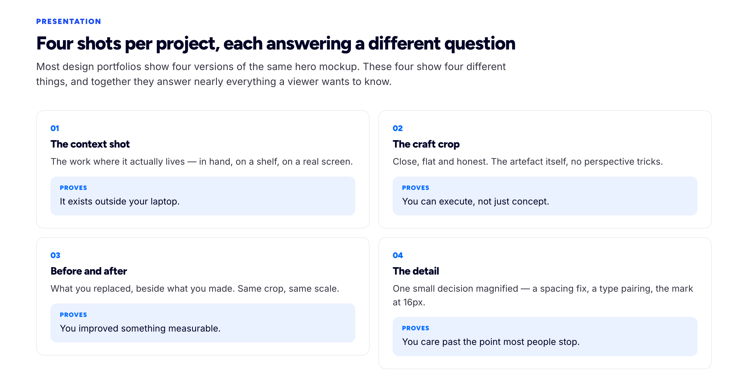
Four shots per project. Each one answers a different question.
The context shot: proof it exists outside your laptop
The work in situ. In someone's hand, on a shelf, on a real screen, on a wall, in a bag. Not a mockup of a hand holding it — the actual thing, photographed.
What this shot buys you is enormous relative to its cost: it converts a design into a thing that happened. A viewer looking at a rendered mockup is looking at your Photoshop file. A viewer looking at the same identity printed on a real menu in a real restaurant is looking at a client who paid, a printer who ran it, and a design that survived contact with the world.
If the work was never produced, say so and skip this shot rather than faking it. A faked context shot is worse than an absent one, because it is a claim about production that will not survive a conversation.
The craft crop: proof you can execute
A close, flat, honest view of the actual artefact. Straight on, full bleed, no perspective, no shadow, no device frame. Just the thing at a size where the decisions are readable.
This is the shot that separates designers who make things from designers who arrange things. Perspective and lighting hide edges, alignment, kerning, colour breaks, the exact weight of a rule. A flat crop hides nothing, and experienced viewers know that — showing one is itself a signal of confidence. If your work only looks good at an angle, in soft focus, at 30% opacity behind a gradient, that is worth knowing about your work before a client finds out.
Before and after: proof you improved something
The thing you replaced, next to your version. This is the most persuasive shot in design and the most consistently skipped, usually out of politeness towards whoever made the original.
Do it anyway, and do it fairly. Show the old artefact at its best, not a deliberately bad photograph of it. Two lines of context — what was wrong, what you changed — is enough. The reason it works so well is that design is otherwise hard to evaluate: a viewer cannot easily tell whether your poster is good, but anyone can tell whether it is better than the one beside it. Before-and-after converts taste into a comparison, and comparisons are decidable.
It also carries an implication that helps you commercially: it says you can be handed an existing mess rather than a blank page, which is what most paid work actually is.
The detail: proof you care past the point most people stop
One small decision, magnified. The spacing fix that made the lockup sit right. The type pairing at the size it is actually read. The mark redrawn so it holds at 16 pixels. The way the folio numbers align to the baseline across a spread.
This shot has an odd, disproportionate effect. It signals that you kept going after the work was already acceptable, which is exactly the quality a client cannot assess in an interview and desperately wants to be true. One sentence next to it does the work: "The original mark filled in below 24px, so the counters were opened and the stroke contrast reduced." Nobody had noticed the problem. Now they can see you did.
Four shots per project, not forty. A project page with a hundred images is not thorough, it is unedited — and editing is part of what you are selling.
Mockups: useful tool, common crutch
Mockups are not the enemy. A tasteful mockup does two legitimate jobs: it gives a sense of scale, and it renders unproduced work as it would exist. A poster is easier to read as a poster when it is on a wall at the right size.
The problem is what mockups conceal. A photorealistic template applies grain, shadow, perspective, slight blur and a colour cast — all of which flatter mediocre execution. Set a weak layout in a beautiful billboard render and it will look competent. Set it flat on white and it will not. Viewers who look at portfolios all day know this, which is why an all-mockup portfolio quietly reads as evasive even when the work behind it is fine.
A workable rule: every project gets at least one flat, honest view. Mockups are allowed alongside it, never instead of it. And keep them plausible — nine identical stationery scenes with the same soft shadow tell a viewer they are looking at a template pack, not a body of work.
The other mockup failure is scale dishonesty: a business card rendered the size of a book, an app screen on a device that does not exist, a sign rendered at a size no council would approve. It reads as inexperience, because the people judging have actually produced things.
Image quality and weight — where designers wreck their own site
This is the section most worth reading twice, because it is the failure mode we see most often and the one designers are least likely to catch. The instinct is right — never let the work look degraded — and the execution is usually wrong: 12-megabyte PNG exports, dropped in at full resolution, on a page with fourteen of them. Where they have already gone up at full size, our image compressor will resize and re-encode them in the browser, so unreleased work never leaves your machine to be fixed.
Your images are almost certainly the largest element on the page, which means they are also what the browser measures your speed against. Google's Core Web Vitals thresholds are a fair bar: largest contentful paint within 2.5 seconds, interaction to next paint within 200 milliseconds, cumulative layout shift under 0.1. For an image-led portfolio, the first and third are the ones you will fail, and you will fail them for the same reason — big files arriving late and pushing the layout around as they land.
What actually works:
- Export at the size the page uses, then double it for retina. If a card renders at 800 pixels wide, export 1600. Not 4000. A 4000-pixel image in an 800-pixel slot is four times the bytes and zero extra visible quality.
- Use WebP or AVIF for anything photographic — mockups, context shots, packaging photography. Both hold up at quality settings that cut file size dramatically compared with a PNG.
- Keep PNG only for flat, hard-edged, type-heavy artwork where compression artefacts would show around the letterforms. Even then, check the exported size and consider a lossless optimiser.
- Set width and height attributes on every image. This is what stops the page jumping as images load, which is the layout-shift half of the problem.
- Lazy-load everything below the fold, and never lazy-load the hero — that is the image being timed.
- Offer a full-resolution view on click if you need it, rather than shipping full resolution to everyone by default.
A useful discipline: open your own portfolio on mobile data, on a phone, away from your studio wifi. Most designers have never once seen their site load the way a client on a train sees it. The compression settings that feel like vandalism on a calibrated 27-inch display are invisible on the device where half your traffic is.
Alt text is not optional, and it is not a keyword slot
Google's image documentation is explicit that descriptive alt text and meaningful filenames help images be understood and surfaced, and that stuffing keywords into alt attributes counts as spam. For a design portfolio this is a rare case where the accessible thing and the discoverable thing are the same thing.
Describe what is in the image, as you would to someone on the phone. brand-identity.jpg with alt="design" tells nobody anything. ferra-bakery-signage-detail.jpg with alt="Hand-painted shopfront signage for Ferra Bakery, showing the redrawn wordmark at full scale" is useful to a screen reader user, to a search engine, and to you in two years when you are trying to find the file. Image search is a genuine discovery route for visual work, and it is one of the few places where a small site can compete. There is more on this — and on the speed side — in our portfolio SEO guide.
Colour, and why your work looks wrong to other people
Designers lose more quality to colour management than to compression, and almost never find out. The work looks correct on the machine it was made on and washed out, dull or oddly warm on everyone else's.
Three things cause nearly all of it:
- Exporting from a wide-gamut working space. Adobe RGB and Display P3 files rendered by a browser that assumes
sRGBcome out visibly desaturated. Export web images as sRGB with the profile embedded, and check them in a browser rather than in your design tool's preview. - Exporting print files for screen. CMYK artwork converted casually to RGB shifts, particularly in rich blacks, deep blues and anything fluorescent. Convert deliberately and correct by eye afterwards.
- Untagged files. An image with no profile is guessed at. Guessing is fine when you were in sRGB anyway and disastrous when you were not.
Two further checks worth building into your routine. Look at your portfolio on a phone with auto-brightness and night shift active — that is the actual viewing condition for a large share of your audience, and near-blacks and low-contrast greys often disappear entirely. And if your site supports a dark theme, look at every project image in it; work presented on white and dropped onto a black page frequently develops a glowing white edge that nobody intended.
How much process to show
Design portfolios fail in both directions here. Some show only outcomes, which looks confident and gives a viewer no way to judge whether the outcome was reasoned or lucky. Others show forty sketches, three mood boards and a stakeholder workshop photograph, which buries the work and reads as padding.
The useful middle is small. For each project: the constraint you were working against, one or two paths you rejected and why, and the decision that made the final thing work. Three or four sentences, next to the images rather than instead of them.
Rejected directions are particularly worth showing, because they demonstrate that a choice was made. A logo presented alone is a shape. A logo presented beside the two directions that did not survive, with a line about why, is a judgement — and judgement is what a client is actually buying. Keep it to two alternatives, not the full deck.
If you want to go deeper on one project — and you should, on exactly one — the long-form structure is covered in our guide to writing a portfolio case study. One opened-up project plus a set of tightly presented ones is a better shape than eight half-explained pieces.
Student, self-initiated and unused work
Nearly every designer has to fill a portfolio before they have enough paid work to fill it. That is fine. What is not fine is letting the ambiguity do the work for you.
Label everything honestly, in the first line. "Self-initiated", "student brief", "speculative rebrand", "concept, unproduced". A single word placed clearly costs you almost nothing and buys you the reader's trust for the whole page. The alternative — hoping a viewer assumes it was commissioned — collapses in the first conversation, and takes the credibility of your real projects down with it.
Self-initiated work has a genuine advantage worth using: you controlled the brief, so you can pick a problem that demonstrates exactly the work you want to be hired for. If you want packaging work, do packaging. Do not do a speculative rebrand of a famous global company — it is the most common student project in existence, everyone judging has seen hundreds of them, and the brand's existing equity does most of the visual work for you.
Unused and rejected client work is showable, with two conditions: check your contract, and say what it is. "One of three directions presented; the client went another way" is an honest, interesting caption. It also lets you show strong work that never saw daylight, which is a large fraction of what most designers actually produce.
Real work for a tiny client beats a beautiful speculative piece more often than students expect. A local café's menu, actually printed, actually used, with a photograph of it on a table, carries production evidence that no concept piece can.
Where to publish: your site, Behance, Dribbble, Instagram
Designers are the one group with genuinely good platform options, which makes the question harder than it is for other freelancers. Behance and Dribbble are real audiences with real discovery, and dismissing them is bad advice. So is treating them as a substitute for a portfolio site you own.
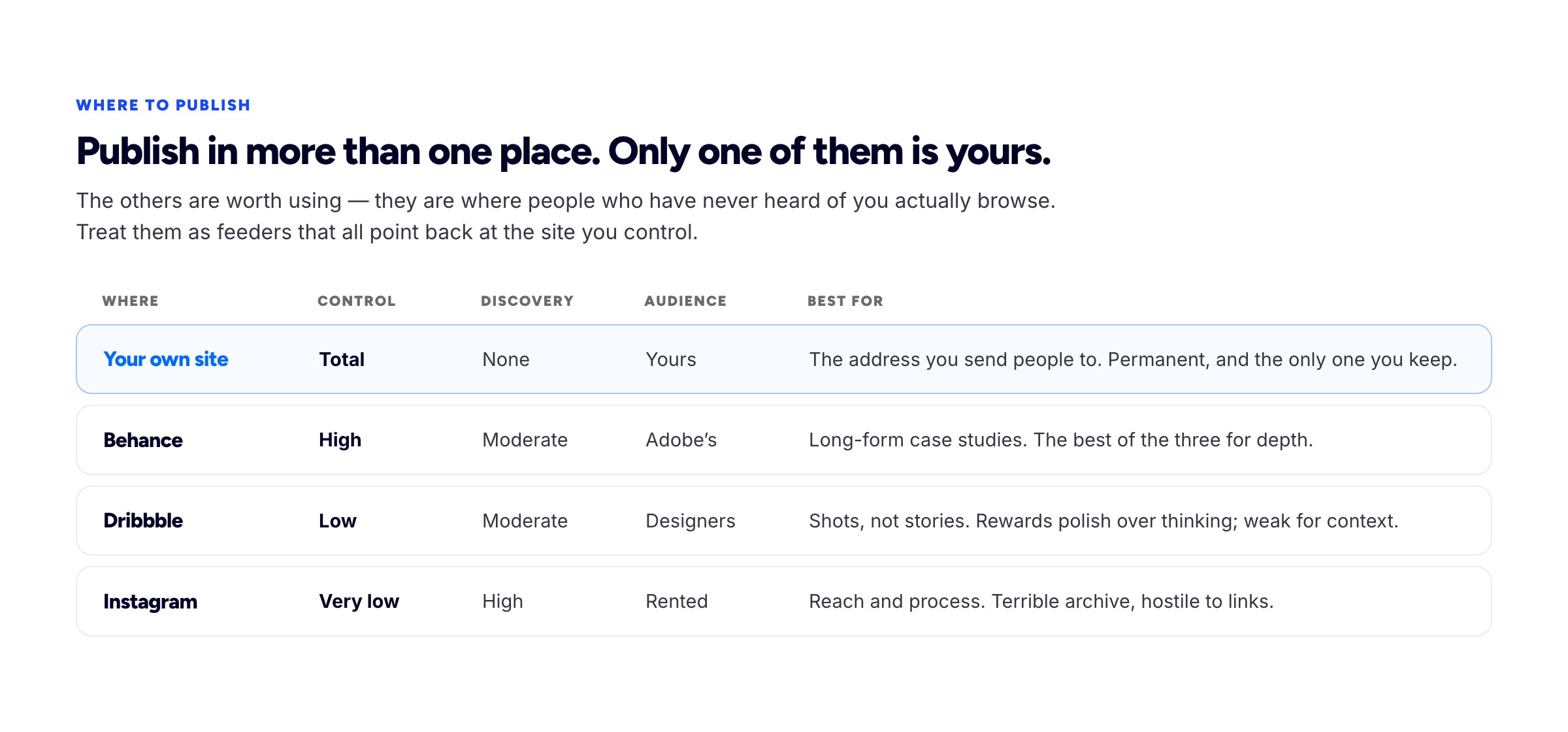
Publish in more than one place. Only one of them is yours.
Your own site gives you complete control of presentation and no discovery whatsoever. Nobody is browsing it. Its job is different: it is the address you send people to, the thing that ranks for your name, the place where the work is sequenced the way you want it read, and the only one of the four that will still exist in the form you left it in five years from now.
Behance is the strongest of the platforms for this kind of work, because its project format accommodates depth — multiple images, sequence, written context. It carries Adobe's audience and a real amount of browsing traffic. Presentation is constrained but not crippling. If you are going to maintain exactly one platform alongside your site, make it this one.
Dribbble rewards a single arresting frame. That makes it good for visibility and poor for demonstrating thinking — the format is a shot, not a story, and it structurally favours visual polish over the reasoning underneath it. Useful for reach and for being found by other designers. Weak as the only evidence that you can solve a brief.
Instagram has the broadest reach and the worst memory. It is genuinely good for process — timelapses, sketches, work in progress, the personality behind the studio — and genuinely terrible as an archive. There is no context, no ordering, no reliable way to link out, and a project you posted eighteen months ago is effectively gone.
The arrangement that works: your own site is home, the platforms are feeders, and every one of them links back. Post the shot on Dribbble and link the full project on your site. Publish the case study on Behance and put your domain in the profile. Show process on Instagram and keep the link in bio pointing at one place. You are borrowing their distribution without renting your identity from them.
Consistency of presentation is its own signal
Look at your projects as a set rather than individually, which is how a viewer encounters them. If one project is shot on white, another on a grey gradient and a third on a wooden desk, if one uses full-bleed images and another is inset with a border, if the captions are sometimes above and sometimes below — the set reads as scrappy even when every individual piece is strong.
Fix it with a template, not with taste applied repeatedly. Decide the aspect ratio, the background, the caption position, the number of images and the order they appear in, then apply it to every project. The uniformity is doing real work: when the frame is identical everywhere, the only variable left is the work, and differences between projects read as range rather than inconsistency.
This is also the cheapest way to make an under-filled portfolio look professional. Four projects presented identically look considered. Four projects presented four different ways look like everything you happened to have.
Being straight about AI in your workflow
Generative tools are in a lot of design workflows now — moodboarding, upscaling, background extension, texture generation, variations, cleanup. Clients are aware of this and increasingly ask, sometimes for commercial reasons rather than aesthetic ones, since usage rights on generated assets are still contested.
Our judgement is straightforward: disclose it where it is material, in a line, without drama. "Background extended with generative fill", "initial texture explorations generated, final artwork drawn". You do not need a policy page or a manifesto. What you need is for the question, when it comes up in a call, to have already been answered on the page.
The failure mode to avoid is a portfolio that is quietly mostly generated output presented as craft. It tends to be identifiable — in the hands, the type, the small details that generators still handle badly — and being caught costs you the whole page, not just the project. Whereas a designer who is explicit about which parts of the toolchain they use reads as current and unbothered, which is the better position.
When your best work is print, packaging or environmental
A screen is a poor medium for showing something whose entire quality is physical — the weight of the stock, the way a foil catches light, how a sign reads from twenty metres. Designers with strong print portfolios often present them worst, because they photograph the artwork rather than the object.
What helps, in rough order of impact:
- Photograph the real thing, properly. Diffuse daylight, plain surface, one or two angles, in focus. A competent phone photograph of a produced piece beats a flawless render of it every time, because it is evidence rather than a proposal.
- Give the viewer scale. A hand, a table edge, a person near the signage. Without a scale reference, a screen flattens a 3-metre banner and a 90-millimetre card into the same rectangle.
- Show it open, folded and closed. Sequence matters for anything with structure — a brochure, a box, a folded map. The unfolding is part of the design and it is invisible in a single flat shot.
- State the production specifications. Stock, weight, finish, print process, dimensions, run length. Two lines. This is the detail that tells another professional you have actually specified a job and talked to a printer, and it is invisible to everyone else — which is exactly the audience you want it to reach.
- Include one flat artwork view alongside the photographs, so the design itself can be read without the photography interpreting it.
If a piece was never produced, a good render is a legitimate substitute — labelled as unproduced. The dishonest version is a render presented as a photograph, which other designers can usually spot and will hold against everything else on the page.
A short audit before you send it anywhere
Open your portfolio on a phone, on mobile data, and answer each of these with a yes or a no.
- Can a stranger tell within five seconds what kind of design you do and who for?
- Does every project have at least one flat, honest view of the actual artefact?
- Is there at least one context shot of real work in the real world?
- Does any project show a before and after?
- Are all your projects presented in the same format — same ratio, same background, same caption position?
- Is every student, speculative or unproduced piece labelled as such in its first line?
- Does the page reach its main image in under 2.5 seconds on mobile data?
- Are any images over about a megabyte, or exported at more than twice their display size?
- Does every image have descriptive alt text and a meaningful filename?
- Do the colours look right in a browser, not just in your design tool?
- Does your site link out to your platform profiles, and do those profiles link back to your site?
- Is there a name, a face, a location and one obvious way to get in touch?
Most portfolios fail four or five of these, and almost all of the failures are an afternoon's work rather than a rebuild.
Frequently asked questions
How do I build a portfolio for graphic design if I am starting from scratch?
Decide the kind of design work you want, then make three to five self-initiated projects aimed squarely at it, each with a brief you wrote down, and label them as self-initiated. Add one small real job for a local business or community group as soon as you can and photograph it in use. Present each project with a context shot, a craft crop and a detail, publish it on your own site, and link to it from Behance and your résumé. Six strong, honest projects are enough to start applying.
How many projects should a graphic design portfolio have?
Six to ten pieces, with three or four opened up properly and the rest presented tightly. Fewer than four and it reads as thin; beyond about ten a viewer stops believing the set was edited, and editing is part of what you are demonstrating. Order matters more than count — put the project closest to the work you want next in the first position.
Behance or my own website — which one should I put effort into?
Both, with different jobs. Behance gives you discovery you cannot generate yourself and a format that handles long-form projects well. Your own site gives you control, permanence, a URL that ranks for your name and the ability to sequence the work. Publish to both, make your site the destination, and make sure every platform profile links back to it.
What should I include if I have no client work yet?
Self-initiated projects with briefs you wrote, clearly labelled as self-initiated, chosen to demonstrate the work you want to be hired for. Then find one real, small, unglamorous job — a local business, a community group, an event — and get it produced. One produced piece with a photograph of it in use is worth more than three speculative rebrands of well-known companies.
Do I still need a PDF portfolio?
Keep one for the situations that demand it — studio applications, agency procurement, anything going into an inbox rather than a browser. It should be the same work in the same order, under about 10 megabytes, with a link to your site on the first page. It is a delivery format, not your portfolio.
Can I show work the client rejected or never used?
Usually yes, and it is worth doing — check your contract for anything unusual first, and label it accurately. "One of three directions presented; the client chose another" is an honest caption that also shows you can generate genuine alternatives rather than one idea plus two straw men.
Should I put prices on my design portfolio?
Indicative ranges or starting points filter out enquiries that were never going to convert and cost you very little. Exact prices for bespoke work are harder to justify, because scope varies too much. If you have not settled on numbers yet, our guide to how much to charge as a freelancer works through how to arrive at them before you publish anything.
How we put this guide together
Bunfolio builds portfolio sites, so we spend a lot of time looking at what designers publish and where those pages fall down. The advice on presentation, mockups, labelling and platform strategy above is our judgement, formed from that vantage point and from the way visual work is reviewed in practice. Weigh it as judgement, not as findings.
The technical claims are the ones we have sourced. The performance thresholds — 2.5 seconds to largest contentful paint, 200 milliseconds to interaction, 0.1 layout shift — come from web.dev. The guidance on descriptive alt text, meaningful filenames and keyword stuffing comes from Google's image documentation. Everything on colour management follows from how browsers treat colour profiles, which is checkable rather than a matter of opinion.
There is a great deal of confident statistical writing about design portfolios — percentages of art directors who do this, seconds that recruiters spend doing that. We have not repeated any of it, because the numbers in circulation trace back to no identifiable study. Where we describe what viewers do, that is an opinion presented as one.
Related reading: the freelance portfolio website guide for the page structure, how to write a portfolio case study for the writing around the visuals, the portfolio SEO guide for image search and speed, and — for the neighbouring visual disciplines — the illustration portfolio and the fashion design portfolio.
More from the blog
September 2, 2026 · 29 min read
How to Build an Interior Design Portfolio
Three readers want different things from the same project. How to photograph a finished space, what before-and-after really requires, how much of the drawing package to show, and the credit line that...
September 30, 2026 · 16 min read
What Is Freelancing? A Plain-English Guide to Freelance Work
Freelancing is selling a skill to several clients one job at a time instead of working for one employer. How a freelancer differs from an employee, contractor or gig worker, one freelance job from enq...
September 25, 2026 · 15 min read
How to Start Freelancing With No Experience: Build Proof, Not Years
Clients do not hire years of experience; they hire evidence that you can do their job. How to pick a skill someone will pay for, manufacture honest proof, package it on one page with a first price, fi...