
September 22, 2026 · 16 min read
Graphic Designer Resume: Set It Like Type, Not a Template
A graphic designer resume is marked twice: once for what it says and once as a piece of design. Here is how to set one that impresses a design lead and still parses in an applicant tracking system — one file or two, skills without rating bars, bullets about briefs and results, and the portfolio link that carries the real weight.
A graphic designer resume is the only resume that gets marked twice. Once for what it says, like everybody else's, and once as a piece of design, because the person reading it hires designers for a living and cannot switch that part of their brain off. So the instinct is to design the thing hard: two columns, a coloured sidebar, a monogram, icons for phone and email, a row of bars showing you at 90% in Illustrator. And that is exactly the file most likely to arrive in an applicant tracking system as scrambled text, with your skills missing and your name glued to your postcode.
Most advice on this picks a side. Template sellers show you the decorated version; resume-format guides tell you to strip everything out and submit a Word file. Neither resolves the real tension: you need a document that reads as a design sample to a person and as clean text to a parser. This guide covers getting both, then the parts that matter more than layout — skills, bullets, junior versus senior versus freelance, and the one line that outweighs the rest of the page.
What a graphic designer resume is actually tested on
Ask designers who hire what they notice first and the answers are strikingly unglamorous: a clean layout, precise placement, tasteful type, a clear hierarchy. Nobody lists the sidebar colour. That is the key to the whole problem. A graphic designer resume is not a decoration opportunity; it is a typography test, set on the most boring brief imaginable, and the reader is checking whether you can pass it.
What they are really looking at:
- Hierarchy. Can a reader find your name, latest role and portfolio link at a glance? Three levels of emphasis is plenty, each distinguished by one variable rather than size, weight, colour and capitals at once.
- Consistency. Dates aligned the same way in every entry, the same gap after every heading, en dashes in date ranges. Nobody is hired for this, but its absence is the cheapest evidence of carelessness there is.
- Measure and spacing. Lines running the full width of the page at 10pt are too long to read. Margins should look generous, and leading should let bullets breathe.
- Restraint. One typeface, perhaps two. One accent colour, used for one job. Leaving things out is the skill being tested.
Seen that way, the conflict with the parser mostly disappears. Type, spacing, alignment and hierarchy survive text extraction perfectly well, because they live in how the text is set rather than in objects laid on top of it. What breaks parsing is decoration, and decoration was never what impressed anybody.
What breaks when a designed resume meets a parser
An applicant tracking system does not look at your resume. It pulls the text out, tries to sort that text into fields — name, contact details, employers, dates, skills — and shows a recruiter the result. Our guide to resume formats that survive an ATS covers the mechanics in full; for designers, five habits cause most of the damage.
- Two columns. Many extractors read left to right across the whole page, so a sidebar of skills gets interleaved line by line with your work history. "Senior Designer, Halden Studio" arrives as "Senior Designer, Halden Typography Studio Figma".
- Text boxes and frames. Anything in its own frame sits outside the main text flow and may be extracted out of order, or not at all — and layout software makes everything a frame by default.
- Outlined type and text in images. Convert your name to outlines so the kerning holds, or export the header as a PNG, and the parser receives no name. The W3C's definition of images of text — "text that has been rendered in a non-text form … in order to achieve a particular visual effect" — describes exactly what a parser cannot read.
- Icons instead of labels. To a parser the little envelope is nothing. Keep it if you like it, but not in place of a word.
- Skill bars and dots. Drawn shapes carry no text, so the rating vanishes. That loss is no loss, as we will see.
The test is cheap. Open your exported PDF, select all, copy, and paste into a plain text editor. That is roughly what a parser gets. If your name is missing, dates have drifted from employers, or skills are woven through your history, the file is broken however good it looks.
One file or two?
There are two defensible strategies, and the right one depends on how you are applying.
The single well-set file
For most people this is the answer. One column, real text throughout, headings a parser recognises ("Experience", "Education", "Skills"), the contact line in the body rather than the page header, and all the design effort spent on type, spacing and hierarchy. It impresses a design lead, parses cleanly, and you never have to remember which version went where.
It is less restrictive than it sounds. You can still have a strong typographic header, a well-chosen serif or grotesque, dates hung in a narrow margin as long as that margin is part of the same text flow, one accent colour and rules between sections. Most resumes designers admire look like this.
The designed file plus a parse-safe twin
Two files earn their keep when you have a layout that cannot survive extraction and genuinely says something about you — an editorial designer whose resume is set like a magazine spread, say. That version goes to humans: a direct email to a creative director, a follow-up after a referral, a copy at interview. A plain single-column twin with identical wording goes into every upload field.
The cost is drift. You update a date in one and forget the other. Write the text once in the plain file and flow it into the designed one, never the reverse.
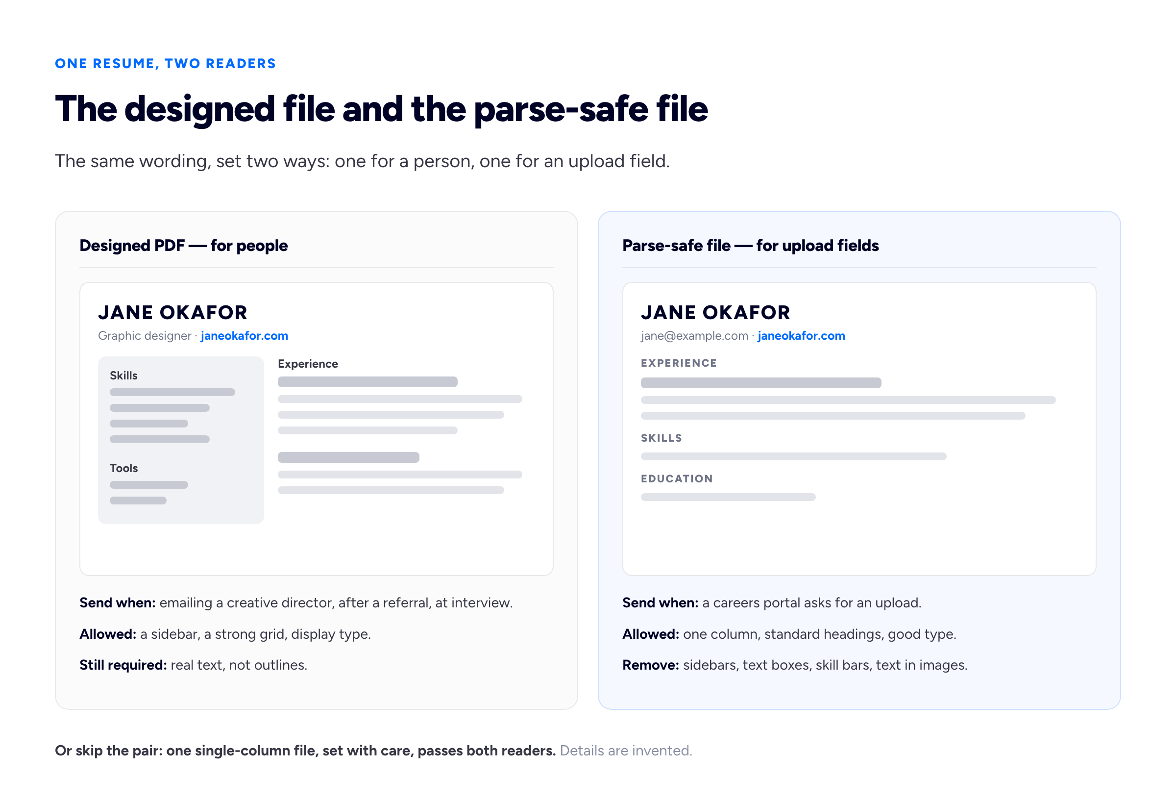
If you keep two files, the wording must match line for line.
Getting a layout-software file to parse
In InDesign, the Articles panel lets you put your frames in a deliberate sequence and use it as the reading order of a tagged PDF export; accessible-pdf.info's walkthrough shows the steps, and the result is also what a screen reader needs. It will not rescue outlined type or a parser that ignores tags, so run the paste test regardless. And never outline resume type in Illustrator: an outlined name is a drawing of a name.
Graphic designer resume skills that mean something
The skills section on most graphic designer resumes is a list of software with a bar next to each item. Both halves are weak.
The bars are meaningless. Illustrator at 90% — ninety per cent of what? The whole application? What your last studio needed? The number has no denominator, it is self-assessed, and Figma at 70% beside Photoshop at 95% volunteers a weakness no interviewer would have found. Our guide to the resume skills section covers the general case; for designers, the irony is that a skill bar is a data visualisation with no data, sent to people who know what a chart is for.
The software list is table stakes. O*NET, the US Department of Labor's occupational database, lists Adobe Creative Cloud, Figma, InDesign, HTML and CSS among the technologies in its graphic designers profile. The reader assumes the core suite. List it — a parser may look for "Figma" by name — but it is not the claim that gets you hired.
What works is a short list in three kinds:
- Applied competencies, the actual skills: brand identity systems, editorial layout, packaging and dielines, prepress, motion for social, design systems, art direction.
- Tools, named plainly without ratings, with context where it helps: "Figma — daily, component libraries and prototyping".
- Adjacent knowledge that suits this role: accessibility and colour contrast, HTML and CSS, briefing a printer.
Mirror the advert's wording where it is true, and never list a skill you would not want tested at interview — in design interviews, you often are.
Writing bullets about design outcomes, not software
This is where most graphic designer resumes are weakest, and it has nothing to do with layout. The typical bullet describes activity: "Designed social media graphics using Photoshop and Illustrator." It says you had a job with a computer in it, and nothing about the brief, the difficulty, or whether it worked.
A stronger bullet has three parts, familiar from any design crit:
- The brief. What was asked for, by whom, at what scale. A rebrand for a 40-branch bakery chain is a different job from a logo for a friend's bakery.
- The constraint. A fixed print budget, a three-week deadline, a brand you could not break, eight languages on one pack. Constraints are where judgement shows.
- The result. Not necessarily a percentage. "Adopted across all 40 branches", "still in use three years later", "approved at first presentation" are results, and checkable ones.
Two of the three, stated specifically, beats all three stated vaguely. And never invent a number: if you do not know engagement rose, say what you do know — it shipped, it was used, it replaced something.
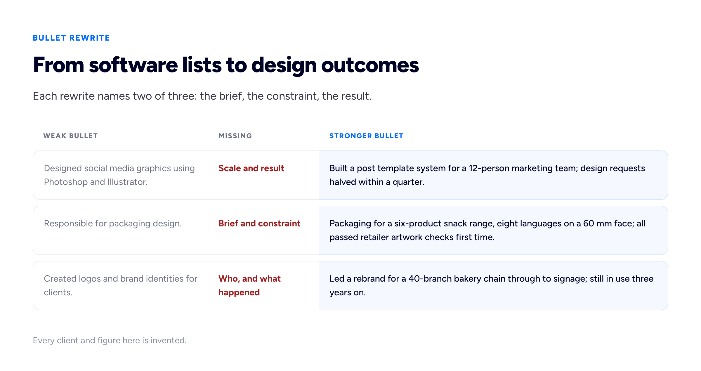
Each rewrite gives an interviewer something real to ask about.
Junior, senior and freelance graphic designer resumes are different documents
The same template cannot serve all three, because each reader is asking a different question.
Junior graphic designer resume
A junior graphic designer resume is read for potential and for proof you can finish things. Coursework, self-initiated projects, internships and student-society work are real work: name the brief and the constraint even when the client was a tutor. "Identity for a student-run film festival: poster, programme and social, printed two-colour on a £300 budget" is a proper bullet.
Put education higher than you will later, with the degree show or any competition entry. The US Bureau of Labor Statistics says graphic designers usually need a bachelor's degree in the field — so most of your competition has one too, and the degree gets you considered rather than chosen. Keep it to one page; as our guide on how long a resume should be argues, length follows content, and at junior level there is not enough to fill two honestly.
Senior graphic designer resume
A senior graphic designer resume is read for judgement. The reader wants what you decided, not what you made: systems you set up, juniors you brought on, stakeholders you persuaded, a wrong brief you reframed. Verbs shift towards "led", "defined" and "briefed" — only where true, because an inflated title is the easiest thing to check in a reference call.
Cut early career hard: a role from twelve years ago earns one line. Two pages is fine if the second is doing work. And the tool list should shrink, not grow; at senior level a long one reads as someone still selling execution.
Freelance graphic designer resume
Ten clients over four years look chaotic as ten separate jobs. Usually the answer is one consolidated entry — "Freelance Graphic Designer, 2022 – present" — with a line summarising the practice, three or four bullets on the strongest engagements, and a line of selected clients. Our guide to putting freelance work on a resume covers breaking out long contracts, NDA work and the gap problem.
The Bureau of Labor Statistics puts about one in five graphic designers as self-employed, so a design lead will not read freelance history as a warning sign. They will notice if it is a list of logos with no sense of scale.
The portfolio link is the real payload
For a graphic designer, the resume is not the argument. It is the covering note for the argument. The Bureau of Labor Statistics says candidates "should have a portfolio that demonstrates their creativity and originality", and every design lead reading your resume is, within the first minute, looking for a way to see the work. So the link must be impossible to miss and impossible to break:
- At the top, in the body text, beside your email — not in the page header layer, a sidebar or an icon.
- Typed as well as linked. Write
janeokafor.comvisibly, so the reader can type it if the hyperlink dies on export or paper. - An address you control, not a shortener, so the resume sent in March still works when forwarded in November.
- Pointing at relevant work. For a packaging role, a second link beside your packaging bullet beats a home page of twelve thumbnails.
The tracking systems expect it too. Greenhouse's article on supported upload formats accepts doc, docx, pdf, rtf and txt, and says portfolios should be hosted elsewhere and shared as a link.
Placement and dead PDF links are covered in putting a portfolio link on your resume; what the reader should find when they arrive is in the graphic design portfolio guide. If you have no site yet, Bunfolio gives every account a free portfolio on its own subdomain — a fixed address to print on every version.
Graphic designer resume PDF: format and export
Send a PDF unless the application asks otherwise. A Word file opened without your fonts substitutes them and wrecks the typography you are being judged on. If an upload field wants DOC or DOCX, send the plain twin rather than forcing the designed layout into Word. Three export details catch designers out:
- Embedded fonts. Licences differ on whether a face may be embedded in a PDF, so check the one for the face you chose.
- File size. A text document needs a few hundred kilobytes, not 20MB of embedded imagery — the size itself says something about how you prepare files.
- Export, do not print. "Print to PDF" often drops hyperlinks. Use the export command, then click the link in a separate viewer.
If you want those defaults done for you, our free resume builder produces a single-column PDF with real text, standard headings and the URL typed and linked — a sound parse-safe twin beside a designed version. Its PDF carries a small "Created with Bunfolio" credit in the footer, better said here than discovered on export.
Before sending, print one page in black and white: if the hierarchy collapses without your accent colour, it was never hierarchy.
Frequently asked questions
Should a graphic designer resume be creative?
It should be well designed, which is not the same thing. Readers who hire designers judge typography, hierarchy, spacing and consistency far more than decoration. A single-column layout set with care usually impresses more than an elaborate template, and it also survives applicant tracking systems. Save the ambitious layout for a version you send directly to a person.
Do skill bars and ratings help on a graphic designer resume?
No. A bar at 90% has no scale, is self-assessed, and invites the reader to ask about the missing 10%. It is also a drawn shape, so a parser discards the rating entirely. Name the tool plainly, add context such as how often and for what, and let your portfolio show the level.
What skills should I put on a graphic designer resume?
A short list of applied competencies — brand identity, editorial layout, packaging, prepress, motion, design systems — plus the tools you use regularly, named without ratings, plus anything adjacent that suits the role, such as accessibility or HTML and CSS. Mirror the job advert's wording where it is true.
Is PDF the best format for a graphic designer resume?
Usually. A PDF exported from your layout or word-processing software keeps your typography intact and contains a real text layer that parsers can read. Send a Word file only when the application asks for one, and never send a PDF that is just an image of your resume.
Should a freelance graphic designer list every client?
No. Group the work under one freelance entry with a date range, describe the three or four strongest engagements in bullets, and add a short line of selected clients. Break out a long contract as a separate entry only if it genuinely read as a full-time role.
Do I need a portfolio if I have a good resume?
Yes. For design roles the resume mainly gets the reader to the portfolio, and hiring designers expect to see the work before shortlisting. Put a short, typed and linked portfolio URL at the top of the resume, and point it at the work most relevant to the role.
How we put this guide together
Bunfolio hosts portfolio sites and runs a free resume builder, so we spend a lot of time on the handover between a resume and the work it points at. The recommendations here are our own judgement, and should be weighed as such: the framing of the resume as a typography test, the preference for one well-set single-column file over a designed-plus-plain pair, the brief-constraint-result shape for bullets, the claim that most of what impresses a design lead survives text extraction, and the differences we draw between junior, senior and freelance versions. What design leads say they notice first reflects what practitioners repeatedly say in public discussion of design resumes; it is a common view, not a measured finding.
We have cited no figures about recruiters or tracking software. The usual two — that three quarters of resumes are rejected by an ATS unread, and that a recruiter spends six or seven seconds on each — trace to vendor marketing and a small commercial eye-tracking study, so they are left out. We also found no reliable figure for how often multi-column resumes fail to parse, only resume-software vendors' own claims, so we describe the mechanism instead.
Where the guide states a fact, it points at a source we read while writing. The degree expectation, the portfolio requirement and the share of self-employed graphic designers are from the US Bureau of Labor Statistics' Occupational Outlook Handbook entry for graphic designers. The technologies associated with the role are from O*NET OnLine's graphic designers profile. Upload formats and the advice to share portfolios as links are from Greenhouse's support article on supported formats for candidate uploads; other tracking systems behave differently, and we have not tested any vendor's parser. The definition of images of text is the W3C's WCAG 2.2 Understanding document. InDesign's Articles panel reading order is described in accessible-pdf.info's guide; Adobe's own help pages refused our automated requests, and menu labels vary between versions, so check yours. The labour-market sources are American; the technical behaviour applies anywhere.
Every name, client, figure and outcome used as an example above is invented for illustration, including everything in both diagrams: Jane Okafor, Halden Studio, the bakery chain, the snack range and the student film festival refer to no real person, business or project.
Related reading: ATS-safe resume formats for the full parsing picture, writing a resume skills section for what to claim and how, where to put your portfolio link for the line that matters most, and the graphic design portfolio guide for what the reader should find when they click it.
More from the blog
November 1, 2026 · 19 min read
Cover Letter vs Resume: What Goes in Each, and When You Need Both
The resume is the record; the cover letter is the argument for this role. What belongs in each and what must never be repeated, when a letter is really needed, how the two should point at each other,...
October 28, 2026 · 19 min read
References on a Resume: Should You List Them, and How?
Usually not on the resume itself, and never "available on request". When references do belong on the application, how to choose referees who will actually help, how to ask and brief them, the referenc...
October 16, 2026 · 16 min read
CV vs Resume: The Difference and Which One to Send
In the US a CV is an academic record and a resume is the short document; in the UK and most of the world, "CV" is the name for that short document.