
September 24, 2026 · 18 min read · Updated October 5, 2026
Brand Designer Portfolio: Show the System, Not Just the Logo
Most brand designer portfolios are one logo on six mockups, which answers none of the questions a client is actually asking. Here is how to structure an identity case study that shows the whole system, label concepts honestly, credit team work, and handle requests for a PDF deck.
A brand designer portfolio is a small set of identity case studies, usually three to five, each showing the brief, the strategy, the routes you explored and rejected, and the finished system of logo, type, colour and rules in real use. It has to prove you can build an identity that holds together when other people apply it, not only that you can draw a good mark.
Most brand designer portfolios are made of the same page, repeated. A logo, centred on a flat colour. Then the logo on a business card at a jaunty angle, on a tote bag, on a shop sign that does not exist, on a phone held by a hand from a stock library. Six mockups, one mark, no words. It looks polished, and it answers almost none of the questions the person reading it actually has — because whoever is hiring a brand designer is not buying a logo. They are buying a system that will still hold together when somebody else uses it in eighteen months without asking you.
This guide covers the mechanics of a brand designer portfolio that proves that: structuring one identity project, showing the system rather than the mark, labelling concepts honestly, crediting team work, how many projects to include, and what to send when someone asks for a PDF. General presentation — image quality, flat crops, when mockups help — is in our graphic design portfolio guide, and is not repeated here.
What a brand designer portfolio actually has to prove
There are three kinds of people reading your work, and each is testing something different.
- A founder or marketing lead hiring directly wants evidence that you understood a business like theirs and turned that understanding into something they could use. Nervous about paying for something subjective, they look for reasoning they can follow.
- A studio creative director wants to see how you think before the mark exists, and whether you can document a system other designers can pick up.
- An in-house brand manager wants proof that your identities survive real applications: a cramped app icon, a slide template, a form nobody wanted to design.
All three share one question the mockup page cannot answer: would this identity still work if you were not there? A logo is one decision. An identity is a set of decisions plus the rules that let other people make the next hundred without breaking it. Your portfolio has to show both.
Why the logo-on-a-mockup page fails
The mockup page is not dishonest, exactly. It is evidence of the wrong thing: that you can place a vector file into a template, at one size, in one colour, on surfaces chosen to flatter it. What it hides is everything a buyer is worried about.
It hides the brief, so the reader cannot judge whether the mark is right, only whether it is pleasant. It hides the alternatives, so nobody can tell whether this was the best of twelve routes or the only one you had. It hides the system, where most of the hours in an identity job go. And it hides the awkward applications, the ones that decide whether an identity survives: the favicon at sixteen pixels, the one-colour fax-quality version on an invoice, the social avatar cropped to a circle.
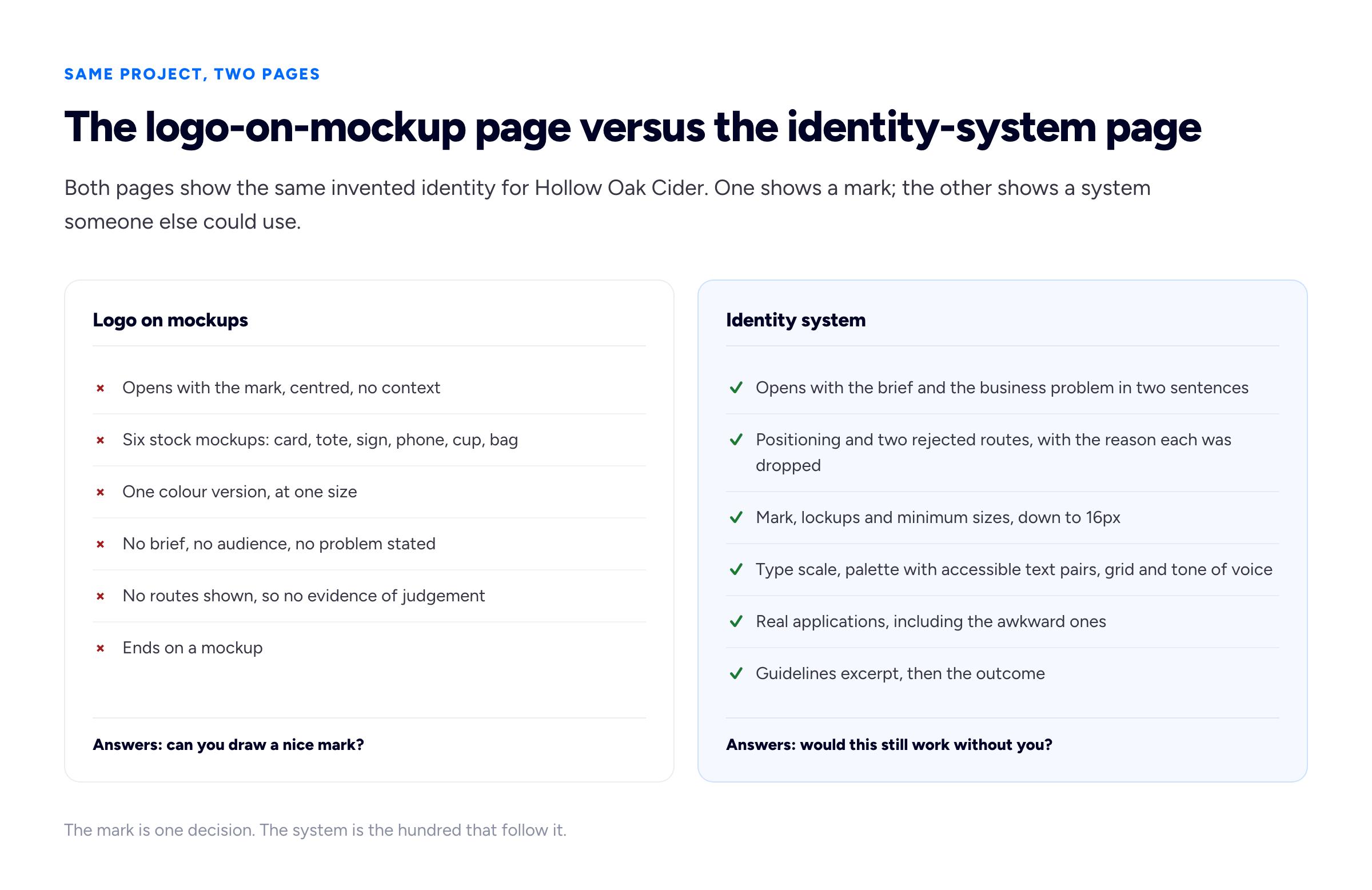
The left page is quicker to make. The right page is the one that gets the call, because it answers the question a buyer is actually nervous about.
How to structure one identity case study
An identity case study works best in the order the project happened, because that order is the argument: what we knew, what we decided, what we built, what it did. Our general guide to writing a portfolio case study covers the skeleton for any discipline. For brand work, seven parts earn their place.
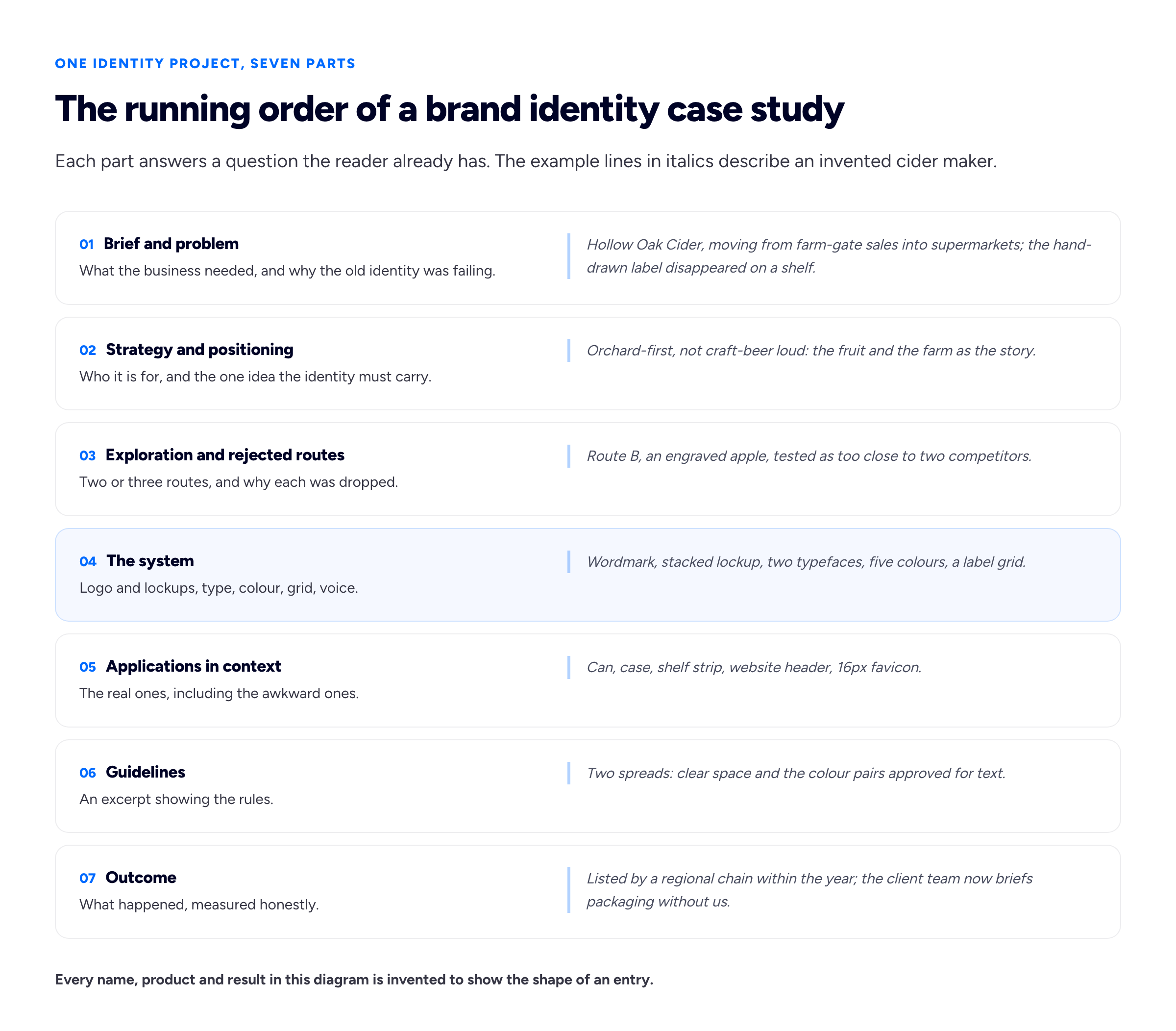
Seven parts, but not seven equal parts. Sections 03 and 04 carry most of the images; sections 01, 02 and 07 are often two sentences each.
01 — The brief and the problem
Two or three sentences: who the client is, what changed in their business, and why the existing identity could not cope. "A cider maker moving into supermarket chillers; the hand-drawn label was invisible from two metres" beats a paragraph about heritage. If there was no previous identity, say what the business needed to be able to do that it could not do yet.
02 — Strategy and positioning
This is where brand designers separate themselves from logo designers, and where most portfolios go quiet. Show the thinking that happened before drawing: the audience, the competitors you mapped, the one idea the identity had to carry. One competitor grid — rivals' packs side by side, with a line on the gap — beats a page of strategy prose. If the positioning came from the client or an agency strategist rather than from you, say so; you can still show how you translated it.
03 — Exploration and rejected routes
Show two or three routes you presented, and give one line each on why they were dropped. This is the most persuasive section in a brand case study, and the one most often omitted out of a sense that unused work looks like failure. It is the opposite. One route gives the reader nothing to measure your judgement against; three routes and a reason prove you chose for the brief rather than your taste.
Keep it edited: pages of sketchbook thumbnails are process theatre.
04 — The system
The core of the page, covered in the next section.
05 — Applications in context
Real applications, photographed where possible, plus the awkward ones on purpose. A packaging shot proves you can design packaging. The favicon, the email signature, the one-colour version on a delivery note and the social avatar prove the system scales down, which is what an in-house manager is checking.
06 — Guidelines
Show two or three spreads from the brand guidelines, not the whole document. Clear space and minimum size, the approved colour pairings, one "do and don't" page. It is the clearest answer to "would this work without you?"
07 — The outcome
What happened after launch, stated honestly. Commercial figures are rare; plenty of useful outcomes are not numbers. The client's team briefing new packaging without you, a new product launched inside the system with no redesign, a stockist won. If the identity has only just launched, say that, and describe what the client is doing with it.
Show the system, not the mark
The single change that most improves a brand designer portfolio is giving the system the space the mark usually gets. Break it into parts a reader can check.
- The mark and its variants. Primary logo, stacked and horizontal lockups, the symbol on its own if there is one, and the one-colour and reversed versions. State the minimum size and show the mark at it. A mark that has been redrawn to hold at sixteen pixels deserves a sentence saying so.
- Typography. The typefaces, why they were chosen, and a type scale shown in use — a headline, a subhead, body copy and a caption on one real page, not a specimen reading "Aa".
- Colour. The palette with its values, and the proportions in which it is used. Then the pairings approved for text, because this is where many identities quietly fail. The W3C's contrast criterion, WCAG 2.2 success criterion 1.4.3, sets a minimum contrast ratio of 4.5:1 for normal text and explicitly exempts logotypes — text that is part of a logo or brand name. So your mark can be pale coral on cream; body text cannot. Showing which pairs are approved for text signals a palette designed to be used, not admired.
- Grid and layout logic. The rule behind the layouts: a label grid, a poster system, a social template structure. One diagram and two applications that obey it.
- Tone of voice. If the system has voice principles, show one before-and-after sentence and credit the writer.
A useful test: could a competent designer who has never met the client produce a new application from what is on your page? If yes, you have shown a system. If they would have to guess the type sizes and which colours go together, you have shown a logo with accessories.
Concepts that were never adopted, spec work and self-initiated rebrands
Brand designers have more unbuilt work than most: rejected routes, lost pitches, competition entries, student briefs, unofficial redesigns of famous brands. Some of it is worth showing. All of it needs a label, because a reader must never assume a client adopted something they did not. One line at the top, visible before the images, does it.
- Unused route for a real client — "Presented to the client as route B; not chosen." Only with the client's permission, and ideally shown inside the case study for the adopted identity rather than as its own project.
- Lost pitch — "Pitch concept, not adopted." Check who owns the work before publishing it; some pitch agreements say.
- Self-initiated rebrand of a real company — "Self-initiated concept. Not commissioned by, or affiliated with, [company]." Keep their name out of the project title if you can, so it never reads as client work in a search result or a thumbnail grid.
- Student or course brief — "Course project, [institution], [year]." Include the brief you were set.
- Fictional brand — "Fictional brand created for this portfolio." Then treat it with the full seven-part structure, including an invented brief you wrote for yourself.
On spec work specifically: the professional body AIGA has long opposed design competitions and pitch processes that ask designers to produce concepts unpaid. The letter template it publishes for members to send to clients argues that speculative processes "result in a superficial assessment of the project" and suggests clients instead ask designers to submit "examples of their work from previous assignments as well as a statement of how they would approach your project". That is a fair description of what your portfolio is for — and a portfolio full of competition entries can signal that you work on spec. Keep one if it is genuinely strong, and label it.
If you have no client work at all, self-initiated projects are a legitimate way to start, and our guide to a portfolio with no experience covers writing yourself a real brief. The strongest are not rebrands of global companies, which invite comparison with the real agency's work, but identities for small, plausible businesses with a specific problem.
Agency work, team credit and NDAs
Much of the best brand work is made inside agencies and studios, by teams. Two separate questions follow, and it helps not to confuse them: whether you may show the work, and how you should credit it.
Showing the work
The designer often does not own the copyright. In the UK, section 11 of the Copyright, Designs and Patents Act 1988 makes the employer the first owner of an artistic work made by an employee in the course of employment, subject to any agreement to the contrary. In the US, the Copyright Office's Circular 30 on works made for hire explains that when a work is made for hire — including one created by an employee as part of their regular duties — the hiring party is considered both the author and the copyright owner. Freelance contracts usually assign rights to the client too. Many permit portfolio use after launch, but that is permission rather than a right, so check your contract or ask. None of this is legal advice.
Never show an identity before it has launched, however good it is, and never show internal strategy documents, research findings or pricing even when the visual work is public. Our guide to showing NDA and confidential work covers anonymising a client and writing a redacted case study in detail.
Crediting the work
A single credit line under the project title solves most of it:
- "Designed at [Studio] for [Client]. Creative director: [Name]. My role: lead designer on the wordmark, type system and packaging."
- "Strategy by [Agency]. Identity design and guidelines by me, as a freelancer."
- "Team of four. I led route exploration and built the guidelines."
Be specific about your part. "Worked on the rebrand" invites the question the reader is too polite to ask. Brand design is a small world, and the creative director reading may know exactly who drew the mark. Precise, modest credit makes the parts you did do more believable.
How many projects a brand designer portfolio needs
Three to five deep identity case studies, in most cases. Brand work is slow to present properly — each project needs the seven-part treatment to be persuasive — and a reader who spends their attention on three full systems learns more than one who scrolls past twelve marks. Our guide to how many projects a portfolio needs makes the general case; for brand designers the argument is stronger, because breadth is exactly what the mockup-grid portfolio already fakes.
Order them deliberately. The first slot goes to the project closest to the work you want next — if you want packaging clients, lead with packaging. The first project should be a real, launched identity if you have one. Labelled concepts belong after client work, never first.
Below the case studies, a compact "selected marks" grid of smaller jobs, each labelled with client and year, shows range without pretending each is a full identity.
The thumbnail that represents each project on the index page is a decision in its own right. For a system, a strong application shot or a tight crop of the guidelines usually beats the bare mark on a flat colour, which makes every project look alike. Our post on portfolio thumbnails covers cropping for the grid.
A PDF credentials deck or a portfolio website?
Brand designers get asked for a PDF more than most freelancers do. Procurement teams, agencies filling a freelance roster and larger clients running a pitch process often request a "credentials deck" or "portfolio PDF" rather than a link. You need both, and they do different jobs.
The website is the version you control, that search engines and strangers can reach, and that holds the full case studies.
The PDF is a selection made for one reader. Keep it short — a cover, a two-line introduction, three or four projects condensed to two or three pages each, a page on how you work, and contact details — and tailor the order to the brief you are responding to. A few practical rules:
- Watch the file size. Full-resolution exports are easily too big to email. Gmail, for example, states that the attachment limit for personal accounts is 25 MB, and workplace accounts have limits set by the organisation's administrator, which can be lower. Export at screen resolution and check the size before sending.
- Put your website on every page, in the footer, typed out as text as well as linked, so a printed or forwarded copy still leads back to the full work.
- Name the file properly —
yourname-brand-design-portfolio-2026.pdf, notPortfolio_final_v3.pdf. - Keep confidential work out unless you have explicit permission for it. A PDF is designed to be forwarded, and you do not control where it goes.
A brand designer portfolio PDF is simply the seven-part case study with fewer images: one each for the brief, the chosen route and the system, and two applications.
Reading brand identity portfolio examples, and where to publish
Search results for brand designer portfolio examples are mostly galleries. Browse them with a checklist rather than for inspiration: can I find the brief within ten seconds? Are any unchosen routes shown? Can I see the type and colour rules, or only the mark? Is there an awkward, real application? Is the designer's role stated? The portfolios you remember tend to pass; many beautiful ones do not. The same questions make a serviceable branding portfolio template for your own project pages.
Behance suits long, image-led identity projects and is good for discovery; our comparison of Behance and Dribbble versus a portfolio website explains why the decision to hire usually happens on your own site. If you want somewhere to put the case studies without first designing a site, Bunfolio gives you a free portfolio website on your own subdomain from a sign-in and a form, so the identity work rather than the frame is what people look at. A résumé to send alongside it can come from the free resume builder, no account needed.
Judging recognised logo work across industries
If you are studying acclaimed identities to calibrate your own, or a client has asked you to show logo work across several sectors, two public sources are worth more than a general gallery. The D&AD Awards archive is free to browse and can be filtered by year and category, including its branding and identity categories, so you see work a jury has already judged. Brand New, from UnderConsideration, publishes written reviews of new logos and identities across sectors, often with the before and after side by side, which is useful precisely because it explains why a piece works or does not.
Excellent logo work looks different from one industry to the next, so judge it against its own context rather than against the logo next to it in a gallery:
- Read it among its competitors. A mark is distinctive only relative to its category. A navy serif wordmark is invisible in banking and loud in children's toys. Ask what the other five brands in that sector look like.
- Check it at its hardest size and surface. For an app or software company that is a favicon and an app icon; for a food brand, a crowded supermarket shelf; for transport, a vehicle seen at a distance; for a hospital, wayfinding signs read by stressed people. Good work survives the toughest real use, not the mockup.
- Look for the rules, not only the mark. Regulated and large organisations (finance, healthcare, public services) need identities that many people can apply without the designer present, so the strongest examples in those sectors show type, colour and layout rules. In hospitality and consumer goods, the strongest examples tend to show range: menus, packaging and signage that feel related without being identical.
- Ask what changed. For a rebrand, the useful question is what problem the old identity had and whether the new one solves it, which is why written reviews teach more than image galleries.
The same habits make your own portfolio stronger: when you show work from several industries, say in one line what that sector demanded and show the application that proves the identity met it.
Frequently asked questions
What should a brand designer portfolio include?
Three to five full identity projects, each showing the brief, the positioning, the routes you explored, the system (mark, type, colour, grid and voice), real applications, an excerpt of the guidelines and the outcome. Add a short about section, services and contact details.
Where can I see recognised examples of excellent logo and identity work?
The D&AD Awards archive lets you browse jury-awarded branding and identity work by year and category, free of charge, and UnderConsideration's Brand New reviews new logos and identities from many industries with written commentary. Use them to study how strong identities handle their sector's hardest applications, not as templates to copy.
Should I only show logos in a branding portfolio?
No. A logo is one decision; clients and studios hiring a brand designer want to see the whole system and the reasoning behind it. Show full branding projects rather than isolated marks, and make sure each project demonstrates how the identity works in use, including small and one-colour applications.
Can I include rebrands of famous companies I made myself?
Yes, if they are labelled clearly as self-initiated and unaffiliated, visibly and before the images. They are usually weaker evidence than an identity for a small, plausible business.
Do brand designers need a PDF portfolio?
Usually, yes, alongside a website. Agencies, procurement teams and larger clients often ask for a credentials deck. Keep it short, tailored, emailable, with your website on every page.
How do I show agency work I did as part of a team?
Check whether your employer or contract permits portfolio use, show only launched work, and add a credit line naming the studio, the creative director and your specific role.
How we put this guide together
The recommendations here are our own judgement rather than an industry standard: the seven-part running order, the three-to-five project range, the advice to show rejected routes and awkward applications, the labelling wording for concepts, and the split between a website and a short PDF deck. Weigh them as opinions with reasons attached. The pages currently ranking for this topic are mostly galleries of examples, so we wrote about the structure of a single project instead.
We have deliberately cited no statistics. There are widely repeated figures about how many seconds a creative director spends on a portfolio and what share of clients hire from one; we could not trace any of them to a published method, so they are left out rather than repeated.
Where the guide states a fact, it points at a primary source we read: the W3C's Understanding SC 1.4.3 Contrast (Minimum) for the 4.5:1 ratio and the logotype exemption; section 11 of the Copyright, Designs and Patents Act 1988 for employer ownership in the UK; the US Copyright Office's Circular 30 for works made for hire; AIGA's letter template on spec work for the quoted lines; and Google's Gmail help page on attachments for the 25 MB limit. For recognised logo work, the D&AD Awards archive and UnderConsideration's Brand New are described from their own pages; the points about judging a logo against its industry are our own. Copyright and contract rules vary by country and by agreement, and nothing here is legal advice.
Hollow Oak Cider, its products, its routes and its outcome — in the text and in both diagrams — are invented for illustration, as are the credit-line examples. They describe no real business, studio or designer.
Related reading: the graphic design portfolio guide, how to write a portfolio case study, showing NDA and confidential work and how many projects a portfolio needs.
More from the blog
September 22, 2026 · 16 min read
Graphic Designer Resume: Set It Like Type, Not a Template
A graphic designer resume is marked twice: once for what it says and once as a piece of design. Here is how to set one that impresses a design lead and still parses in an applicant tracking system — o...
September 8, 2026 · 18 min read
Event Planner Portfolio: How to Show the Work Nobody Sees
A good corporate event leaves almost nothing behind, which makes it hard to prove you ran it. Here is how to build an event planner portfolio from scale lines, rebuilt run-of-show pages, post-event fi...
September 6, 2026 · 18 min read
Wedding Planner Portfolio: How to Show the Work Nobody Photographs
A wedding planner's portfolio is usually other people's photographs of other people's flowers, and couples cannot see the planning in it. How to show logistics, credit suppliers properly, start with s...