
September 5, 2026 · 16 min read
The Illustration Portfolio: Show One Market, Not Your Range
An art director opens your portfolio with a brief already in their head, looking for a prediction rather than an appreciation. Why showing range costs commissions, how the first three images decide it, what a children's book portfolio needs, and the one-line caption that beats three more pieces.
An illustration portfolio is not a gallery. Nobody is browsing it for pleasure. An art director opens it with a brief already in their head — a feature about interest rates that needs an image by Thursday, a middle-grade cover about a boy and a whale, a campaign that has to work at billboard scale and on a phone — and they are looking for one thing: evidence that you will solve this specific problem, in a style I can brief, by the date I need it.
That is a prediction, not an appreciation. Which means your portfolio is not judged on whether the pictures are good. It is judged on whether it lets someone forecast what you will do for them. Most portfolios that get admired and never commissioned fail at exactly this point, and they fail in the same way: they show range.
This guide covers the edit that fixes it, how many pieces to show and what the first three have to do, why the children's book market wants a completely different portfolio from the editorial market, how to caption work so an art director can read it in one line, what to do about personal work, and why your own URL still matters when your following lives on Instagram. If you arrived here looking for how to build a portfolio document in Adobe Illustrator, this is not that post — this is about the body of work, not the software.
The range trap
Every illustrator is told to show range, and range is what kills commissions. Consider what actually happens on the other side. An art director has a brief and a budget. They have to convince a colleague that the person they picked will deliver. They are not buying an artist; they are buying a fairly narrow prediction about one image.
A portfolio that shows six styles gives them nothing to predict with. It says "I can do many things", and the reader hears "I do not know what I will send you". A portfolio with one consistent visual voice across twelve pieces says "commission me and this is what arrives", which is the only sentence that gets a job.
This is uncomfortable if you genuinely work in several modes, so be precise about the rule. It is not that you must only ever draw one way. It is that one portfolio shows one market. If you do sharp conceptual editorial work and warm children's picture-book work, those are two portfolios with two links, and you send the one that matches. Showing them mixed together halves both.
The related question — should you specialise at all — is the same argument at a career level, and we made it at length in should freelancers niche down.
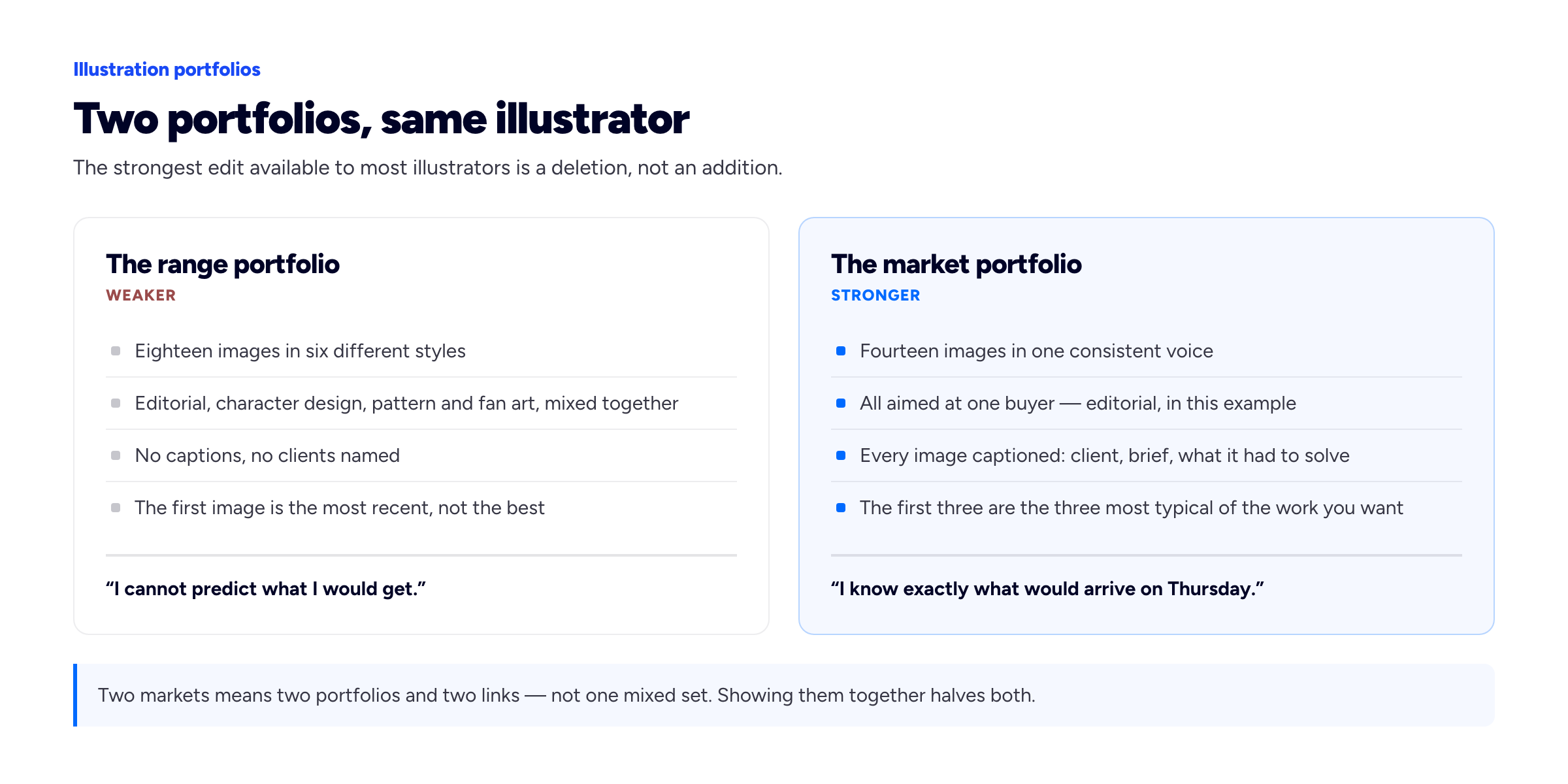
The strongest edit available to most illustrators is a deletion, not an addition.
Twelve to eighteen images, and the first three decide it
Somewhere between twelve and eighteen finished pieces is right for a single market. Below about ten it reads as thin; above about twenty you are relying on the reader to find the good ones, and they will not.
Order matters more than most illustrators think, because a portfolio is not read evenly. The first three images do nearly all the work, and they should not be your three most recent, or your three most unusual. They should be the three most typical of the work you want more of. Put the piece you are proudest of but never want to repeat somewhere in the middle, or take it out. It is easier to judge once you can see what that running order looks like on a page rather than in a folder.
The test is blunt: if a reader saw only the first three and stopped, would they commission you for the right thing? If the answer is "they would probably ask me for something I do not enjoy", reorder.
The wider question of how many projects a portfolio site should carry, and why more is usually worse, is covered in how many projects your portfolio website should have.
Four buyers, four portfolios
"Illustration" is at least four separate businesses with different processes, fee structures and expectations:
- Editorial. Newspapers, magazines, online publications. Fast turnarounds, conceptual demands, smaller fees, high volume. The portfolio needs to show that you can carry an idea — a metaphor that lands without a caption — and that you can do it against a deadline measured in days.
- Publishing. Book covers and interiors, from children's picture books to adult fiction. Long lead times, character and atmosphere over concept, and a much stronger interest in whether you can sustain a world across many images.
- Advertising and brand. Agency process, several rounds, larger fees, tighter usage terms. Buyers here want evidence you can work inside a brand's existing system and survive committee feedback without the work collapsing.
- Licensing and surface. Greetings cards, homeware, textiles, stationery. This one is genuinely different in kind: the buyer needs to see repeat patterns, coordinating collections and colourways rather than one-off images, and they are buying a range that fits a season.
You do not have to choose forever. You do have to choose per link. A portfolio that tries to be all four ends up being a good fit for none, which is the range trap again in a costume.
Children's book illustration is a different portfolio
This is the sub-market where generic portfolio advice does the most damage, because publishers and agents are looking for skills that a set of beautiful single images cannot demonstrate at all.
What a children's publisher or agent needs to see:
- Character consistency. The same character, drawn repeatedly, from different angles, at different distances, in different emotional states. A character sheet does this explicitly and it is the fastest way to prove you can carry a thirty-two page book. One gorgeous drawing of a fox proves nothing about your ability to draw that same fox two hundred times.
- Sequential storytelling. At least one sequence of three to five images that moves a narrative along. Publishers are buying pacing, not pictures.
- Full spreads, not squares. Work laid out to a real page shape, aware of the gutter, with space where type would go. An illustrator who leaves nowhere for the words has not thought about the object.
- A dummy. A rough mock-up of a whole book — thumbnails throughout, two or three spreads to finish. This is the single most requested item and the one most portfolios lack.
- A clear age category. Board book, picture book, chapter book and middle grade are different products with different visual conventions. Show which one you are for.
Publishing has its own etiquette on submissions and its own calendar, and the Society of Children's Book Writers and Illustrators is the standard place to read the current version of it rather than relying on second-hand summaries.
Personal work counts, and here it counts more
In most disciplines a portfolio full of self-initiated work reads as inexperience. Illustration is the exception, and it is worth understanding why: commissioners hire you for a sensibility, and personal work is where a sensibility is visible without a client having sanded it down. A great many commissions begin with an art director seeing something nobody paid for.
So personal work belongs in the portfolio at full weight, mixed in with client work rather than quarantined in a separate section. Two rules keep it honest:
- Make it look like the job you want. If you want editorial commissions, illustrate a real article and say which one. If you want covers, produce a cover for an existing book, laid out with type. Self-initiated work aimed at a real format is a portfolio piece; a nice drawing is not.
- Never let it read as a client job. Label it. "Self-initiated" or "unpublished, personal work" in the caption, every time. An art director who recognises the publication and knows you did not do it will stop reading, and they will be right to.
The general version of this problem — evidence when you have not been paid yet — is in building a portfolio with no experience.
Caption every image in one line
Uncaptioned images are the second most common failure after the range trap. An art director cannot tell whether an image was a commission, a test, a student brief or a personal piece, and in the absence of information they assume the least impressive option.
One line under each image, in a consistent order: what it was for, who it was for, and what it had to solve.
Cover illustration, [publication], for a feature arguing that remote work has changed city centres — needed to read at thumbnail size in the app and full-bleed in print.
That single line tells a reader the format, the client type, the conceptual demand and the technical constraint. It is worth more than three additional images. For work under an agreement you cannot name, describe the sector rather than the client — the approach in showing confidential work in a portfolio applies directly.
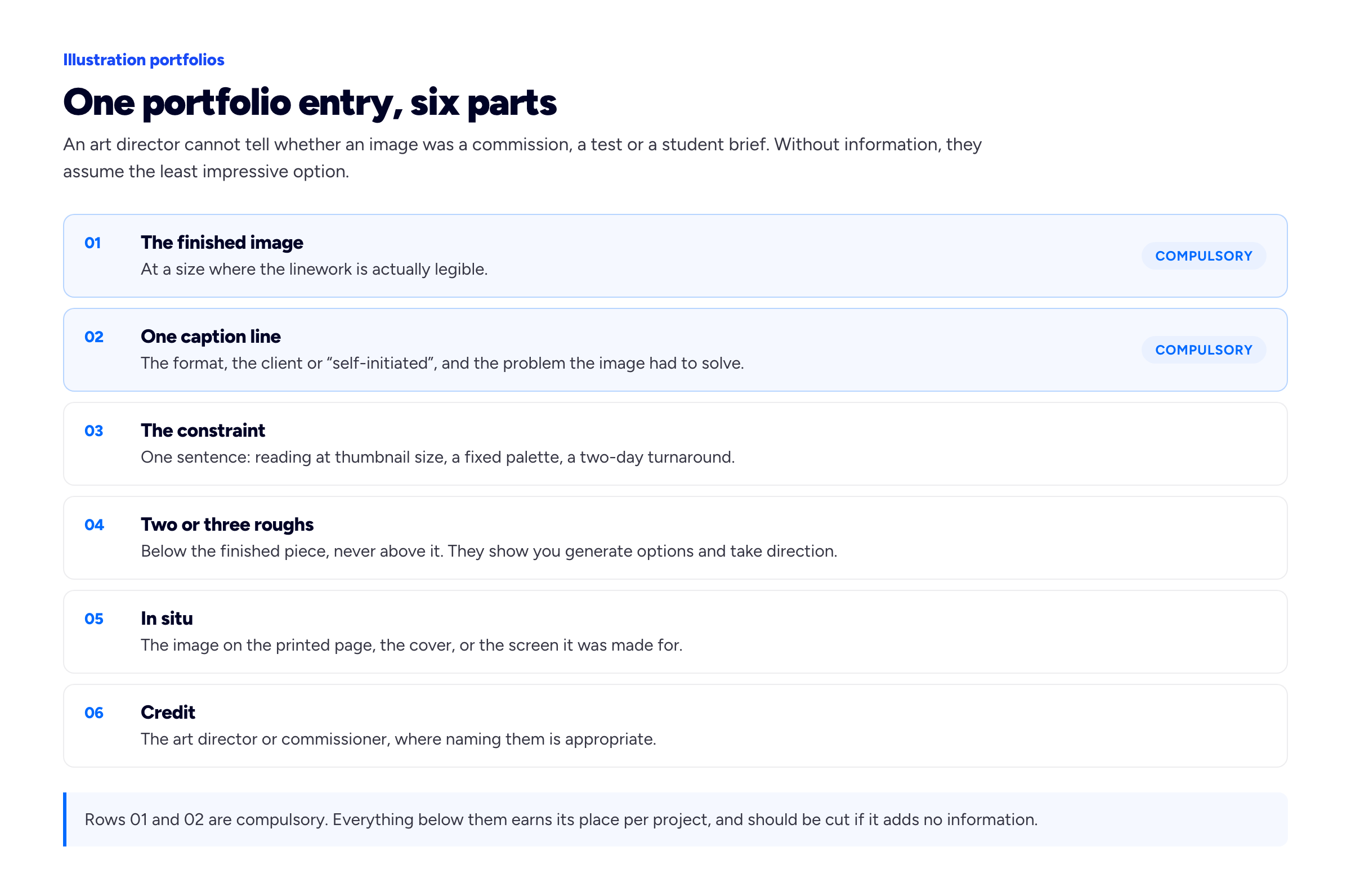
The finished image and one caption line are compulsory. Everything below them is optional and should be cut if it does not add information.
Roughs and process: yes, but underneath
Art directors like roughs, for a specific reason. Roughs show that you generate options and take direction — that a brief which changes at the second round will not produce a sulk or a stalemate. That is a real commercial worry and showing two or three thumbnail options answers it.
Put them after the finished piece, never before it. A portfolio that opens a project with sketches asks the reader to do the work of imagining the outcome, and they will not. Two roughs is plenty; a full process narrative belongs in a case study rather than a portfolio entry, and how to write a portfolio case study covers that longer format.
The about page does specific work here
For illustration, the about page has three jobs beyond biography, and most illustrators do none of them:
- Say what you are for. One line naming the markets you take work in — "editorial and publishing, UK and US" — saves an art director a guess and saves you a bad enquiry.
- Say whether you are available. A dated availability line is the cheapest trust signal on a portfolio site and almost nobody has one. "Booking from November" is more useful than any amount of prose.
- Be clear that licensing is how this works. You are selling usage, not the picture. You do not need a rate card on the page, but a sentence saying that fees depend on usage, territory and duration frames the first email correctly. The Association of Illustrators publishes pricing guidance for members, and the Graphic Artists Guild is the equivalent reference in the United States.
The writing itself — the tone, the length, what to leave out — is covered in how to write a portfolio about page.
Instagram is not a portfolio
A social following is a genuine asset and plenty of commissions start there. It is still not a portfolio, for four reasons that have nothing to do with taste:
- It has no running order. A grid is reverse-chronological. You cannot put your three most typical pieces first, which is the one editorial decision that matters most.
- It cannot be captioned usefully. Client, brief and constraint disappear into a caption nobody expands, next to hashtags.
- You cannot be found by name. An art director who half-remembers you will search your name in Google, not scroll a platform. A page you own, at your own address, is what turns up.
- You do not own the account. Accounts get locked, reach gets throttled, platforms change. Everything you have built lives on somebody else's terms.
The pragmatic setup is a portfolio site at your own address as the permanent record, with social as the place work is seen and shared, each linking to the other. The wider version of this argument is in Behance and Dribbble versus your own portfolio website.
While you are at it, give the images real filenames and real alt text. Google's image best practices are short and they are the difference between an illustration that is findable by search and one that exists only if somebody already knows your name.
A pre-send audit
Before you send the link to an art director:
- Does the portfolio show one market, or is it still trying to show range?
- Are the first three images the three most typical of the work you want more of?
- Are there between twelve and eighteen pieces, with the weakest two already deleted?
- Does every image carry a caption naming the format, the client or "self-initiated", and the problem?
- Is every personal or unpublished piece explicitly labelled as such?
- Do any pieces appear that you would not want to be commissioned to repeat?
- Is there a dated availability line and a contact address that is not a form?
- For children's work: is there a character sheet, a sequence, a full spread and a dummy?
- Does the site load quickly on a phone, and does your name find it in a search engine?
Frequently asked questions
What should an illustration portfolio include?
Twelve to eighteen finished pieces aimed at one market, in one consistent visual voice, each with a one-line caption naming the format, the client or "self-initiated", and the problem the image solved. Add roughs beneath the finished pieces where they show you generate options, an about page stating your markets and availability, and a contact address. Personal work belongs in at full weight, provided it is labelled.
How many pieces should be in an illustration portfolio?
Twelve to eighteen for a single market. Fewer than about ten reads as thin; more than about twenty means the reader has to find the good ones themselves, and the weaker pieces set the expectation rather than the stronger ones. If you work across two markets, that is two portfolios of twelve to eighteen, not one of thirty.
How do I build an illustration portfolio with no clients?
Illustrate real formats rather than making nice drawings: take an article published this week and illustrate it, produce a cover for an existing book with type laid over it, or design a card range with coordinating colourways. Aim each piece at the exact job you want next, label everything as self-initiated, and use the same caption structure you would use for a commission. In illustration, self-initiated work is where most commissioners find a sensibility they want to buy.
What does a children's book illustration portfolio need?
Four things beyond good drawings: a character sheet proving you can hold a character consistent across angles and expressions, a sequence of three to five images that moves a story, at least one full spread laid out to a real page shape with room for type, and a dummy — a rough mock-up of a whole book with two or three spreads taken to finish. State the age category you are aiming at, because a board book and a middle-grade novel are different products.
Should my illustration portfolio be a website or Instagram?
A website, with Instagram feeding it. A grid cannot be ordered, cannot carry useful captions, cannot be found by someone searching your name, and is not yours. Keep the social presence for reach and use a page at your own address as the permanent, ordered, captioned record that an art director can forward to a colleague.
Do I need a niche, or should I show range?
One portfolio, one market, one visual voice. Range across a single set of images makes you harder to commission, because the person hiring cannot predict what will arrive. If you genuinely work in two modes, build two portfolios and send whichever matches the enquiry — that is showing range across your career rather than inside one link.
Should I show sketches and roughs?
Two or three per project, placed below the finished image, never above it. They demonstrate that you generate options and can absorb direction, which is a real commercial concern. A longer process narrative belongs in a case study rather than in the portfolio itself.
How do I get art directors to look at my portfolio?
Send a short, specific email to a named person, with two or three images in the body and one link, and make the link go to the market that matches what they commission — not to a mixed homepage. Follow their published submission preferences where they have them. The portfolio's job in that exchange is to confirm the prediction your email created, which is why the first three images and the captions matter more than the total number of pieces.
How we put this guide together
Bunfolio builds portfolio sites, so we spend our time reading what illustrators publish and watching where a page loses the person who could commission it. The recommendations here are our own judgement rather than industry rules, and you should weigh them that way: the argument that range costs commissions, the twelve-to-eighteen count, the claim that the first three images do most of the work and should be the most typical rather than the most recent, the one-line caption structure, the decision to place roughs beneath finished work, and the four-market split. They come from a consistent pattern — commissioners are making a prediction under time pressure, and every editorial choice that makes the prediction easier improves the response rate.
We have cited no statistics on commission rates, art directors' review times, or how many portfolios get opened. There is a large circulating body of numbers of that kind in the illustration and freelance-creative space, and we could not trace them to a primary study we would be willing to stand behind, so we have left them out rather than repeat them. Piece counts and image counts here are ranges we consider workable, offered as judgement, not as thresholds anybody enforces.
Where a factual claim points somewhere, it points at a primary source rather than a summary: the Society of Children's Book Writers and Illustrators for children's publishing submission practice, the Association of Illustrators and its pricing guidance in the UK and the Graphic Artists Guild in the US for how illustration is licensed and priced, and Google's image best practices for the findability points. Those organisations' guidance changes; check the current version rather than our description of it, and nothing here is legal advice about a licence you are being asked to sign.
The example caption, the remote-work feature, the availability line and the market descriptions are invented for illustration. They exist to show the shape of a useful entry. They do not describe a real commission, and no example copy here should be reused as a claim about work you did.
Related reading: the graphic design portfolio guide for the adjacent discipline, how to build an art portfolio website for selling and exhibiting rather than being commissioned, Behance and Dribbble versus your own site for the platform question, how to write a portfolio about page, what a freelance artist is for quoting, usage rights and the paperwork once commissions arrive, and should freelancers niche down for the career-level version of the range argument.
More from the blog
October 31, 2026 · 19 min read
Professional Summary: How to Write One (With Examples)
A professional summary is three or four lines built from the job advert: your role and level, two pieces of proof, and what you bring to this employer. Summary, profile and objective compared, when an...
October 24, 2026 · 19 min read
Artist Statement Examples (and How to Write One Without Artspeak)
What an artist statement is and how it differs from a bio and a project statement, the four lengths to keep ready, a four-move method for drafting one, plain-language rules, an artspeak paragraph rewr...
October 16, 2026 · 16 min read
CV vs Resume: The Difference and Which One to Send
In the US a CV is an academic record and a resume is the short document; in the UK and most of the world, "CV" is the name for that short document.