
October 3, 2026 · 16 min read
How to Make a Resume Stand Out: What to Change on the Page
A resume stands out by being the easiest one in the pile to say yes to, not by looking different. Here is how to rebuild the top of page one, turn duties into results (even without numbers), tailor honestly and keep the layout plain.
To make a resume stand out, tailor it to one job so that the top third of page one answers the advert's first requirements, then rewrite every duty as a specific result someone could check. Keep the layout plain and conventional, so the content is what gets noticed rather than the decoration, and give the reader one piece of evidence they can open, such as a portfolio link or a named project. A resume stands out by being the easiest one in the pile to say yes to, not by looking different.
Most advice on this question is a list of tips everybody else in the pile has also read: tailor it, quantify it, proofread it. All true, none of it telling you what to change on the page in front of you. This guide covers what a reader does in the first pass and the second, how to rebuild the top of page one, how to turn duties into results when you have no numbers, how to tailor without lying, which design choices help, and how to stand out with a thin or unusual history. A ten-minute check at the end runs on your own file.
What "standing out" means to the person reading
A resume is read twice. The first read is a match: does this file contain what the advert asked for, roughly where it is expected? The second, if you survive the first, is a judgement: is there evidence this person has done the work, rather than heard of it?
Those two reads want opposite things from you. The first rewards convention. Purdue's Online Writing Lab puts it plainly: "Readers have expectations about how a résumé should look. This allows for quick scanning, as many times your audience has seen many resumes." A reader who has to hunt for your current job title is not impressed by the layout that hid it.
The second read rewards specificity, and that is where you are obliged to be different. Two items on Harvard's careers office list of what resume language should be are the whole method in miniature: "Specific rather than general" and "Written to express not impress".
So the working rule, and it is our recommendation rather than a published standard, is this: conform on form, stand out on content. Make the document look like a resume, and make what it says impossible to mistake for anyone else's.
Rebuild the top third of page one
Everything above your first job title is prime space, usually wasted on an address, an objective and adjectives. Rebuild it in three parts.
The name line and a target title
Under your name, put the title of the job you are applying for, or the closest honest version of it: "Payroll Specialist", "Junior Data Analyst". It costs one line and does the first read's job immediately. Then phone, email, town or city, and one link: LinkedIn, or a portfolio if your field hires on work. A full postal address is no longer expected.
A two-line summary that only you could write
Prospects, the UK graduate careers site, describes the personal profile as "a concise statement that highlights your key attributes and helps you stand out from the crowd". The trap is that most profiles are made of attributes nobody can check. Compare two versions for an invented payroll specialist.
Weak.
Highly motivated and detail-oriented professional with excellent communication skills and a proven track record of success, seeking a challenging role in a dynamic organisation.
Every phrase is a claim the reader has seen all week, and none could be shown to be false. It could sit on any resume in any field.
Strong.
Payroll specialist with six years running monthly and weekly payroll for 400 to 900 staff across two UK sites. Moved Brightwater Logistics from spreadsheets to Sage Payroll without a missed pay date, and now handle the year-end and pension submissions on my own.
Same length. It names the work, the scale, a tool, an outcome and the level of responsibility, and nobody else applying could have written it. Keep it to two or three lines.
Put your strongest evidence where the eye lands first
The only eye-tracking work most articles cite on this is a 2012 study by TheLadders, a job search company, which observed thirty recruiters over ten weeks. Its published brochure reports that recruiters spent "almost 80%" of their review time on six things: name, current title and company, previous title and company, the start and end dates of both, and education. It is vendor research with real limits, set out at the end, but the direction matches Purdue's point that readers work left to right and top to bottom. So make your current title and employer easy to find, and put your best evidence first under each role, not fifth.
Turn duties into results: the change that matters most
The biggest difference between a resume that stands out and one that does not is whether the bullets describe a job or a person doing it. "Responsible for social media" is the job description your employer already wrote.
The careers offices agree on the fix even when they word it differently. Harvard asks for language that is "Fact-based (quantify and qualify)" and lists "Not demonstrating results" among its top five mistakes. Prospects says to use "active verbs when possible" and, instead of generic phrases such as "team player", to "provide real-life examples". The US Department of Labor's federal resume tips put it more bluntly: "Include your accomplishments; do not be shy, be truthful."
A pattern that works for most bullets, our own rather than any official formula: verb, what you did, at what scale, with what result. Not every bullet needs all four, but a bullet with only the first two is a duty in disguise.
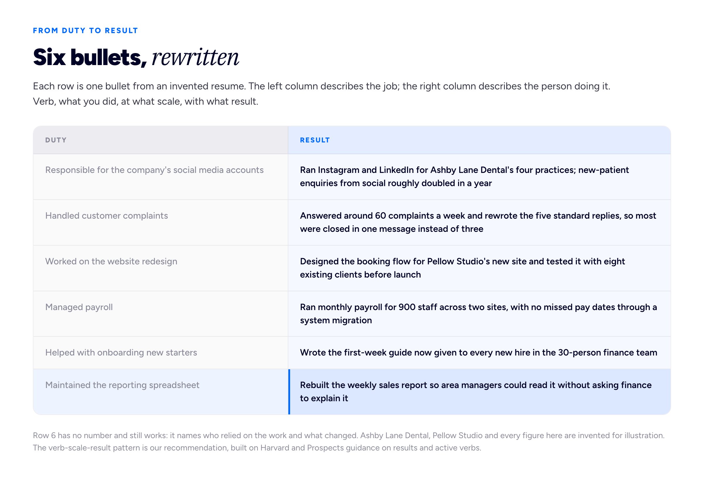
None of the right-hand bullets is clever. Each one replaces a category with a fact, and each would give an interviewer a real question to ask.
When you have no numbers
Plenty of good work comes with no percentage attached, and inventing one is worse than leaving it out: a number is the thing an interviewer is most likely to ask you to explain. Reach for one of these instead.
- Scale. How many people, sites, clients, products, pages or pounds were involved. "Across 14 branches" is a fact even if nothing was measured.
- Frequency. Weekly, daily, every quarter. Doing something repeatedly and reliably is evidence in itself.
- Who relied on it. "Used by the whole sales team", "presented to the board", "adopted by two other offices".
- Before and after. What was true before you started and what was true after, in plain words: "the report went from a day's work to an hour".
"Roughly doubled" is fine if it is honest. Precision you cannot defend is not more impressive than an approximation you can.
Cut the bullets that only prove you had the job
Four strong bullets beat seven where three are duties. Delete anything that would be true of anyone who held the same title; what earns a place is covered in how long a resume should be.
Tailor it to the advert, properly
Every careers source agrees on tailoring. Purdue: "Though you may maintain a general résumé, you should tailor your résumés to fit the needs and expectations of each company and job position." The Department of Labor: "One size never fits all." What they leave to you is how. A fifteen-minute procedure:
- Mark up the advert. Underline every requirement and tool, then number the first five in the order listed; adverts tend to lead with what matters most to whoever wrote them.
- Find your evidence for each. For each of the five, find the bullet on your resume that proves it. If there isn't one but you have done the thing, write it.
- Reorder. Move the bullets that answer the first requirements to the top of their roles, and make sure the summary touches at least two of them.
- Adopt their words for your work. If the advert says "stakeholder engagement" and you wrote "kept clients informed", change your phrase to theirs. The Department of Labor's advice is to use verbs "that match key words identified in the job announcement".
- Leave out what you cannot back. If a requirement has no evidence behind it, do not add the keyword to a skills list and hope. That claim gets tested in the first conversation.
Step four is translation, and it is honest; step five is the line not to cross. The distinction is drawn out at length in our guide to the resume skills section, and the reason exact wording matters to the software that stores your file is in ATS-friendly resume formatting.
Remove what makes every resume sound the same
Standing out is partly subtraction. These lines are on so many resumes that readers skip them, and they spend space a fact could have used.
- Self-description adjectives. "Hard-working", "passionate", "detail-oriented", "results-driven". Prospects specifically warns against "team player" in favour of real examples. A quality you can only assert is not evidence.
- "Responsible for" and "duties included". Both announce that the next words are a job description.
- An objective about what you want. "Seeking a challenging role where I can grow" is about your needs, not theirs.
- "References available on request". Harvard lists reference lists among the things to leave off.
- Personal pronouns and narrative style. Also on Harvard's list. Bullets start with the verb: "Rebuilt", not "I rebuilt".
- A photo or date of birth in the UK and US. Harvard advises leaving out pictures and age or gender information; where local practice expects a photo, follow it.
Design: stand out by being easy to read
One version of "make your resume stand out" means colour, icons, a sidebar and a skills chart. It makes the file look different; it rarely makes the content easier to find, and the first read is about finding.
The sourced guidance on layout is unglamorous. Purdue recommends "no more than two fonts in your résumé" and warns that "overusing these tools makes the reader ignore the items you wish to emphasize", meaning bold, capitals, italics and underlining. The UK's National Careers Service suggests "a clear font like Arial, Times New Roman or Calibri in size 11 or bigger" and using "headings and bullet points to make it easier to read". Prospects suggests 10 to 12 point body text with margins of about 2.5 centimetres. Harvard asks for a page that balances white space and is "Written for people who / systems that scan quickly".
Our own additions:
- One column. Two-column layouts are where text gets read in the wrong order once the file is parsed, and they push important content into a narrow sidebar the eye treats as secondary.
- Bold for one job only, usually job titles. If everything is bold, nothing is.
- One accent colour at most, for headings. Colour that carries meaning does not survive a black-and-white print or a parser.
- No skill bars or star ratings. Four stars out of five has no scale, and the graphic often turns into nothing when the file is read as text.
- Real text, not images. If you cannot select a word in the PDF, a system cannot read it.
Designers are a narrower exception than they think: the craft belongs in hierarchy, spacing and type, not graphics that replace text; the graphic designer resume guide goes further.
If the layout is fighting you, our free resume builder produces a single-column PDF with real selectable text and no account step. The PDF carries a small "Created with Bunfolio" credit at the foot, which is what keeps the tool free.
Give the reader something to open
Everything on a resume is a claim. The strongest way to stand out is to attach one claim to something the reader can check in under a minute: a live project, a case study, an article, a repository. A reader who clicks and finds real work is no longer comparing your bullets with someone else's; they are looking at what you made.
This matters most in fields that hire on output, such as design, development, writing and marketing, but it helps almost anywhere: an operations manager can link a one-page write-up of a process change. The link goes in the contact line as a short, readable address; see the portfolio link on your resume for placement.
It has to load quickly and show work on the first screen, be a real web address rather than a download, and match the bullets, so the click confirms what the page claimed. If the work exists but was never written up, one portfolio case study does more than any reformatting. A simple site on your own name is a same-afternoon job, and the longer argument for one is in building a resume website; Bunfolio gives you one free on a subdomain, but any clean, fast page you control will do the job.
Standing out with a thin or unusual history
With no experience
You cannot out-list someone with five years in the role, so lead with the closest relevant thing you have done: a dissertation, placement, society role or project of your own. The National Careers Service suggests including "work placements, volunteering and paid jobs", and describing what you did "using the STAR method" in two to three lines. A short, true resume reads better than a padded one, and building a portfolio with no experience covers producing evidence on purpose.
As a freelancer
Twenty short engagements listed as twenty jobs look like instability. Group them under one heading with a continuous date range and give bullets to the two or three clients that best fit the advert. The full structure is in putting freelance work on a resume.
When changing career
The summary has to name the move and the bridge in two lines: "Eight years managing client accounts in advertising, moving into project coordination; I have run budgets, timelines and supplier contracts on campaigns of up to £400,000." Then put the transferable bullets first in each role.
The ten-minute check
Run your finished resume against this before every application.
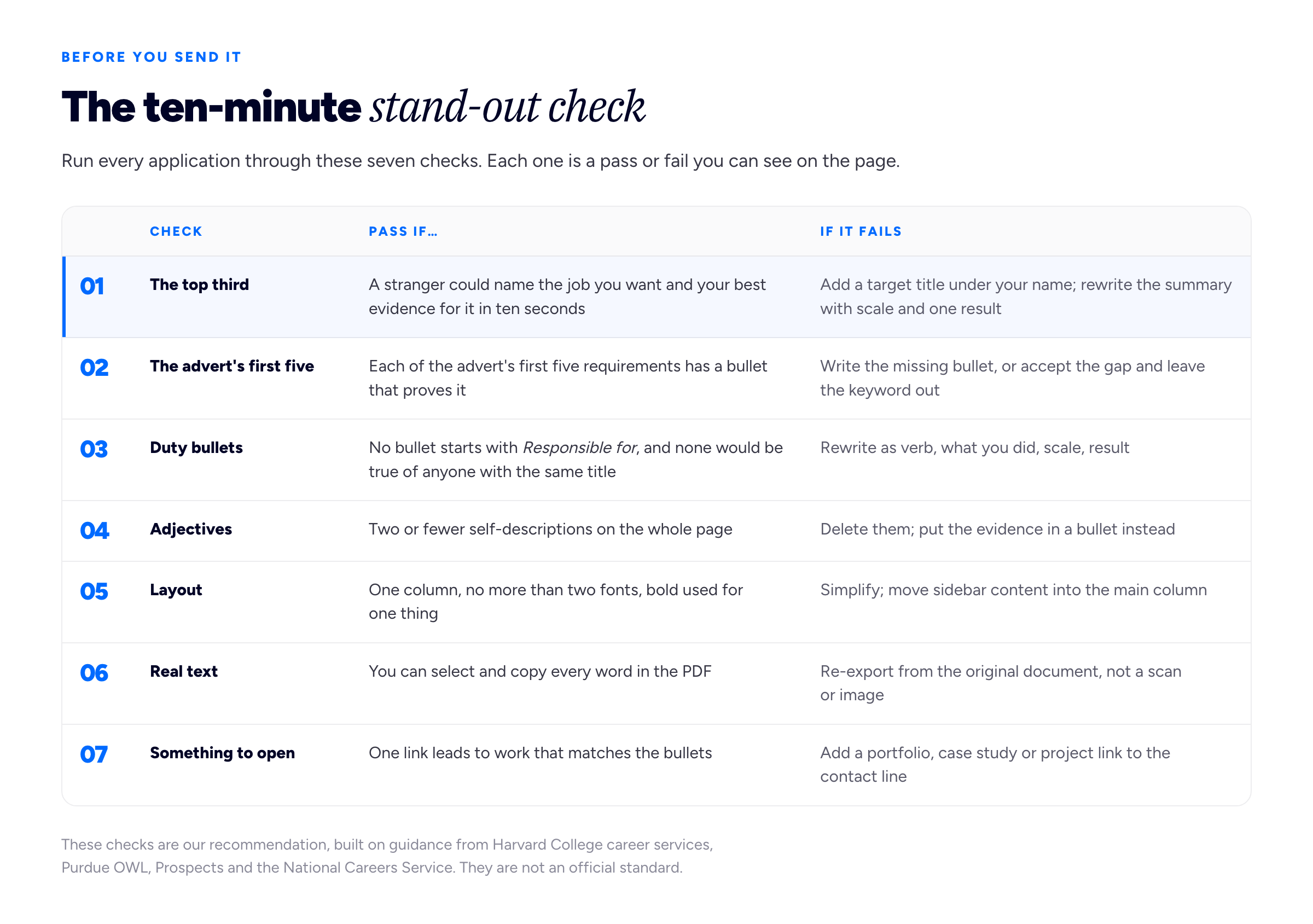
The first row decides whether the rest get read. If you only have time for one fix, make it the top third.
Then proofread. Purdue lists "Grammar and spelling are flawless" among a reader's expectations, Harvard puts spelling and grammar errors first in its top five mistakes, and the National Careers Service suggests asking someone else to check. Name the file with your name and the role: Priya-Nair-Payroll-Specialist.pdf, not resume_final_v3.pdf. If the employer wants a cover letter, the hook you put at the top of the resume is the one to open with; our guide to how to start a cover letter shows how.
Frequently asked questions
What makes a resume stand out to employers?
Relevance and evidence. The top of page one plainly matches the job, and the bullets show specific results rather than duties. A clean, conventional layout makes that evidence quick to find, and a link to real work is the strongest addition of all.
How can I make my resume stand out with no experience?
Lead with the most relevant thing you have done, paid or not: a project, placement, volunteering role or piece of coursework, described with the same specifics you would give a job. Keep the resume short and true rather than padding it, and if your field allows it, link to something you have made.
How do I make my resume stand out without numbers?
Use scale (how many people, sites or clients), frequency (weekly, daily), who relied on the work, and a plain before-and-after description of what changed. "Rebuilt the weekly report so area managers could read it without help" is a result with no number in it. Never invent a figure you could not explain in an interview.
Should I use colour or a creative template to stand out?
Usually not. Careers guidance favours clear fonts, consistent formatting and white space, and two-column layouts, graphics and skill bars can scramble when the file is parsed. One accent colour on headings is fine; designers should put the visual work in a portfolio.
What should you not put on a resume?
Self-describing adjectives, "responsible for" duty lists, objective statements about what you want, "references available on request", personal pronouns and, in the UK and US, a photo or date of birth. Harvard's careers office lists pictures, age and gender information, and reference lists among the things to leave out.
How we put this guide together
Bunfolio builds portfolio sites and runs free career tools, so we see a great many resumes. The sourced facts here are narrow and attributed where they appear: what careers offices say about language, results, tailoring, layout and proofreading, and what TheLadders' brochure reports. Everything else is our own judgement and should be weighed as such: "conform on form, stand out on content", the verb-scale-result pattern, the substitutes for a missing number, the tailoring procedure, the layout rules and the ten-minute check.
We have not used this topic's usual opening statistic, that recruiters spend six or seven seconds on a resume, as a fact about hiring. Unusually, it is traceable. TheLadders' 2012 brochure, archived by Boston University, describes thirty professional recruiters observed over ten weeks, credits the underlying report to the company's own Head of User Experience Design, and reports about six seconds on the initial "fit/no fit" decision. A 2018 update, announced in a press release, gave 7.4 seconds. But it is a small study with no published selection method, never independently reviewed, and the brochure ends by promoting the company's own resume rewriting service, whose rewrites are what it found performed better. We used it only for where recruiters' eyes went, which agrees with independent guidance, not for the number. We also left out circulating figures for interview rates and recruiter preferences, because none we found pointed to a survey method we could check.
The primary sources, all read while writing: the Purdue Online Writing Lab's introduction to résumés (reader expectations, tailoring, flawless grammar) and its résumé design page (two fonts, overusing emphasis, reading order); Harvard College's guide to creating a strong resume (specific, fact-based language, the top five mistakes, what to leave out); Prospects' guide to writing a CV (the personal profile, active verbs, avoiding "team player", font sizes and margins); the National Careers Service's CV sections guide (fonts, headings, the STAR method, getting it checked); and the US Department of Labor's tips for writing a federal resume (tailoring, matching keywords, including accomplishments). Some are written for UK CVs and some for US resumes; the advice on content transfers, but conventions on photos, length and personal details differ, so follow the employer's instructions where given.
Brightwater Logistics, Ashby Lane Dental, Pellow Studio, Priya Nair and every figure in the examples and diagrams are invented to show the shape of a rewrite, not drawn from a real resume or candidate.
Related reading: how long a resume should be, what to put in the resume skills section, ATS-friendly resume formatting, where to put your portfolio link on your resume, how to build a resume website and putting freelance work on a resume.
More from the blog
September 23, 2026 · 18 min read
Portfolio vs Resume: Which One You Need, and When
A resume and a portfolio are not two formats of the same thing: one answers the screening question, the other answers "show me". This guide covers who needs which by profession, where the CV fits, and...
September 22, 2026 · 16 min read
Graphic Designer Resume: Set It Like Type, Not a Template
A graphic designer resume is marked twice: once for what it says and once as a piece of design. Here is how to set one that impresses a design lead and still parses in an applicant tracking system — o...

September 20, 2026 · 24 min read
ATS-Friendly Resume Format: What Actually Breaks
An applicant tracking system is a database with a form on the front, not a judge. Here is the two-minute test that shows you exactly what the parser sees in your own file, the failures that genuinely...