
November 16, 2026 · 19 min read
Best Font for a Resume: Safe Choices, Sizes and How to Test
The best font for a resume is a plain one already installed on the reader's computer: Arial, Georgia or Verdana ship with both Windows and macOS, while Calibri and Cambria are safe once the file is a PDF. Set the body at 10 to 12 point, use no more than two fonts, keep margins of at least three quarters of an inch, and send a PDF.
The best font for a resume is a plain, well-made typeface that is already installed on the machine of whoever opens it. In practice that gives you a short, safe list: Arial, Georgia or Verdana if you want something that ships with both Windows and macOS, Calibri or Cambria if you are sending a Word file to people who use Microsoft Office, and Helvetica only inside a PDF, because Windows does not include it. Set the body at 10 to 12 point, headings one or two sizes larger, use no more than two fonts, keep margins of at least three quarters of an inch, and export to PDF. Serif or sans-serif matters far less than people think; installed or not installed matters a great deal.
That is the whole answer for most people. The rest of this guide explains why availability matters more than taste, how fonts behave inside PDFs and Word files, which fonts cause trouble, how to test your own file in five minutes, and when a designer should break the rules.
Why "installed everywhere" beats "looks nicest"
A font is not part of your text. It is a separate file on your computer that tells the screen how to draw each letter. When you send a resume, what happens to that font depends on the format.
If you send a Word document, the recipient's copy of Word looks for the fonts you used on their machine. If a font is missing, Word quietly swaps in another one. Different fonts have different widths, so lines break in new places and the last lines of a one-page resume spill onto a second page. Microsoft's own support page on embedding fonts makes the point from the other side: embedding exists so that "the fonts, layout, and styling of the document won't change" for the person who opens it. Without it, they can.
If you send a PDF, the export normally embeds the fonts — or the subset of letters you used — inside the file. That is why a PDF looks the same everywhere, and why you should send one unless asked otherwise. But embedding is not automatic for every font. Font makers set an embedding permission inside the font file, and Microsoft lists the levels: non-embeddable, preview and print, editable, and installable. A font marked non-embeddable may be left out of the PDF or replaced at export, which puts you back where you started.
So the safest font is one that needs none of this. If it is already on the reader's machine, the Word file looks right without embedding, and anything that later converts your file has a matching font to hand.
What actually ships where
We checked the two lists that matter. Microsoft's Windows 11 font list includes Arial, Calibri, Cambria, Georgia, Times New Roman, Verdana, Trebuchet MS, Segoe UI and Palatino Linotype. Apple's page on fonts included with macOS Sequoia, which opens with the line "macOS Sequoia comes with these built-in and downloadable typefaces", includes Arial, Georgia, Helvetica, Helvetica Neue, Times New Roman, Verdana, Trebuchet MS, Palatino, Avenir, Gill Sans and Baskerville.
Read across the two and three useful facts fall out. Calibri and Cambria are on Windows but are not on Apple's macOS list; a Mac user normally has them only because they installed Microsoft Office. Helvetica is on the Mac but not on the Windows 11 list. And Garamond, a favourite of resume font lists, is not on the Windows 11 core list and appears on Apple's page only as a document-support font, available to documents that already use it rather than as an ordinary menu choice. A fine typeface; a poor bet in a Word file.
Aptos, the newer Microsoft default, is a special case. Microsoft announced in 2023 that "Aptos will start appearing as the new default font across Word, Outlook, PowerPoint, and Excel", replacing Calibri. It is on neither the Windows 11 core list nor the macOS list; it arrives with Microsoft 365 rather than with the operating system. Someone opening your .docx without a current Office subscription may not have it. If your resume is in Aptos because that is what Word gave you, either export to PDF or change it.
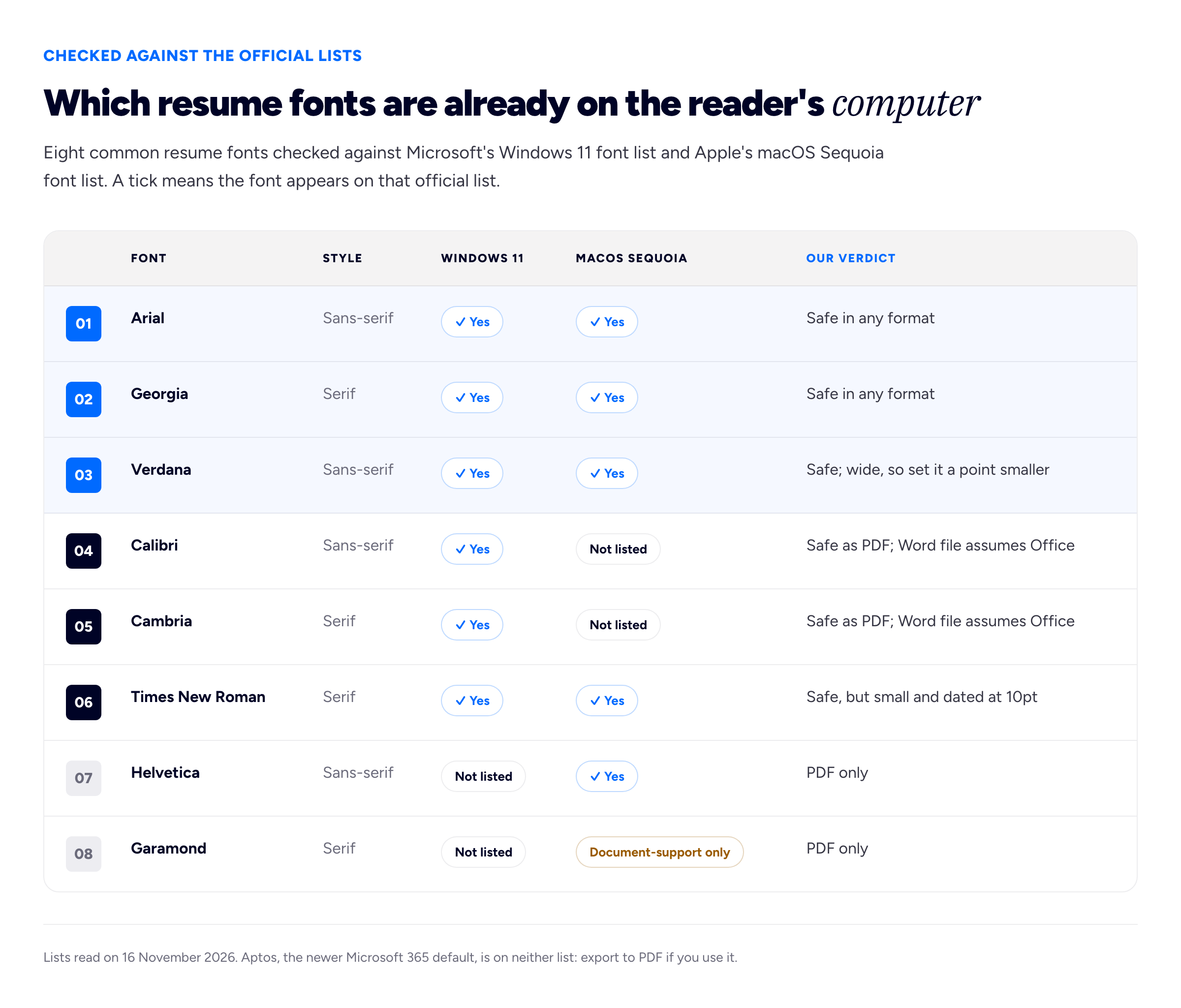
The top three rows render the same on almost any machine. Everything below them is fine once it is inside a PDF.
Serif or sans-serif?
Serifs are the small strokes at the ends of letters in Georgia, Cambria and Times New Roman. Sans-serif fonts such as Arial, Calibri and Verdana leave them off. Purdue's Online Writing Lab, in its résumé design guidance, notes that serif fonts "tend to keep the eye reading along the text" while sans-serif fonts are "typically used for headings and titles".
Our view is that either works, and the choice should follow the kind of job rather than a rule. A serif such as Georgia or Cambria reads as traditional and suits law, academia, finance, publishing and the civil service. A sans-serif such as Arial or Calibri reads as plain and current, and suits technology, marketing, operations and most corporate roles.
The pairing Purdue describes — sans-serif headings over a serif body — is the classic combination, and it is the most you should do. Purdue's advice is "no more than two fonts in your résumé", and we would go further: one font in two weights (regular and bold) is cleaner than two fonts, and it is impossible to get wrong.
Our short list, by situation
- You do not know what the employer uses, and they might want a Word file: Arial or Georgia. Both are on Windows and macOS.
- You are sending a PDF and want something a little warmer than Arial: Calibri for a sans-serif, Cambria for a serif.
- Your resume is dense and must stay on one page: Calibri or Arial at 10.5 or 11 point. Avoid Verdana here; it is wide and will cost you lines.
- You write and edit in Google Docs: pick from the fonts already in the Docs menu, and prefer one from the cross-platform rows above, because the file you download is opened by people with ordinary computers, not by Google.
- Traditional sector: Georgia or Cambria for the body; bold of the same font for headings.
- Creative role: see the section on designers below.
Size, spacing and margins
The careers service at Harvard's Faculty of Arts and Sciences, in its resume guidance, says "font size should be between 10 and 12 point and kept consistent throughout the document", and that margins "should be at least three quarters of an inch". It also asks you to "stick to a common, easy to read font". Our numbers below sit inside that frame.
Point size is not the same across fonts. Ten-point Times New Roman looks noticeably smaller than ten-point Verdana, so choose by eye on a printed page. As a starting point, our recommendations are:
- Body text: 10.5 to 11 point for Calibri, Arial or Cambria; 11 to 12 for Times New Roman and Georgia; 10 to 10.5 for Verdana.
- Section headings: 12 to 14 point, bold, in the same font or your one heading font. Small capitals or all capitals are fine for headings if you add a little letter spacing; never for body text.
- Your name: 18 to 24 point. It is the largest thing on the page and the only thing that needs to be.
- Line spacing: 1.0 to 1.15.
- Space between sections: 6 to 12 points of space before each heading, set in the paragraph settings rather than by pressing Enter twice.
- Margins: 0.75 to 1 inch (about 1.9 to 2.5 cm), equal on all four sides.
The commonest mistake is shrinking the font to win space. Below 10 point, the resume is too long, not the font too large; our guide on how long a resume should be covers what to cut first.
How fonts break in parsing and in PDFs
You will read that "ATS systems cannot read certain fonts". That loosely describes something real, and knowing the mechanism lets you test for it. Our guide to ATS resume format explains how applicant tracking systems read a file overall; this section is only about the font's part in it.
Inside a PDF, text is not stored as letters you could read in a text editor. It is stored as references to shapes (glyphs) in the embedded font, plus, if the export did its job, a mapping table that tells any program reading the file which real character each shape stands for. When you copy text out of a PDF, or when a recruitment system extracts it, that mapping table is what turns shapes back into words.
Most of the time this works perfectly. It goes wrong in a few predictable ways:
- Missing or broken character mapping. Some decorative fonts, some old fonts and some design-tool exports produce PDFs where the shapes look right on screen but the mapping is wrong or absent. The page is readable to a person and gibberish to software. Copy-paste shows strings of odd symbols or blank boxes.
- Icon fonts. Many templates draw the little phone, email and location symbols with an icon font. Those icons map to characters with no ordinary meaning, so the extracted text has a stray symbol or a gap exactly where your contact details begin.
- Ligatures. Some fonts join letter pairs such as "fi" and "fl" into a single shape. Well-made fonts map these back to two letters. Poorly made ones can extract "efficient" as "e cient" — a small thing, unless it happens to a skill a recruiter searches for.
- Letters drawn as outlines. Some design tools offer to convert text to outlines, or rasterise it, to guarantee the look. The result is a picture of words, with no text in it at all.
- Font not embedded. If the font's licence forbids embedding, or the export setting skipped it, the viewer substitutes another font. In a PDF, that can mean overlapping or clipped lines, because the layout was calculated for a font that is not there.
None of these is about a font being "too fancy" for software. Software does not see style at all; it sees whether the text layer is intact. A plain system font exported from Word or Google Docs is the nearest thing to a guarantee of that, which is the practical reason the safe list is safe.
Fonts to avoid, and why
None of these is banned. Each one costs you something the safe fonts do not.
- Script and handwriting fonts (Segoe Script, Brush Script and their many free cousins). Hard to read at 10 point, often built with unusual character mappings, and they read as a greeting card.
- Comic Sans. Readable, but it signals informality to most readers, and first reactions are the whole problem.
- Condensed and display fonts (Impact and anything sold for posters and headlines). Built for large sizes; at body size the letters crowd together and the counters — the holes in "e" and "a" — close up.
- Light and thin weights. A 300-weight font looks elegant on a high-resolution laptop and nearly disappears on a cheap office printer or a phone in sunlight. Use the regular weight for body text.
- Fonts you downloaded from a free-font site. Licence permissions, character mapping and completeness vary. Some lack accented characters, so "Valdés" falls back to another font mid-word.
- Aptos, Calibri or Cambria in a Word file sent to an unknown reader. Good fonts, but each assumes the reader has Microsoft Office. Send a PDF, or switch to a cross-platform font.
Times New Roman deserves a fair hearing. It is on both platforms and perfectly legible, and nobody will reject you for it. Its weakness is that it is narrow, so at 10 or 11 point it looks small and cramped, and to many readers like a default nobody changed. If you like a serif, Georgia does the same job with more room in each letter.
A worked example: one resume, three files
Here is how this plays out, with invented people. Iris Valdés is a mid-level designer applying for an in-house role at Brackwater Studio, a branding agency. The application goes through a recruiter, Kwame Ofori, who asks for a resume "in Word, please, so I can add our header".
Iris's original resume was built in a design tool, in a licensed geometric sans-serif at a light weight, with icons for her contact details. As a PDF it looks excellent on her own laptop.
She tests it before sending, and three things happen. First, she exports it to Word from the design tool and opens it on her partner's Windows laptop: the licensed font is missing, Word substitutes another, the two-column layout reflows and the resume runs to a page and a third. Second, she copies all the text out of the PDF and pastes it into a plain text editor: the phone and email icons come through as empty boxes, and "Brand identity for a fintech" arrives with a gap where "fi" should be. Third, she prints the PDF on the office laser printer: the light body text is grey and faint.
Her rebuilt version for Kwame is deliberately plain. The body is Arial 10.5 point at 1.1 line spacing; headings are Arial Bold 12 point in small capitals with a little tracking; her name is 22 point. The contact line is written out in words — "Email", "Phone", "Portfolio" — with no icons. Margins are 0.8 inch. She sends Kwame the Word file he asked for, plus a PDF of the same document, and a link to her portfolio site.
Kwame's later comment is the useful part. The Word file opened correctly on the agency's machine and nothing moved when he added his header. What persuaded Brackwater's creative director was the portfolio link, which is where Iris's typography was always going to be judged. The resume's job was to arrive intact. It did.
How to test your own resume file
Five minutes catches almost every font problem before an employer does.
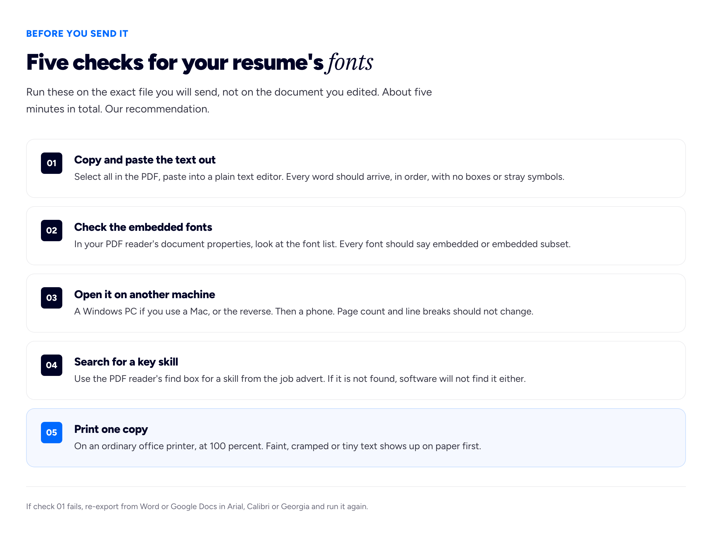
The first check does most of the work: if the text survives a plain copy and paste, software can read it too.
- Copy and paste the text out. Open the PDF, select all, copy, and paste into a plain text editor such as Notepad or TextEdit in plain-text mode. Every word should be there, in a sensible order, with no boxes, question marks or broken words. It is the nearest thing you have to seeing your resume the way software does.
- Check the embedded fonts. Most desktop PDF readers, Adobe Acrobat Reader among them, show a list of the file's fonts in the document properties. Each font should be described as embedded, or as an embedded subset, which means only the letters you used were stored. A font that is not embedded will be substituted on someone else's machine.
- Open it on another machine. If you are on a Mac, open it on a Windows PC, and the reverse. Then on a phone. Page count and line breaks should be identical.
- Search for a key skill. Use the PDF reader's find box to search for one or two skills from the job advert. If the search fails on a word you can see on the page, the text layer is broken under that word.
- Print one copy. On an ordinary office printer, not a photo printer, at actual size. Faint light weights, tiny sizes and cramped lines all show up on paper before they show up anywhere else.
If you are embedding fonts in a Word file because you must send .docx in a font the reader may lack, Microsoft's support page gives the route in Word for Windows: File, then Options, then the Save tab, then the "Embed fonts in the file" check box under the heading about preserving fidelity when sharing. It works only if the font's licence allows it, and it makes the file considerably larger. Switching to a cross-platform font is usually simpler.
Headings, emphasis and the rest of the typography
The font is one decision among several. Use bold for one job only — job titles, say, or section headings — because bold scattered through bullets cancels itself out. Keep italic for dates or locations, skip underlining except on a link, keep text black or very dark grey, and left-align the body with a ragged right edge. Use the font's own round bullet, not an image or an icon-font symbol. Typography only gets a reader to the content; what they find depends on the bullets themselves, which our guides on how to make a resume stand out and writing the skills section cover.
If you are a designer
The obvious objection: a designer's resume is a piece of design, and setting it in Arial looks like a failure of nerve. There is something in that, and two things to weigh against it.
First, most designer applications pass through recruiters and software before they reach a designer, and a distinctive resume that arrives broken does more harm than a plain one that arrives intact. Second, a resume is a weak place to show typographic skill: one page of lists, viewed at a size you do not control. Your portfolio is where type and layout are actually judged, as our graphic designer resume guide explains.
If you do want a designed resume, our recommendations are:
- Send it only as a PDF, with every font embedded, and run all five checks above. The copy-and-paste test is the one designers most often fail.
- Keep live text. Never convert type to outlines.
- Choose a font with a licence that permits embedding, and complete character coverage including accents.
- Keep a second, plain version for recruiters, application portals and anyone who asks for Word.
For any creative role, the most useful thing to put on the resume may simply be a link. A portfolio site gives a reader somewhere to see the work your typography is meant to hint at; a free resume builder can handle the plain version so the design effort goes where it is judged.
Frequently asked questions
What is the best font for a resume?
A plain font already installed on the reader's computer. Arial, Georgia and Verdana appear on both Microsoft's Windows 11 list and Apple's macOS Sequoia list, so they render the same almost anywhere. Calibri and Cambria are excellent once the resume is a PDF, but a Word file in either assumes the reader has Microsoft Office.
What font size should a resume be?
Body text between 10 and 12 point, which is the range Harvard's careers service recommends. Choose by eye, because fonts differ: Calibri or Arial usually looks right at 10.5 to 11, Times New Roman and Georgia at 11 to 12. Headings one or two sizes larger, and your name at 18 to 24 point.
Is Times New Roman a bad font for a resume?
No. It is installed on Windows and macOS and nobody will reject you for using it. It looks small and crowded at 10 or 11 point and reads to many people as an unchanged default, so Georgia or Cambria is usually a better serif choice.
Should a resume use a serif or sans-serif font?
Either is fine. Serif fonts such as Georgia and Cambria suit traditional sectors such as law, finance and academia; sans-serif fonts such as Arial and Calibri suit technology and most corporate roles. Use one font, or at most two, and keep it consistent.
Can an applicant tracking system read any font?
Software does not judge a font's style; it reads the text layer inside your file. Plain system fonts exported from Word or Google Docs almost always produce a clean text layer, while decorative fonts, icon fonts and text converted to outlines can produce gibberish or nothing. Copy and paste your PDF's text into a plain editor to check.
Should I send my resume as a PDF or a Word file?
A PDF, unless the employer asks for Word, because a PDF carries its fonts with it and looks the same everywhere. If you must send Word, use a font installed on both Windows and macOS, such as Arial or Georgia, and open the file on another computer before sending.
What line spacing and margins should a resume have?
Line spacing of 1.0 to 1.15 and margins of 0.75 to 1 inch, equal on all sides. Harvard's careers service asks for margins of at least three quarters of an inch. If you have to go smaller than that to fit everything, cut content instead.
How we put this guide together
This guide separates two kinds of claim. The font availability facts are sourced: we checked each one against Microsoft's Windows 11 font list and Apple's fonts included with macOS Sequoia, both read on 16 November 2026. The embedding behaviour, the permission levels and the Word steps for embedding come from Microsoft Support's page Benefits of embedding custom fonts, and the Aptos change from Microsoft Design's announcement, "A change of typeface". The size and margin ranges come from Harvard FAS Career Services' resume guidance, and the serif and two-font points from Purdue OWL's résumé design page; we also read Google's Docs Editors Help page on changing fonts. Font lists change with operating system updates, so check them again if you are reading this much later. Two things we could not confirm from an official page, and so kept general: which fonts Google Docs' own menu offers (Google's help page names none), and the menu path to the font list in Adobe Acrobat Reader, whose help pages we could not open. The short list by situation, the per-font size suggestions, line spacing, the fonts to avoid, the five-check test and the advice for designers are our recommendation, drawn from building resume tools at Bunfolio, not findings from a study.
We have deliberately left out the numbers that usually decorate this topic: the claim that recruiters spend a set number of seconds on a resume, the percentage of resumes said to be rejected by applicant tracking systems for their font, and survey rankings of the "most professional" font. We could not trace any of them to a published method, sample and date we were willing to stand behind, and several appear to come from the marketing of resume products. We explain the mechanisms instead, because you can test those on your own file.
Iris Valdés, Kwame Ofori and Brackwater Studio are invented for illustration, as are the application, the files and every detail in both diagrams other than the font list entries.
Related reading: ATS resume format, how long a resume should be, the graphic designer resume and how to make a resume stand out.
More from the blog
November 1, 2026 · 19 min read
Cover Letter vs Resume: What Goes in Each, and When You Need Both
The resume is the record; the cover letter is the argument for this role. What belongs in each and what must never be repeated, when a letter is really needed, how the two should point at each other,...
October 28, 2026 · 19 min read
References on a Resume: Should You List Them, and How?
Usually not on the resume itself, and never "available on request". When references do belong on the application, how to choose referees who will actually help, how to ask and brief them, the referenc...
October 16, 2026 · 16 min read
CV vs Resume: The Difference and Which One to Send
In the US a CV is an academic record and a resume is the short document; in the UK and most of the world, "CV" is the name for that short document.