
July 27, 2026 · 29 min read · Updated August 31, 2026
UX Designer Portfolio: What Gets You the Interview
Your screens cannot carry the argument, so the writing has to. The three passes your portfolio gets, a case study spine with word budgets, a skeleton you can copy straight into a draft, and why process documentation backfires.
A UX portfolio fails differently from other design portfolios. A graphic designer's work is legible at a glance — you can look at a poster and know whether the person can do it. UX work is not legible at a glance, because the interesting part is invisible. Two designers can produce a near-identical settings screen, and the difference between them is entirely in what they knew, what they ruled out, and why they stopped where they did.
That is the whole problem. Your screens cannot carry the argument on their own, so the writing has to — and most UX portfolios respond to this by writing a great deal of the wrong thing. They document a process nobody doubted instead of the decisions everybody wants to see.
This guide covers how your portfolio is actually read, what a thumbnail has to communicate before anyone clicks it, the six-section spine of a case study, a copy-and-fill skeleton with a word budget for every section, a worked rewrite of a weak opening, the failure mode of process theatre, which projects to show, how to handle NDA and unshipped work, what changes between junior and senior, and how a client reads all of it differently from a hiring manager.
How your portfolio is actually read
Design for the first pass. Nearly all portfolio effort goes into a reading that most visitors never get to.
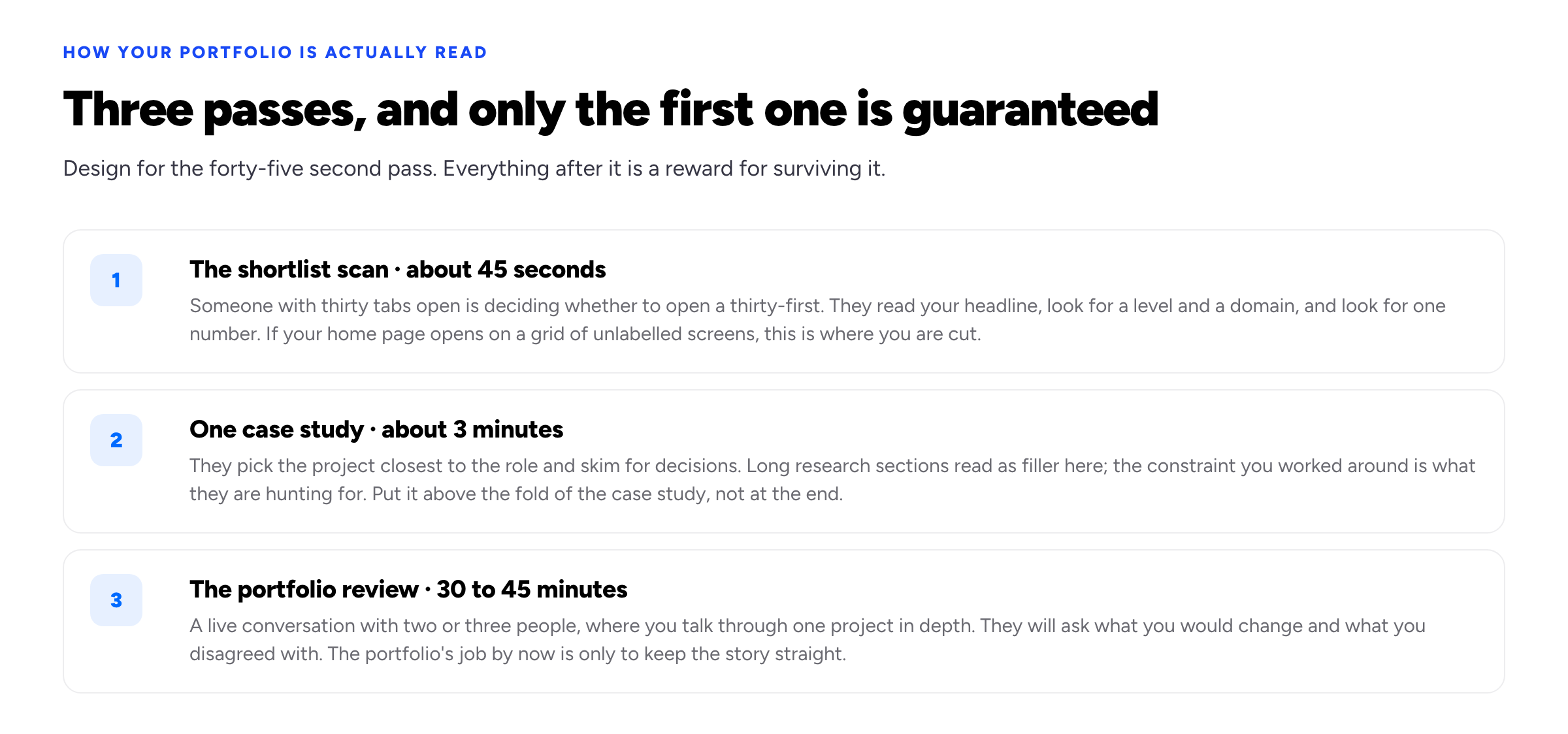
Each pass has to be earned by the one before it.
The forty-five second pass is a triage decision made by someone with your portfolio open in one of thirty tabs. They are looking for three things and will not hunt for any of them: what level you operate at, what domain you know, and one outcome they can repeat to somebody else. A home page that opens on a grid of unlabelled screens supplies none of these, which is why the most common structural fix to a UX portfolio is also the dullest: put a sentence at the top saying who you are and what kind of problems you solve.
None of this is peculiar to portfolios. It is ordinary web reading behaviour, described for decades by people you already cite in your own case studies. Jakob Nielsen's 1997 finding on how users read on the web is that they largely do not: they scan a page, picking out individual words and sentences. Nielsen Norman Group's eye-tracking work on the F-shaped scanning pattern adds where that scanning lands — the first lines of a page receive more gazes than the lines beneath them, and the first few words of each line receive more fixations than the words after them, particularly on text with weak formatting cues. And Nielsen's analysis of how long users stay on web pages makes the same point about time: the first ten seconds decide whether there is an eleventh.
A hiring manager is not a more attentive species of reader. They are a normal web reader with a stack of tabs, applying to you the triage your users apply to the products you build.
The three-minute pass is a skim of the single case study closest to the role. They are hunting for constraints and trade-offs, and skimming past research summaries to find them. This matters for layout: if the interesting decision is in section seven, it will not be read. Put the constraint high.
The thirty-minute pass is a live conversation, and by that point the portfolio's job is nearly over. It exists to keep your story straight while you talk. Everything a portfolio can win has been won by then.
The home page is a positioning statement
The forty-five second pass happens almost entirely on your home page, and most UX home pages are built as galleries when they need to be built as claims.
The top of the page needs to answer three questions before the reader scrolls: what you do, who for, and at what level. One sentence usually does it. Compare:
Product designer passionate about creating delightful, user-centred experiences.
That sentence appears, in some arrangement, on a very large number of portfolios. It contains no information — no domain, no level, no evidence — and a reviewer's eye slides straight off it. Now:
Product designer, eight years, mostly in regulated fintech. I work on the parts of a product where compliance and usability disagree.
The second version is memorable in a way the first is not, and it does something specific for you: it tells a reviewer whether to keep reading, which is a favour to both of you. If the role is a health-tech role, they now know. If it is not, they were never going to hire you anyway, and you have lost nothing but forty seconds of somebody's attention.
Underneath, put the three case studies with a one-line problem statement each — not a project name, a problem. "Cutting invoice-status support tickets by rebuilding a status page" tells the reviewer whether to click. "Northwind — Dashboard" does not.
The thumbnail is the case study's first sentence
Most portfolio advice treats the case study as the unit of work. In practice the unit that decides your outcome is the card on the home page: an image, a title, and — if you have written one — a supporting line. That card is what the forty-five second pass consumes, and the case study behind it is only read if the card earns it.
At the size a card is genuinely viewed at — roughly a third of a laptop screen, or the full width of a phone — it has to communicate three things: what kind of problem this was, what kind of product it lived in, and why it is worth three minutes rather than the next one. Almost nothing about a screenshot communicates any of those.
This is why a beautiful UI shot is a weak thumbnail. A full dashboard reduced to card size is a grey rectangle with coloured flecks — legible as "a dashboard", illegible as anything else, and indistinguishable from the four other dashboards on the page. Floating it in a tilted laptop frame on a gradient makes it prettier and no more informative. The reviewer learns that you can produce a mock-up; they already assumed that.
What works instead is a fragment carrying one idea: a cropped before-and-after of the single element that changed, a labelled slice of a flow with three steps and an arrow, or the one screen the project turned on, cropped close enough to read. The test is mechanical. Shrink the image to card size, look for two seconds, and say out loud what it is about. If the only honest answer is "an interface", it is not working yet.
Pair it with a title that states a problem or an outcome rather than a client and a noun. "Northwind — Dashboard Redesign" names a deliverable. "Cutting forty support calls a week by rebuilding a tracking page" names a result, and it survives being repeated to somebody else — which is what happens when a reviewer forwards you to a colleague. Add one always-visible line with domain, duration, role and year: "Logistics SaaS, eleven weeks, sole designer on the page, shipped 2025". Never hide it behind a hover state: hover does not exist on a phone, and on a laptop it asks the reader to be curious first.
Then think about order, because a grid is read as a sequence, not a set of equals. The first card takes most of the attention, the last card in a row takes the next most, and the middle of a long grid is where things go to be skipped. Two rules follow. Order by relevance to the role you want, not by recency — recency is what the date line is for. And the impression is set by the weakest card the reader can see, so a fourth project that is merely fine costs more than it adds. Three cards in a row read as a curated set; seven read as an archive, and an archive invites the reader to hunt for the bad one.
Six questions your case study should answer without being asked
A quick diagnostic. Read one of your case studies as a stranger and check whether these are answerable from the page alone. Each one is a question interviewers ask, and each one your writing answers is a question that does not eat interview time.
- What was the business trying to achieve? Not the user goal — the reason the company funded the work. Designers who cannot answer this get read as executors.
- What did you personally decide? As distinct from what the team decided and what you were handed.
- What was the hardest constraint? If there was no hard constraint, the project is probably not your strongest one.
- What did you get wrong? Something, on every real project. A case study with no wrong turns reads as edited rather than honest.
- How did you know it worked? Including "we did not find out, because X" — that is a legitimate answer and a common reality.
- What happened next? Whether it shipped, whether it survived, what the team did after. Following your work past launch is a seniority signal that costs one sentence.
The spine of a case study
Six sections, about nine hundred words, in this order. The word budgets are not decoration — they are the mechanism that stops the research section eating the piece.
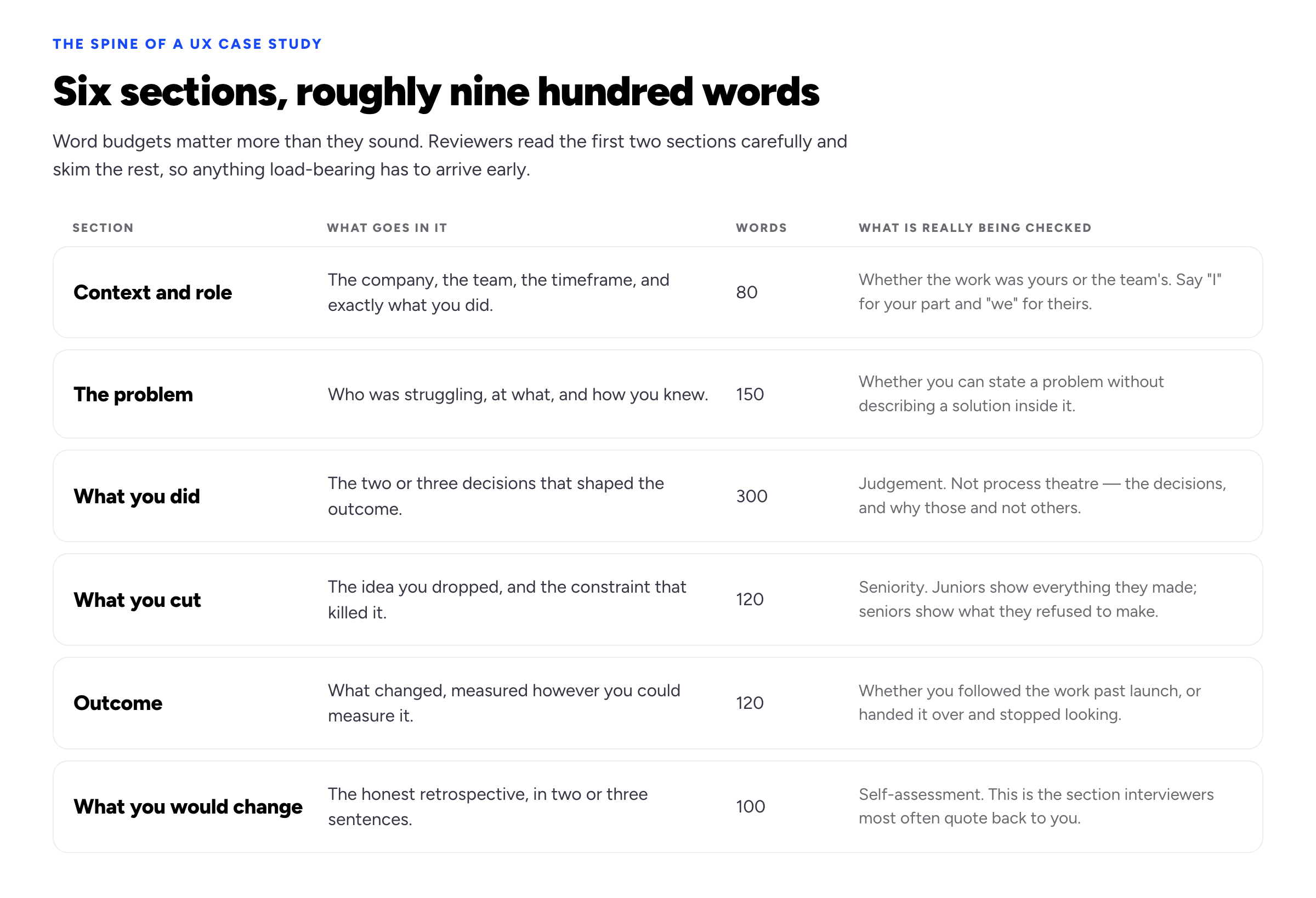
Nine hundred words total. The two sections people skip are the two that signal seniority.
Context and role
Company, team, timeframe, and precisely what was yours. The pronoun discipline matters more than it sounds: use we for what the team did and I for what you did, consistently, and never let a case study leave the reader unsure which is which. Interviewers probe this directly, and a portfolio that blurs it turns a good conversation into an interrogation.
The problem
Who was struggling, at what, and how you knew. The test of a well-stated problem is that it contains no solution. "Users needed a dashboard" is a solution wearing a problem's clothes. "Support was answering the same question about invoice status forty times a week, and the answer was already in the product" is a problem — and it makes the eventual design decision legible, because now the reader can see what you were aiming at.
What you did
The largest section, and the one most often misused. It should contain the two or three decisions that shaped the outcome, and for each one: what you chose, what you chose it over, and why. Not a chronology of your week. If a sentence would be equally true of any project you have ever worked on, cut it.
What you cut
The idea you dropped and the constraint that killed it — an engineering limit, a deadline, a legal requirement, a research finding that contradicted you. This section is short and does an unreasonable amount of work, because it is the clearest available evidence that you design inside reality rather than inside a case study.
Outcome
What changed, measured however you could measure it. If you have numbers, give the baseline alongside them: "support tickets about invoice status fell from about forty a week to under ten over two months" is worth more than "reduced tickets by 75%", because it tells the reader what was actually going on. If you have no numbers, say what you do have — a qualitative finding, a shipped date, a decision the team took as a result — and say plainly that the metric was not instrumented. Inventing a percentage is the single fastest way to lose a reviewer who has ever owned a metric.
What you would change
Two or three honest sentences. This is the section interviewers most often quote back at you, and the one juniors most often leave out because it feels like an admission. It reads as the opposite.
A case-study skeleton you can copy
The spine is easier to agree with than to apply, so here it is as literal placeholder text. Copy it, replace everything inside [square brackets], and keep each word count visible while you write. The counts are the point. If a section comes in at double its budget, that is rarely a sign you had more to say — it usually means one section has started doing another section's job.
Context and role — 80 words
[Company]is[what it does, one clause]. Over[timeframe]I worked with[team size and roles]on[the surface or system]. I owned[the specific screens and decisions that were yours].[Colleague's role]owned[the adjacent piece], which is out of scope here.
Eighty words is four sentences, deliberately: this section is orientation, not narrative. If you cannot name what was yours in a single clause, resolve that before writing anything else — every later section inherits the ambiguity.
The problem — 150 words
[Who]were[doing what], and[what went wrong for them]. We knew this because[the evidence — a support volume, a drop-off between two steps, an objection sales heard repeatedly, five of six people in a usability session]. It mattered to the business because[the commercial consequence]. We agreed before starting that success would look like[the observable change in behaviour].
Read it back with one test: does any sentence name a screen, a feature or a pattern? If so you have written a solution and labelled it a problem. Take the noun out and describe the behaviour that was going wrong.
What you did — 300 words
Three decisions shaped the outcome.
One. I chose
[option A]over[option B]because[the evidence or constraint that settled it]. The cost was[what got worse], which we accepted because[reason].Two.
[Same shape: the choice, the alternative, the reason, the cost.]Three.
[Same shape again.]
[Artefact]appears below because it changed[the specific thing it changed]. The rest of the research is summarised in the line above rather than shown.
A hundred words per decision is enough for the choice, the alternative and the reason, and not enough for a chronology. That is the intended effect.
What you cut — 120 words
We designed and dropped
[the idea]. It failed on[the constraint — an engineering limit, a deadline, a legal requirement, a research finding that contradicted us]. We shipped[the smaller thing]instead, which covered[the part of the need it did cover]and left[what is still unsolved].
Outcome — 120 words
Before:
[the baseline, with the period it was measured over]. After:[the same measure, over a comparable period].[One other thing you can personally attest to: a support workflow retired, a decision the team took, a follow-on project it unblocked.][If the change was never instrumented, say so plainly here in one sentence, and say what you have instead.]
What you would change — 100 words
If I ran this again I would
[the change], because[what you learned during the project that you did not know at the start]. The thing I still do not know is[the open question], and I would find out by[how].
When the skeleton is filled in, do one pass with a highlighter: mark every sentence that would remain true if you swapped this project for a different one, then delete what you highlighted. What survives is the case study. What you deleted is the part that made it read like everyone else's.
A weak opening, rewritten
Both versions below are invented — the company, the numbers and the colleague do not exist. They show what the spine does to the first paragraph, which is the only paragraph you can rely on being read. Here is an opening in the shape most case studies arrive in:
Northwind is a fast-growing logistics platform on a mission to revolutionise how retailers move goods. As the lead designer on this project, I was tasked with redesigning the shipment tracking experience to create a more intuitive and delightful user journey. I began with a competitive audit, followed by stakeholder interviews and the creation of two personas, before moving into ideation, wireframing and high-fidelity design.
And the same project opened against the spine:
Northwind sells shipment tracking to mid-size retailers. Over eleven weeks I worked with a product manager and two engineers on the tracking page; I owned the page itself, and a colleague owned the notification emails, which are out of scope here. Retailers were ringing their account manager to ask where a shipment was — around forty calls a week — when the answer was already on a page they had not found. The job was to make the calls stop.
Five changes, each doing a specific thing:
- The company description lost its adjectives and gained a customer. "Fast-growing" and "on a mission to revolutionise" are unverifiable and say nothing about the design problem. "Sells shipment tracking to mid-size retailers" gives the domain, the buyer and roughly the complexity in seven words.
- "Lead designer... tasked with" became a boundary. The original states a title; the rewrite states scope, including what was not yours. Naming the piece you did not own buys disproportionate trust, because it is the sentence someone with something to hide does not write.
- The process list went entirely. Audit, interviews, personas, ideation, wireframes — five artefacts, no information, and anyone who has finished a UX course has produced all five. Those words are better spent on the one finding that changed the design.
- The problem arrived with evidence attached. "More intuitive and delightful" is a preference. "Around forty calls a week, when the answer was already on a page they had not found" is a diagnosis, and it implies the work without prescribing it — the issue is findability, not charm.
- The goal became a change in behaviour. "Make the calls stop" is checkable, so the outcome section now has something to be measured against. "A delightful journey" can never be shown to have happened.
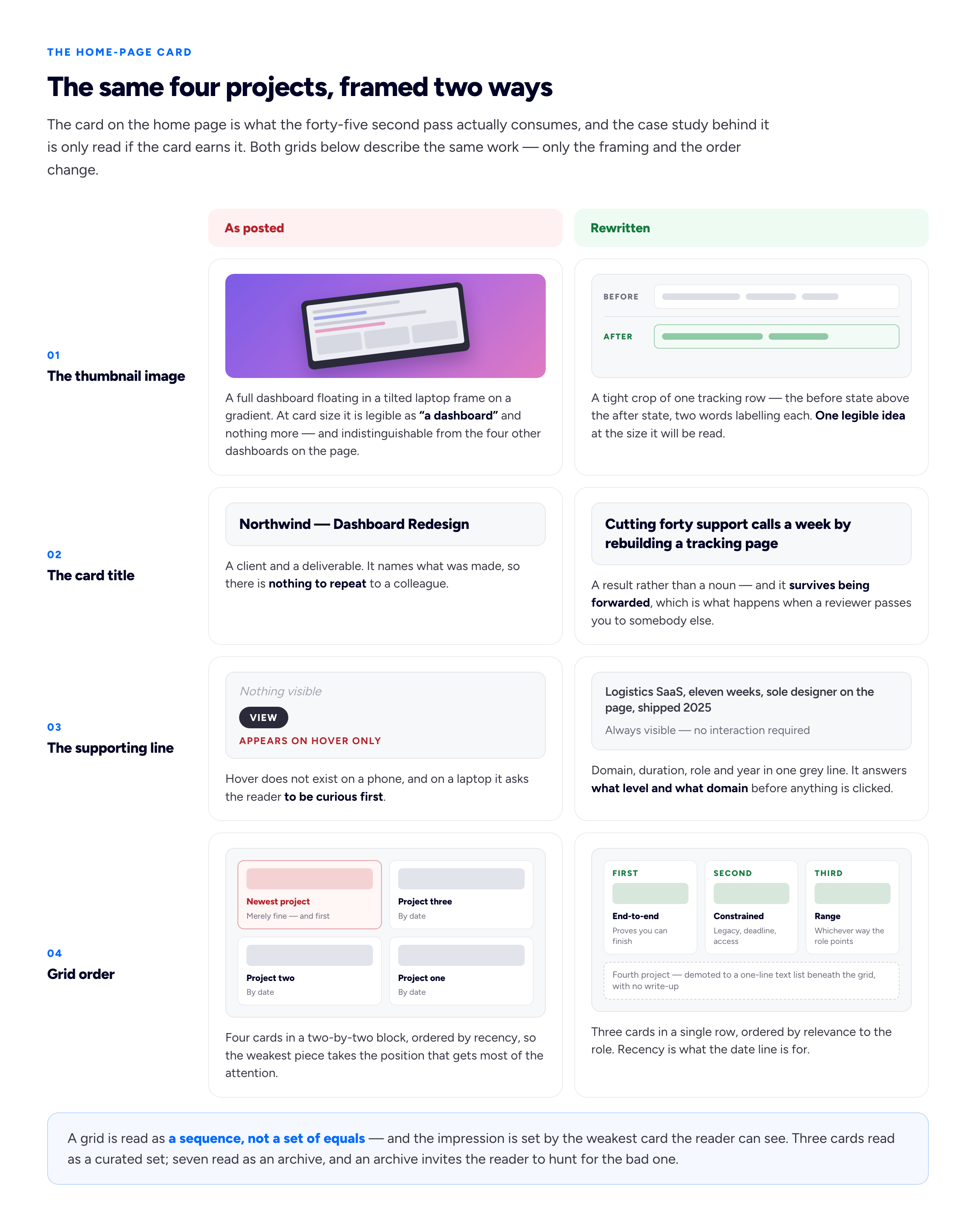
Both grids describe the same four projects. Only the framing and the order change.
Process theatre
The dominant failure mode in UX portfolios is not ugliness or thinness. It is length spent proving that you know the process — the affinity map, the persona set, the empathy map, the journey map, the crazy eights, all laid out in sequence as evidence of rigour.
The reason this backfires is that nobody doubted it. Every applicant has the same artefacts, produced by the same courses, and their presence carries almost no information. Worse, it consumes exactly the attention you needed for the decisions. A reviewer reading eleven screens of process before reaching a design choice has already concluded something about how you prioritise.
The fix is not to delete your research. It is to include an artefact only when it changed what you built, and to say what it changed in the same breath. "Five of six participants tried to search before browsing, so we moved search into the header and dropped the category landing page" earns its screenshot. A persona nobody consulted after week one does not.
Which projects, and how many
Three case studies is the working answer, and there is a specific reason not to go higher: reviewers form their impression from your weakest piece, not your strongest. A fourth project that is merely fine will lower the average of the set. If you have a fourth that is genuinely as strong, show it; otherwise it belongs in a one-line list rather than a full write-up.
Aim for the set to say something as a set. The most useful mix for most designers:
- One end-to-end project where you owned a problem from research through to a shipped result. This is the one that proves you can finish.
- One constrained project — a redesign inside a legacy system, a two-week deadline, an accessibility remediation. This proves you work in conditions that resemble the job you are applying for.
- One that shows range in whatever direction the role points: a systems or component-library piece for a product role, a research-led piece for a role in a research-mature team, a scrappy zero-to-one piece for a startup.
If you are targeting a specific domain — fintech, health, developer tools, marketplaces — say so on the home page and let the set reinforce it. A narrower claim is easier to believe and much easier to remember.
NDAs, unshipped work, and team work
Three situations that make people freeze, none of which need to.
Work under NDA. You can almost always describe the problem shape, your approach and the reasoning without naming the client, showing the interface or quoting figures. "A European retail bank, six-person team, twelve weeks" is enough context. Blur or rebuild the screens, and say explicitly that you have done so — a case study that acknowledges its own redaction reads as trustworthy rather than evasive. Check your actual agreement rather than assuming; the terms differ, and this is one of the things worth settling in the contract before the work starts.
Work that never shipped. Perfectly showable, provided you say so and say why. Projects are cancelled for reasons that have nothing to do with the design, and "this was ready to build when the team was reorganised" costs you nothing. What you cannot do is describe an outcome that never happened.
Work you did a small part of. Show it, scoped honestly. A clearly-bounded contribution to something large and real is more interesting than sole authorship of something small and invented. State the boundary in the first paragraph, not in a footnote.
What changes between junior and senior
The structure above is the same at every level. What changes is where the weight sits, and which sections are load-bearing.
The junior portfolio
A junior portfolio is judged on craft and on whether the person can be taught. It should show that you can execute cleanly, take a critique and reason about a decision — the "what you did" section carries it. Depth in one project beats breadth across four, and it is not close: two well-reasoned case studies out-perform five thin ones, because the weakest piece sets the impression and five pieces give a reviewer five chances to find it.
The real difficulty is what to show when you have not shipped anything, and the honest answer is concept work. The objection to concept projects is not that they are unpaid. It is that they have no constraints — and a design made without constraints can demonstrate taste but not judgement, which is the thing being assessed. A redesign of a famous app, done because its visual style is not to your liking, fails on exactly this point: no problem, no limit, no consequence, and so nothing for a reviewer to evaluate but the surface.
Concept work becomes credible when you supply the missing constraints deliberately and say that you have. Pick a product with a problem you can observe rather than assume, and describe how you observed it. Talk to five actual users of that kind of product — five is enough to produce findings you did not expect, and going and finding five is itself part of the evidence. Set yourself a real limitation and hold to it: build inside the existing design system, add no new backend capability, finish in two weeks. End on what you would test and how, rather than a claimed result. And label the work as self-initiated and unshipped in the first paragraph, not the last: a reviewer who discovers halfway down that it was hypothetical rereads everything above with suspicion, while one told in sentence two simply adjusts and carries on.
That settles a question which worries a lot of career-changers: whether a weak client project beats a strong student one. Usually it does not. The reviewer is reading for evidence of how you think, not for a logo. A paid project delivered with no research, no stated constraint and no reflection says little beyond the fact that somebody paid you. A course project built on a genuine problem, with honest reasoning and a clear-eyed retrospective, shows how you would behave on their team — which is what they are buying. The mistake is assuming "real client" does the work by itself. Choose whichever piece answers the six questions best, and label its origin accurately either way.
Then apply the credibility test, which is one sentence long: would this case study survive a reader who has already worked on this exact problem? Every number you cite needs a source you can name out loud in an interview. Every research finding needs to be research you ran, or research you attribute precisely to whoever did. Every "we" sentence needs to be safe to say in a room containing the rest of that team. Juniors most often fail this by overclaiming scope — "I redesigned the onboarding flow" for a project where you produced three screens under direction. The overclaim is rarely necessary and it collapses in the first five minutes of a conversation with someone who has run that project. If you are starting from nothing, our guide to building a portfolio with no experience goes further.
The senior portfolio
A senior portfolio is judged on judgement and on scope. The "what you cut" and "what you would change" sections stop being nice additions and become the whole point. So does the size of the problem: how you chose what the team should work on, how you handled a stakeholder who wanted something else, how you made a decision with insufficient research and a deadline. If your case studies at eight years' experience read like your case studies at two — thorough, well-executed, entirely about the interface — you will be read as mid-level regardless of the years listed.
When the reader is a client, not a hiring manager
Everything above assumes the person opening your portfolio wants to hire you into a team. If you freelance, a meaningful share of your readers are clients instead, and they read for something different enough that the same page can do well with one audience and badly with the other.
A hiring manager compares you against other candidates for a role that already exists, and reads for how you think, because they will sit next to that thinking for years. A client is assessing risk on a project they already have in mind, usually without the vocabulary to evaluate process at all. They cannot tell a good affinity map from a bad one and they know it, so they read for three things: have you done something recognisably like this before, will it be finished when you say, and how much managing will you need.
That changes a few concrete decisions. The home page needs a service and an enquiry route, not only a positioning line — a client who has to hunt for how to contact you will often just not. The commercial outcome has to move earlier in the case study, because a client skips to the end and works backwards. The "what you cut" section, which impresses hiring managers, can read to a nervous client as a project that did not get finished, so frame it as scope control: "we deferred the bulk-export screen to protect the launch date" says the same thing and reassures instead of alarming. Testimonials, which barely register in a hiring process, do a great deal of work here — one specific line from a named client about delivery is worth several paragraphs of your own prose, and asking for one is easier than most people expect. And the questions a client will not ask you before deciding — availability, how you work, roughly what a project costs — need answering somewhere on the site, because unanswered they simply become reasons not to enquire.
Those changes go deep enough that we have given them their own guide rather than compressing them here: see the freelance UX designer's portfolio for the client-facing version, including services, pricing signals and the enquiry path.
Practical things that quietly cost interviews
- A password on the portfolio. Every barrier loses a fraction of an audience that was already only half-interested. If some work must be gated, gate that work, not the site.
- A PDF as the primary artefact. Send one if a recruiter asks. Do not make it the only thing you have, and never make it a 40 MB one.
- Case studies buried behind a hover interaction. If the reviewer cannot see there are case studies without moving the mouse, assume they will not find them.
- Heavy image loads. A portfolio that takes six seconds to render its hero is making an argument about your attention to experience. Our portfolio SEO guide covers the thresholds this is measured against.
- No dates. Recency is part of the signal, and its absence is read pessimistically.
Frequently asked questions
How many case studies should a UX portfolio have?
Three full write-ups, with anything else reduced to a one-line list. Not because reviewers lack time for a fourth, but because they judge the set by its weakest visible member, so an average project actively costs you. Two is fine if both are strong; one is workable for a junior if it is genuinely deep.
Should my portfolio be a website or a PDF?
A website, with a PDF available if someone asks. Applications get forwarded as links, links can be updated after you send them, and a website can be found by someone who was never sent anything. A PDF has one real advantage — it survives an agency's internal process intact — so keep a current one under about 10 MB and treat it as a leave-behind. The résumé and the covering note that travel with the application are separate documents again: our free résumé builder exports a one-page PDF carrying a small "Created with Bunfolio" credit at the foot, and the cover letter generator drafts the letter from the advert and your own notes.
Is it acceptable to password-protect my portfolio?
Gate individual case studies, not the whole site. A site-wide password removes you from every search a recruiter might run and adds a step for someone only mildly interested, which is most of them. If one project must be protected, gate that project, publish the rest, and put the password in the application rather than making people ask.
Can I show work that is under NDA?
Usually, in reduced form — but read the agreement rather than guessing, because terms differ and some are stricter than people assume. Normally safe: the shape of the problem, your reasoning and your role, without the client's name, the real interface or the actual figures. Say in the case study that it has been redacted, and why. Our guide to showing confidential work covers the wording.
How long should a UX case study be?
Around nine hundred words, a three to four minute read. Longer is justified only when the extra words are decisions rather than description — a two-thousand-word case study is nearly always a thousand words of process narration in a longer coat. If yours has run over, check the budgets: the overflowing section is almost always research.
What do I do with projects where I was one of six designers?
Show them, and state the boundary in the opening paragraph. Name what you owned, name what someone else owned, and use "I" and "we" consistently after that. A well-scoped contribution to a large real product beats sole authorship of something small and invented, and it is the honesty about the boundary — not the size of the contribution — that reviewers respond to.
Do I need to include my process artefacts?
Only the ones that changed what you built, and only alongside a sentence saying what they changed. Personas, journey maps and affinity diagrams are produced by every applicant, so they carry almost no signal while consuming the attention you needed for your decisions. One finding that overturned a plan is worth more than a full set of artefacts nobody consulted after week one.
How often should I update it?
Write the case study within a fortnight of a project ending, while you can still remember what you cut and why — that detail goes first, and it is the part that makes the write-up worth reading. Otherwise, put visible dates on your work and re-order the set whenever your target role changes.
How we put this guide together
The three-pass model, the six-section spine, the word budgets, the thumbnail test and the credibility test are our own recommendations. They come from what we see working on portfolios built with Bunfolio and from the consistent shape of how designers describe portfolio reviews going — a brief triage, one case study read closely, then a long conversation about a single project. The durations attached to each pass are rules of thumb describing observed behaviour, not measurements, and we would treat any confident statistic about portfolio reading time with suspicion, including one of our own. We have deliberately left out the round percentages that usually decorate advice like this, because we could not trace them to a primary source.
The general reading behaviour the model rests on is not ours and is properly sourced. Jakob Nielsen's How Users Read on the Web (Nielsen Norman Group, 1997) reports that people rarely read pages word by word and instead scan for individual words and sentences. Kara Pernice's F-Shaped Pattern of Reading on the Web (Nielsen Norman Group, 2017) sets out the eye-tracking evidence that first lines attract more gazes than later ones, and that the opening words of each line attract more fixations than those that follow, especially where formatting cues are weak. Nielsen's How Long Do Users Stay on Web Pages? (Nielsen Norman Group, 2011) is the source for treating the opening seconds of a visit as decisive. We cite these for the behaviour they describe, not for any number applied to portfolios; they are studies of web pages in general, and the oldest dates from 1997.
The guidance on stating baselines rather than bare percentages, on labelling redacted, unshipped or concept work, and on separating "I" from "we" reflects a single underlying principle: a claim a reader can check is worth more than a claim they cannot. That is also the substance of Google's guidance on creating helpful, reliable, people-first content, which asks whether content demonstrates first-hand experience and makes its sourcing clear. On accessibility work specifically, the W3C's WCAG standards are the reference point worth citing in a case study rather than describing informally.
All example copy is invented to demonstrate a shape, not drawn from a real engagement: the invoice-status tickets, the European retail bank, the search behaviour, and the Northwind logistics example in the before-and-after rewrite, including its colleague, its eleven weeks and its forty calls a week. No real designer's portfolio, screenshots or wording appear anywhere in this guide.
Related reading: how to write a portfolio case study, the freelance UX designer's portfolio, building a portfolio with no experience, and how many projects to put on a portfolio website.
More from the blog
September 24, 2026 · 18 min read
Brand Designer Portfolio: Show the System, Not Just the Logo
Most brand designer portfolios are one logo on six mockups, which answers none of the questions a client is actually asking. Here is how to structure an identity case study that shows the whole system...
September 22, 2026 · 16 min read
Graphic Designer Resume: Set It Like Type, Not a Template
A graphic designer resume is marked twice: once for what it says and once as a piece of design. Here is how to set one that impresses a design lead and still parses in an applicant tracking system — o...
September 4, 2026 · 25 min read
Portfolio Images: Choosing the Thumbnail That Gets a Project Opened
Every visitor sees your grid; only some open a project. Which of the six frames you already have should lead, how to crop for a tile rather than a page, why a consistent grid beats individually better...