
July 18, 2026 · 20 min read · Updated September 25, 2026
Personal Website Examples, and the Decisions Behind Them
Not another gallery of screenshots. The four jobs a personal website quietly does, the six patterns the good ones share, the failures that recur just as reliably, and how the right answer changes with your situation.
Search for personal website examples and you get galleries: thirty screenshots, a one-line caption each, and no explanation of why any of them works. They are pleasant to scroll and close to useless the moment you sit down to build your own, because the thing you actually needed was never the visual. It was the decision underneath the visual.
So this guide inverts the format. We are not going to reproduce, screenshot or rank anyone's site. Instead we will describe what the personal sites that work have in common — the jobs they are quietly doing, the wording patterns that recur, the failures that recur just as reliably, and how the right answer changes depending on whether you are a graduate, a career-changer, an engineer, a writer or a consultant between contracts.
Every person, site and line of copy below is invented for illustration. The patterns are not.
The four jobs a personal website actually does
Before you look at a single layout, it helps to be honest about what the page is for. In our experience there are four jobs, and a site that does two of them well beats a beautiful one that is not clear which it is doing.
It is proof of work. Anyone deciding about you — a hiring manager, a client, a conference organiser, a potential collaborator — wants evidence that is not a claim about yourself. A CV is a claim. A finished thing with your name on it, described in your own words, is evidence. This is the job most personal sites are built for and the one they most often under-serve, because people spend their effort on the header and their last thirty minutes on the work.
It is a stable address you own. Platforms change their rules, their layouts and sometimes their existence. Your profile on any of them is rented. A domain you control is the one address that survives you changing jobs, changing platforms, going freelance, going back in-house, and deleting your accounts in a bad week. That permanence is worth more than any single feature a platform offers.
It is the destination for a bio link. Every profile you have gives you one link. That link has to lead somewhere that explains you completely to someone who arrived with no context and will give you about fifteen seconds. A personal site is the only page you control that can do that.
It is a filter. This is the job people notice last and value most. A specific site attracts fewer enquiries and better ones. When your page says plainly that you build accessible design systems for regulated industries, the agency looking for a cheap logo does not write to you, and the fintech that needs exactly that does. Fewer, better-fitting enquiries is a real outcome, and it comes from specificity rather than polish.
Now the job it does not do. A personal website will not, on its own, bring you traffic. Nobody wakes up and searches for a person they have never heard of. The site converts attention you have already earned somewhere else — a conference talk, a good answer in a community, a referral, a LinkedIn post, a cold email. It is a closing tool, not a discovery channel. You can layer discovery on top by publishing, and that works, but it is a separate project with a separate timeline. If you build a personal site expecting an audience to arrive because it exists, you will conclude it failed when it was never doing that job.
Personal website vs portfolio vs personal brand site vs CV site
Here is the most common mistake, and it happens before anyone opens a design tool. These four things get treated as synonyms. They are four different documents with different readers, different success conditions and different correct lengths. Building the wrong one is why so many personal sites feel vaguely unsatisfying to their owners without the owner being able to say why.
A portfolio is read by someone assessing your craft. Its job is to prove capability through work, so it is mostly projects, and it succeeds when a stranger can judge your standard without speaking to you. Depth beats breadth. A designer, developer, photographer or illustrator usually needs this one.
A CV site is read by someone verifying your history. Its job is to be scannable and complete: roles, dates, scope, education, a way to download a PDF. It succeeds when a recruiter finds the fact they were looking for in under a minute. It is deliberately boring, and that is correct. People in structured career tracks — finance, medicine, academia, law, large-company operations — are usually best served here.
A personal brand website is read by someone deciding whether to follow you or book you. Its job is to establish a point of view, so it leads with writing, talks, a newsletter, an idea you are associated with. It succeeds when people subscribe or invite you to things. Consultants, coaches, speakers and independent writers need this, and almost nobody else does — it is the highest-maintenance of the four and quietly punishes anyone who is not publishing regularly.
A personal website in the general sense is the umbrella: a small home for you that can carry a bit of each. Its reader is anyone who just heard your name. Its job is orientation — who you are, what you do, what to do next — and it succeeds when a stranger understands you in fifteen seconds and knows how to reach you. This is the right default for most people, especially anyone whose work is not visual and anyone who is between things.
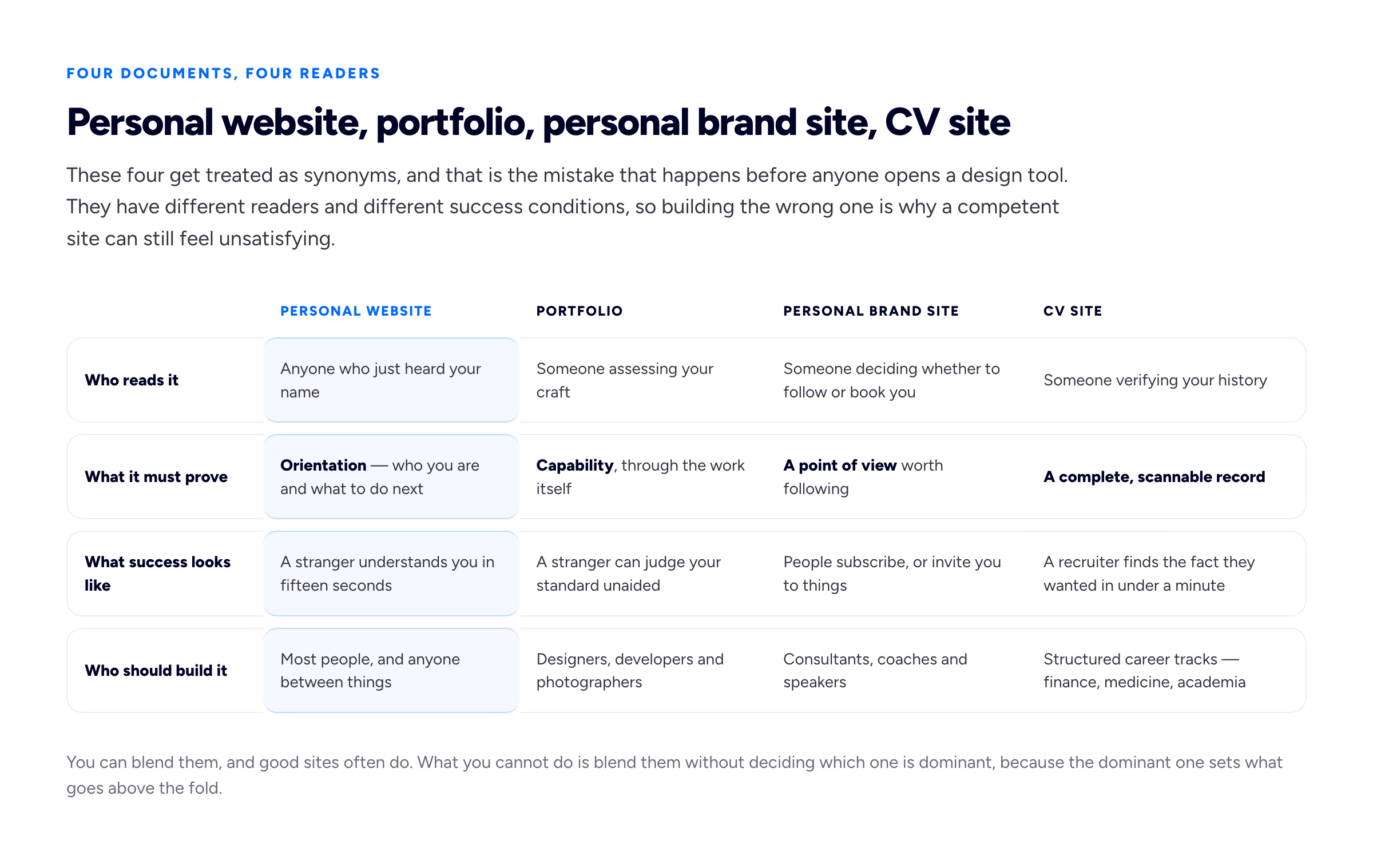
Most disappointing personal sites are competent versions of the wrong one of these four.
You can blend them, and many good sites do — a portfolio with a short CV page, or a personal site with three case studies attached. What you cannot do is blend them without deciding which is dominant, because the dominant one sets what goes above the fold. Pick the reader you most need to persuade, build for them, and let the others be secondary pages.
Six patterns the good examples share
Across the personal sites that do their job, the same six structural decisions keep appearing. None of them is about aesthetics, which is why galleries cannot teach them.
A positioning line, not a job title. "Product Designer" tells a reader nothing they cannot get from your LinkedIn headline. A positioning line names who you help and what changes. Compare an invented example: "Senior Product Designer" against "I design onboarding flows for B2B software companies, usually where activation has quietly stalled." The second is longer, less elegant, and immeasurably more useful. It is also the single highest-leverage sentence on the page — if you change nothing else after reading this, change that.
Above-the-fold clarity about who you help. Someone landing from a bio link should not have to scroll to learn what you do. The first screen carries your name, the positioning line, and one visible next action. That is enough. Ambient video, a full-bleed abstract gradient and a single word in 120px are all ways of spending your best real estate on decoration.
Evidence before personality. The instinct is to open with your story. Readers want to know whether the work is any good before they care who you are. Put a strip of work, a client list, a testimonial or a shipped result early, and let the personal narrative earn its attention afterwards — which it will, once the work has done its part. Our guide to writing an about page that does not read like a diary goes into what that section should carry once it has been demoted from the top.
One obvious next action. Good sites want one thing: email me, book a call, read the newsletter, view the work. Sites with five equally weighted calls to action get none of them. Choose the action you actually want and make everything else visually quieter.
A contact route that does not depend on a form. Publish an email address as text a human can copy. Forms fail silently, land in spam folders, get eaten by plugin updates, and give the sender no record of what they wrote. Keep a form if you like the structure it imposes, but never as the only route. This is the failure that most reliably costs people work, and its victims never find out it happened.
A visible freshness signal. Something on the page should show the site is tended: a "last updated" date, a current availability line, a recent post, a dated project. Absent that, a reader has no way to tell your site from one abandoned four years ago, and the safe assumption is abandonment.
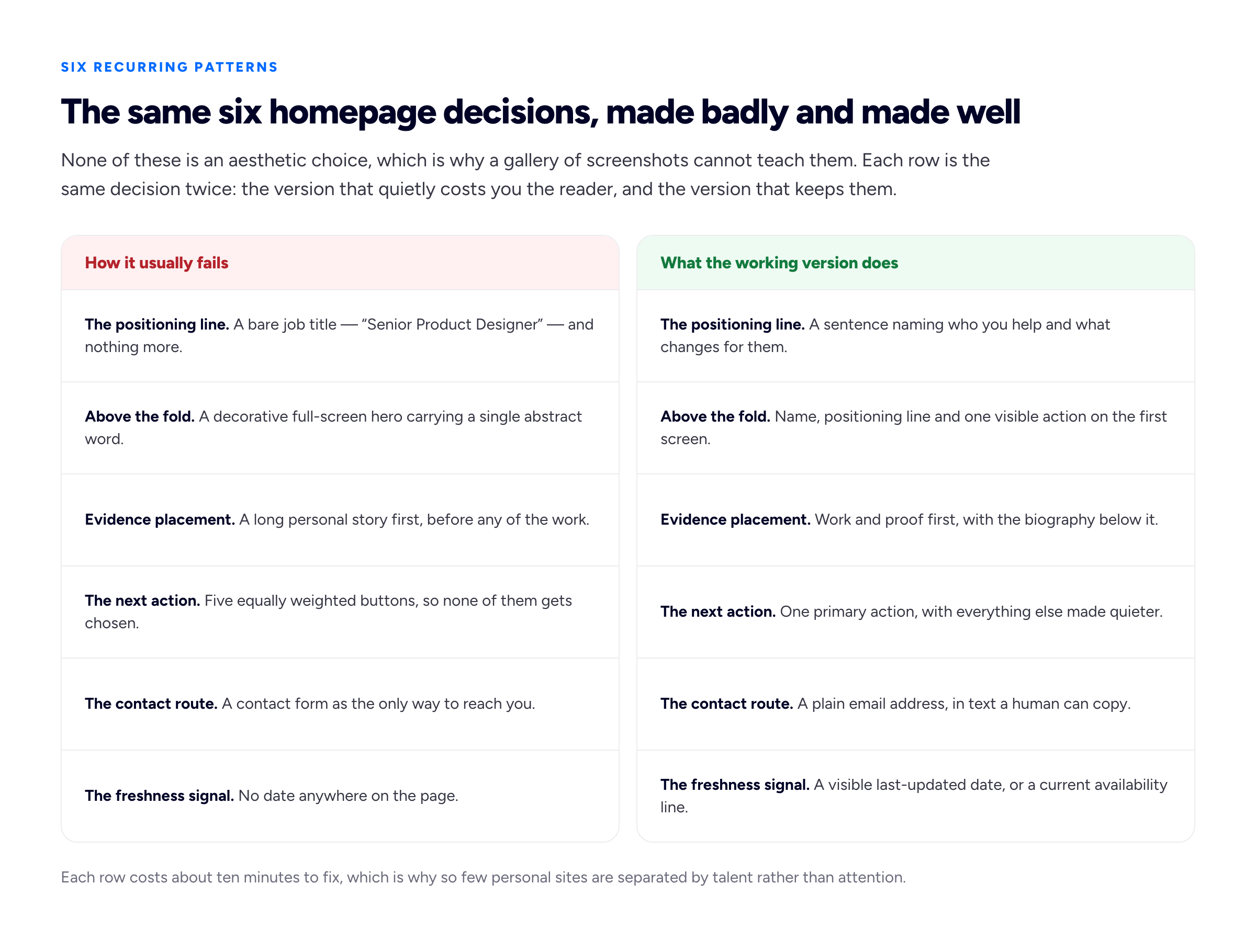
Each row costs about ten minutes to fix, which is why so few sites are separated by talent rather than attention.
The failure patterns, named
The mirror image is just as consistent, and worth reading as a checklist against your own draft.
The mysterious homepage. A beautiful page that never says what you do. Usually the result of treating the site as a design exercise rather than a communication one. If a friend outside your field cannot describe your job after reading the first screen, it is failing.
The "creative technologist" fog. Titles assembled from abstract nouns — "multidisciplinary maker", "digital storyteller", "creative technologist" — that sound expansive and commit to nothing. They are usually a hedge against narrowing, and they cost you the filtering job entirely. Narrowing is the point; we have written separately about whether to niche down and when it genuinely does not apply.
The animation that delays the content. A loading sequence, a staged fade, a scroll-jacked intro. Every one of these is a toll charged to the reader before they receive anything. Motion that decorates content already on screen is fine; motion that gates it is not.
The dead blog with three posts from 2019. A blog link in the main navigation is a promise. Three old posts break it in public and date your entire site. Either publish or remove the section — an empty room is worse than no room.
The contact form that goes nowhere. Covered above, but worth repeating because it is invisible. Send yourself a test message from a different device and a different email address at least twice a year.
The site that never says where you are or whether you are available. Time zone, country and current status are cheap to state and expensive to omit. A client who cannot tell whether you are in Lisbon or Auckland, or whether you are taking work at all, frequently just does not write.
Personal website ideas by situation
The right content depends almost entirely on where you are standing. These are invented composites, but each pattern is common.
Student or recent graduate. You have coursework, side projects and no clients, and the temptation is to apologise for that. Do not. Build a personal site — not a portfolio — with a positioning line about the direction you are heading, two or three projects written up properly including what you would do differently, and a clear note that you are looking for your first role. Two well-explained student projects beat eight thumbnails. Our guide to building a portfolio with no professional experience covers what counts as a project when you have not been paid yet.
Career-changer. Your site's job is to make the change feel deliberate rather than desperate. Lead with the new field, not the old one. Then include one short paragraph — genuinely one — that frames the previous career as an advantage rather than a gap. An invented example: a former nurse moving into health-tech UX writes "Eleven years in acute care, now designing the software clinicians actually use at 3am." That sentence does more than a chronology ever will. Keep the old CV accessible on a secondary page for anyone who wants it.
Engineer. Readers are technical and sceptical, so the site should be fast, plain and specific. Name the stack, the scale, the problem. Link the repository or the live thing. Skip the skills bar chart that claims you are 85 per cent proficient in Python; nobody has ever believed one. Depth on two systems beats a list of forty technologies, which is broadly what hiring managers say they look for in a developer's site.
Writer. The work is the product, so the site is mostly links and short framing. Group clips by the kind of writing rather than the publication, state who you write for, and keep an accessible copy of anything behind a paywall. A writer's portfolio that makes an editor hunt for a sample is failing at the only thing it does.
Consultant. This is the one case where a personal brand site is usually right. Lead with a point of view — the thing you believe that your market does not yet — then proof, then a booking route. Publishing is not optional here; the site only works if it is fed.
Freelancer between contracts. Add one line stating availability and the date. "Available for new projects from October" outperforms every clever hero sentence ever written, because it answers the question the visitor came with. Update it or delete it — a stale availability line is worse than none. The rest of the page should make replying easy, which is most of what turns attention into first clients.
Someone who mainly needs a link in bio. If your real audience lives on a platform and you just need a hub, build a single short links page: name, one line, three or four links, an email address. That is a legitimate personal website and it will take an evening. Do not let anyone talk you into an eight-page site you will never update.
The domain question
Of everything on this page, the personal website domain is the decision with the longest tail. Platforms are replaceable; the address is not. Every link anyone has ever sent about you, every citation, every profile field points at a string, and if you own that string you can change everything behind it without losing anything.
Buy yourname.com if you can. When it is taken — and for most common names it is — the realistic fallbacks, roughly in order: add your discipline (janeokaforwrites.com), add a middle initial, use a country code that reads naturally (.co.uk, .de, .ca), or use a modern extension that reads as intentional rather than cheap (.dev, .design, .studio, .ink). Avoid hyphens and number substitutions; they are hard to say aloud and look like spam in an email signature. The test is whether you can dictate it over a phone call without spelling anything twice.
A subdomain — yourname.someplatform.com — is a fine place to start and a poor place to stay. It works, it is free, and it gets you live this week, which matters more than anything in this paragraph. But the platform owns it, so moving later means every existing link breaks unless the platform redirects for you. Owning the domain means a future move is a DNS change and a set of redirects rather than a restart; Google's own guidance on moving a site with URL changes describes what that migration involves, and the short version is that it is manageable when you control the address and messy when you do not. Bunfolio gives every account a subdomain immediately and lets you attach your own domain, as an optional paid add-on, whenever you buy one, which is roughly the order we would recommend regardless of platform: publish first, then own the address.
Platform trade-offs, honestly
There is no universally correct answer here, and anyone who tells you otherwise is selling something.
Hand-rolled, or a static site on GitHub Pages. Choose this if you write code and want total control. A GitHub personal website is free, fast, version-controlled, and hosted from a repository — GitHub's Pages documentation covers custom domains and HTTPS, so you are not giving anything up technically. The cost is real but not upfront: it is the small ongoing tax of a build step, dependency updates and the fact that a content change requires a commit. A developer who wants full control should absolutely hand-roll it, and we would not try to talk them out of it.
Squarespace and similar general builders. A Squarespace personal website makes sense if you want visual control, expect to grow into commerce, bookings or a mailing list, and are comfortable paying monthly for it. You get a mature editor and a large supply of personal website templates. The costs are the subscription, a learning curve that is steeper than it looks, and the standing invitation to redesign your site instead of updating it. If you enjoy design work, that invitation is a feature; if you do not, it is how a site takes four weekends.
A focused portfolio builder. This is the narrow case: you want the site live today, you do not want to make design decisions, and your content is a person and their work rather than a shop. Bunfolio sits here deliberately — four fixed templates, no page builder, sign in and fill a form or import from LinkedIn. That constraint is the product, and it is also the reason it is wrong for anyone who wants a bespoke look or a custom feature. Know which you are before you pick.
On free personal website templates generally: they are fine, and template quality is rarely what separates a working site from a dead one. Choose one that is fast, readable on a phone, and does not require you to fill nine sections you have no content for. Then stop looking at templates, which is the harder instruction.
Personal website design, and how much of it matters
Design matters at the threshold and then stops paying. A site that is legible, fast, and obviously maintained clears the bar for almost every reader. Beyond that, additional polish mostly reassures its owner. The exceptions are the visual disciplines, where the site is itself a work sample and craft is being assessed directly.
Two things are worth genuine attention. The first is speed, particularly how quickly the main content appears — the Core Web Vitals documentation is the standard reference for what to measure, and the practical implication for a personal site is to keep images sensible and not to gate content behind script. The second is that it works on a phone, because a bio-link visitor is almost always on one.
Whether the whole thing lives on one scrolling page or several is largely a content question rather than a design one, and we have covered the one-page versus multi-page trade-off separately. For a first personal site, one page is nearly always right.
Maintenance: the smallest set worth keeping alive
Most personal sites die of neglect rather than bad decisions, so it is worth knowing the minimum that keeps one credible.
- Availability or status line — monthly, or whenever it changes. The highest-value thirty seconds you will spend on the site.
- Positioning line — every six months. What you do drifts faster than you notice, and the line written two years ago usually describes a slightly different person.
- Work section — whenever something ships that is better than what is there. Adding is optional; replacing the weakest item is the actual discipline.
- Contact test — twice a year. Send a message through every route on the page from an address you do not own.
- Links and domain renewal — once a year. Dead outbound links and, far worse, an expired domain. Turn on auto-renew and check the card on file is still valid.
That is the whole list. Notice that a redesign is not on it. If you have twenty minutes a quarter, spend them here rather than on the header.
Frequently asked questions
How do I build a personal website if I have never made one?
Write the positioning line first, in a plain text file, before choosing anything else. Then list what evidence you have. Then pick the smallest tool that can publish those two things this week — a builder, a template, or a static host if you code. Creating a personal website goes wrong most often when the tool is chosen before the content exists, because then the tool's empty sections start dictating what you write.
How long should a personal website be?
One page for a first site. Add pages only when a specific piece of content needs its own address — a case study long enough that it does not fit, or posts you intend to publish regularly. Pages should exist because content needs somewhere to live, not to make a menu look substantial.
Do I need a blog on my personal website?
No, and most people should not have one. A blog is the only reliable way to make a personal site a discovery channel rather than a closing tool, but it only works if you publish consistently for months. If you are not going to, a dead blog section actively damages the rest of the page.
Is a personal website worth it if I am not freelance?
Usually yes, for the stable-address job alone. Employed people change jobs, get asked to speak, apply for things, and occasionally need somewhere to point a stranger that is not a social profile. The site can be four paragraphs long and still earn its keep.
Should I put my photo on it?
Yes, one, looking like you actually look. It is a small trust signal and costs nothing. A clear phone photo in decent light is fine; a stock-styled corporate portrait is not better, and for some fields it is worse.
How we put this guide together
The framing here is ours, and it is worth naming exactly which parts are judgement rather than fact. The four-jobs model — proof of work, a stable address, a bio-link destination, a filter — is our own way of describing what people are actually buying when they build a personal site, as is the accompanying claim that the site does not generate its own traffic. The four-document comparison of personal website, portfolio, personal brand site and CV site is our categorisation, not a standard anyone else uses. The six recurring patterns and their failure counterparts, the situation-by-situation content advice, and the domain recommendations are all judgement formed the same way: from working with freelancers, designers, developers and writers building portfolio sites on Bunfolio, and from watching which pages get replies and which get polite silence.
Where a claim is technical rather than editorial, it is sourced. What a site migration involves, and why controlling your own address makes one manageable, is described in Google's documentation on moving a site with URL changes; the general guidance on how pages are understood and described comes from the Search Central SEO starter guide. The performance advice points at web.dev's Core Web Vitals rather than any number we made up. That a GitHub personal website supports custom domains and HTTPS comes from GitHub's own Pages documentation.
We deliberately did not quote a figure for how many recruiters or clients visit a candidate's personal website before deciding, or for how long a visitor spends on one. Numbers for both circulate widely and we could not trace either to a primary source we were willing to stand behind, and an invented statistic would be worth less than saying plainly that we do not know. The fifteen seconds mentioned above is a working assumption for how to write, not a measurement.
Every person, site and line of copy in this guide is invented for illustration, including the nurse moving into health-tech and the domain examples. We have not reproduced, screenshotted or ranked any real person's personal website, partly because we do not have the rights to and mostly because a gallery of other people's sites teaches you less than one honest paragraph about what those sites have in common.
Related reading: portfolio website examples and the decisions behind them, how to write a portfolio about page, which is the section most personal sites get wrong after the positioning line, connecting a custom domain to your portfolio for the practical side of the domain advice above, and building a freelance portfolio website that wins clients if the site's job is bringing in work rather than orientation.
More from the blog
October 6, 2026 · 26 min read
What Is a Portfolio Website? Definition, Types and Examples
A portfolio website is a site you own that shows samples of your work. Here is the plain definition, what a personal portfolio means, the eight different kinds of portfolio and who asks for each, what...
October 2, 2026 · 15 min read
How to Start a Cover Letter: Greetings, Opening Lines and Examples
Start with your details and the date, a greeting to a named person or "Dear Hiring Manager", then an opening that names the role, gives one specific hook and says why this employer. Greetings compared...
September 27, 2026 · 22 min read
How to Write a Letter of Presentation (With 6 Examples)
A letter of presentation is what Spanish, Italian and Portuguese speakers call a cover letter, and it also means a letter introducing yourself or your services to a prospective client. What each meani...