
September 9, 2026 · 19 min read
Motion Design Portfolio: What Studios Look At Before the Reel
A showreel proves something moved well. It cannot prove you designed it, timed it, or built any of it — and on a five-craft job the silence reads as a claim to all of it. Why style frames outrank the reel, the artefacts that prove authorship, and how to credit a slice without diminishing it.
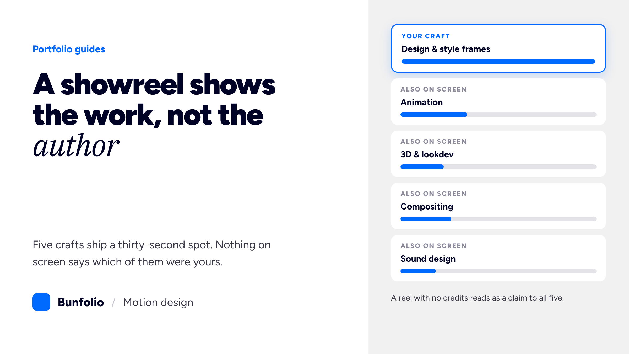
A showreel is a compilation of moments in which something moved well. That is the format's whole strength and its whole problem at once: seventy-five seconds of other people's brands, cut to a track you did not write, in which nothing on screen states which of the five separate crafts were yours. The viewer sees a finished spot. They cannot see whether you art-directed it, animated someone else's boards, built the 3D, comped it, or delivered the fourteen social cutdowns after everyone interesting had left the project.
This is the specific reason motion design portfolios underperform the work in them. The advice everyone is given — cut a reel, put your best shot first, post it — is sound and insufficient. It solves the attention problem and leaves the attribution problem completely untouched, and attribution is the thing standing between a reel that gets watched and a reel that gets a reply. The people hiring you have watched hundreds of reels made by people whose actual contribution was a fortnight of rotoscoping.
So this guide is about the parts of a motion portfolio that are not the reel: the style frames that decide whether a studio thinks you can design, the process artefacts that prove the movement was yours, how to state your slice of a five-craft job without diminishing it, what to do about sound you did not make, and the peculiar trap of being judged on a personal website that is itself a piece of motion. Reel-first page architecture, hosting and embed settings are already covered in our guide to a video editor portfolio website, and most of it transfers unchanged — this post does not repeat it.
What a reel cannot tell anyone
Three things, and all three are what you are being assessed on.
It cannot show design decisions, only their outcome. Motion design is two jobs welded together. One is deciding what a thing should look like — the type, the palette, the grid, the composition, the visual idea that makes a thirty-second spot about mortgage rates worth watching. The other is making it move with weight and timing. A reel demonstrates the second job continuously and the first job only by implication, because a beautiful frame that somebody else designed looks exactly like a beautiful frame you designed once it is in motion at 25 frames a second.
It cannot separate you from the team. A single finished spot routinely contains a director, a designer on boards and style frames, one or more animators, a 3D generalist, a compositor and a sound designer. Your reel shows the sum. Every other reel shows the sum too, which is why an experienced studio lead watches reels with a running internal question — what did this person actually do — and gives the benefit of the doubt to nobody.
It cannot survive being paused. Motion forgives a great deal. Timing, sound and momentum carry frames that do not hold up as stills, and everybody in the field knows this, so the reviewing habit is to scrub and pause. If your work only reads at speed, pausing is where it comes apart. This is not a reason to make cautious work; it is a reason to know which frames of yours you would be happy to have frozen, and to make sure those are the ones you also publish as stills.
None of that argues against a reel. The reel is still how you get watched at all. It argues that the reel is the trailer and the portfolio is the film, and most motion designers publish only the trailer.
Style frames are what studios hire on
If you take one thing from this guide, take this. Ask anyone who staffs a motion studio what they look at after the reel and the answer is some version of the boards. Style frames — the static, fully designed key frames that sell a look before a single keyframe is animated — are where design taste is legible and uncontaminated by movement. They are also the artefact a studio needs from you in week one of a real job, before the animation starts, which makes them a straightforward test of whether you can do the part of the work that happens before the fun part.
Publish them properly. A style frame shown at 400 pixels wide is decoration; shown large, it is evidence. For each opened-up project, show three to six frames at a size where the typography is readable and the texture is visible, and write two lines beside them about the decision: why this palette, what the type is doing, what the client's brand guidelines forbade, what the first version looked like before it was rejected. That last one is disproportionately persuasive, because a rejected direction shown next to the approved one proves you generate options rather than one idea you then defend.
The same logic applies to the animatic. A rough animatic — boards with timing, scratch VO, no polish — is the least glamorous thing you own and one of the most convincing, because timing is the hardest part of the craft to fake and an animatic is nothing but timing. Showing a boards-to-animatic-to-final progression for a single project does more to establish that you can run a job than three more finished spots.
The artefacts, and what each one proves
A motion project leaves a trail. Most designers publish only the last item on it and quietly discard everything that demonstrated how they got there.
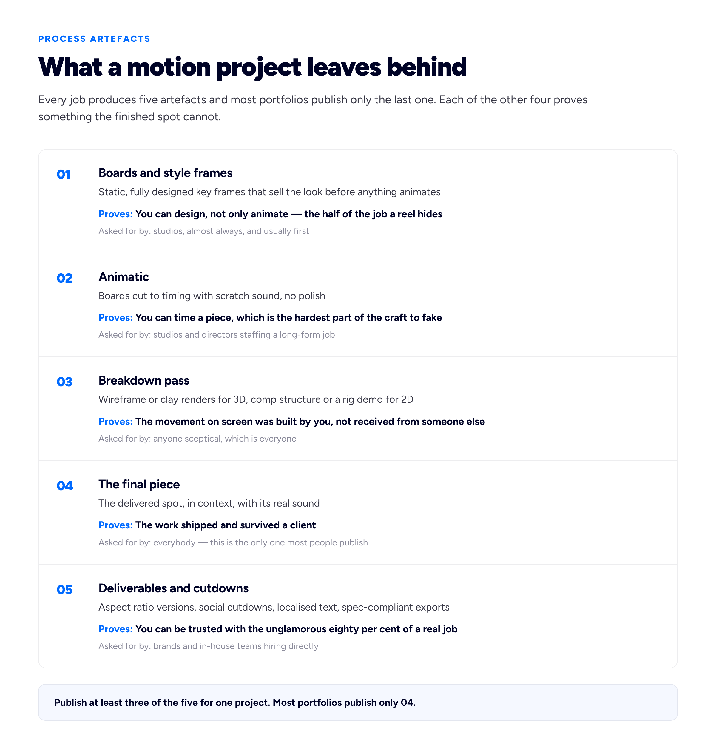
The breakdown pass is the single most underused artefact in the discipline — it is proof rather than assertion, and it takes an afternoon to export.
The breakdown deserves its own note because it answers the credit question without you having to make a claim. A wireframe or clay-render pass beside the final 3D shot, a comp structure screenshot, a short screen recording of a rig being driven by its controls, a before-and-after of a tracked and cleaned plate — these are all things you can only show if you built them. They read as confidence rather than defensiveness, and they are the closest thing motion has to a developer's commit history.
Five crafts, one spot: state your slice
Naming what you did not do is the most credibility-generating move available to you, and motion designers resist it harder than any other discipline because the work is collaborative and the reel format encourages a shared silence about it. That silence is not neutral. A reel with no credits reads, to a studio lead, as a claim to all of it — and the first time a reference call contradicts that claim, everything else on your site becomes suspect.
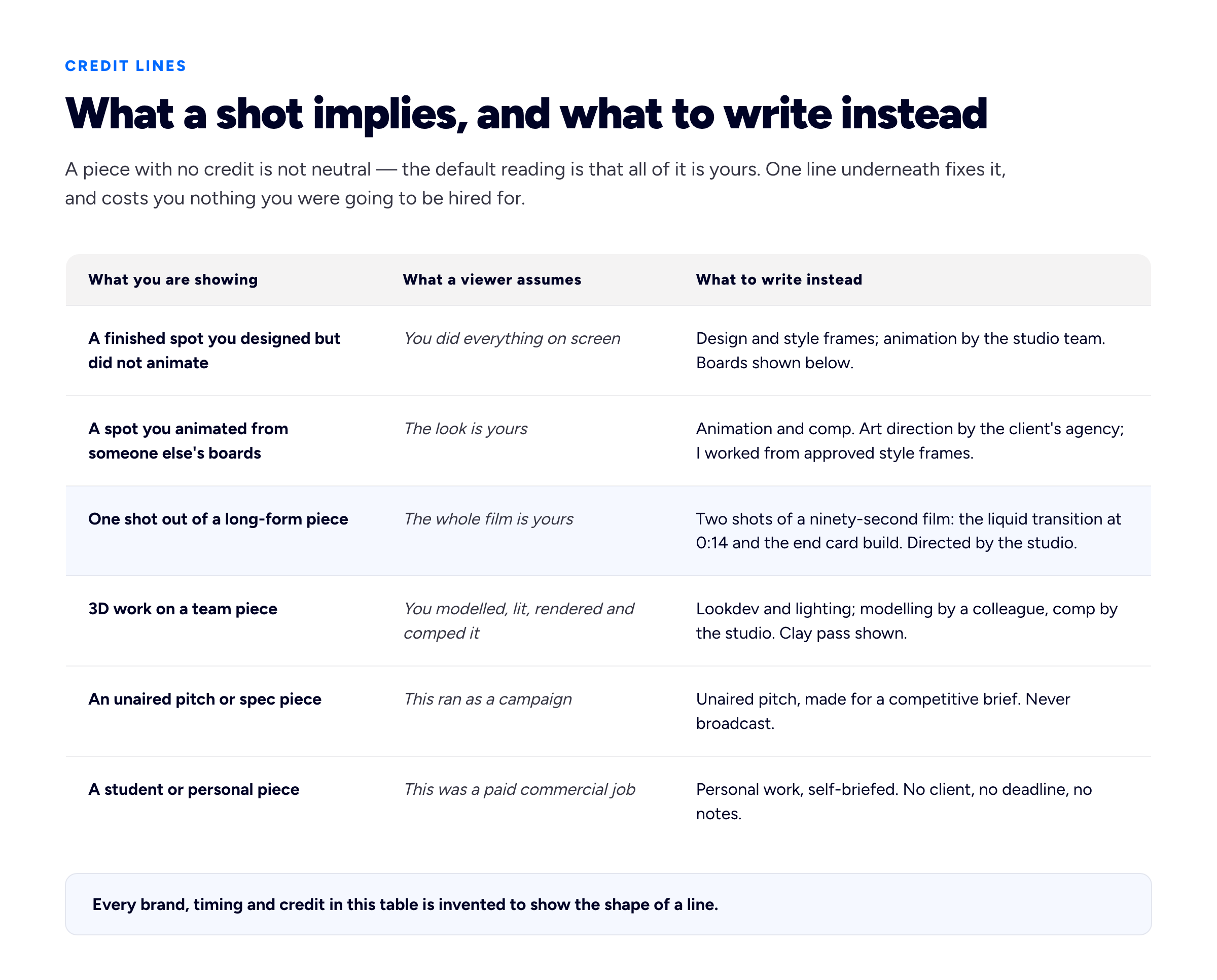
Each replacement is one line, sits under the piece, and costs you nothing you were actually going to be hired for.
Two refinements. First, be specific about time — "the liquid transition at 0:14" is a credit a reader can verify by watching, and verifiable credits make the unverifiable ones believable. Second, do not over-apologise. "Animation and comp, working from approved style frames" is a professional description of a professional job; "I only did the animation" is the same fact written by someone who has decided it is a weakness. Studios hire specialists constantly and are perfectly happy to hire an animator who cannot design, provided they know that is what they are getting.
The sound problem
Sound is doing more work in your reel than you are comfortable admitting, and everyone reviewing it knows the trick, because they have used it. A cut on a beat reads as intentional timing. A whoosh reads as weight. A well-chosen track carries mediocre pacing for a full minute. This has two consequences and both are practical.
Credit the sound designer, or say there wasn't one. If the spot had a composer and a sound designer, name them. If you cut your reel to a commercial track, that is not sound design and should not be presented as though it were. Where you genuinely did design sound — and a growing number of motion designers do — say so explicitly, because it is a differentiator worth actual money and nobody can hear it in a reel otherwise.
The music on your reel is a licensing decision, not a taste decision. A popular track on a publicly hosted reel is the most common way a motion designer's portfolio gets muted, blocked or taken down, because the large platforms run automated content matching — YouTube's Content ID is the documented example — and a match does not care that your use felt harmless. Separately, the licence a client bought for a broadcast spot generally covers that client's use of that spot, not your republication of it on your own site; if you want certainty on a specific piece, that is a question for the contract or the client rather than for a blog. The low-friction answer is a properly licensed library track, or a composer you credit and pay, and it removes a whole category of problem permanently.
Whatever you choose, publish a reel that survives being watched silently, because a large share of first views are muted — on a phone, in an open-plan office, in a browser tab that was never given permission to make noise. If the cut only makes sense with the track, the cut is not finished.
Your own site is a work sample, which is a trap
Every discipline says its portfolio site should look good. For motion designers the claim is stronger and stranger: the site is itself a piece of motion, it is being read as one, and a portfolio full of brilliant work that scrolls badly genuinely damages you. Page transitions, hover states, the easing on a menu, whether a loop stutters — a reviewer notices all of it, in the same way a typographer notices your body copy.
The trap is that this invites overbuilding. The failure mode is a site with a four-second animated intro, a custom cursor, scroll-jacking, and a grid of twelve autoplaying loops that takes nine seconds to become useful on a phone — a site that demonstrates enthusiasm rather than judgement. Restraint reads as senior. A fast page with two or three pieces of exactly-right easing is a better sample of your taste than an experience.
Three things worth getting right, all cheap:
- Respect a reduced-motion preference. The
prefers-reduced-motionmedia query tells you the visitor has asked their operating system for less movement, often because motion makes them ill. Honouring it — pausing decorative loops, cutting parallax, keeping the content — is a few lines of CSS and it is, in a motion portfolio, a statement about craft rather than an apology for it. You of all people should be able to build a graceful reduced-motion variant. - Give autoplaying loops a stop. WCAG's Pause, Stop, Hide criterion asks that anything moving automatically for more than five seconds alongside other content can be paused, stopped or hidden. A wall of looping tiles is exactly the case it describes. A hover-to-play or click-to-play grid solves it and loads faster.
- Watch the flashing. The three-flashes criterion exists because rapid flashing can trigger seizures. Strobing, hard flash frames and high-contrast stutter are all live idioms in motion design, and a piece that is fine as a fifteen-second spot in a deliberate context is not fine autoplaying in a grid on a page someone arrived at from a search result. Put that piece behind a click.
On format: do not ship animated GIFs. A GIF is capped at 256 colours and has no real interframe compression, which makes it uniquely bad at precisely what motion design is made of — gradients, motion blur, soft light. A short muted looping MP4 or WebM with playsinline, a deliberate poster frame and lazy loading is smaller, sharper and controllable. Browsers permit muted autoplay by default and treat sound as the thing requiring permission; Chrome's autoplay policy documents the rules. Our guide to portfolio thumbnails covers choosing the still that represents a moving piece, which for motion work is a real decision and not a default export.
Spec work, unaired pitches and the labelling rule
Motion is unusual in how much of its most-admired public work was never commissioned. Concept rebrands, self-briefed title sequences, "what if this bank had a motion identity" — the field's culture accepts these as legitimate portfolio pieces in a way that, say, architecture does not. Use that. It is a genuine advantage when you are starting, and it stays useful later as a way to show the work you wish clients would ask for.
The rule is that the label is not optional and not small. A personal piece marked Personal work, self-briefed is a strength. The same piece with a real brand's logo on it, undated and uncaptioned, sitting between two commissioned jobs, is a thing a reviewer may reasonably read as a claim — and unaired-versus-aired is a fact that gets checked, because checking takes ten seconds. The same applies to pitches that lost: showing them is fine, showing them as campaigns is not, and "unaired pitch for a competitive brief" is a phrase that costs nothing and has occasionally started a conversation about the brief itself.
Work you are contractually not allowed to show at all is a different problem with its own answers — an embargo date, a redacted description, a private link for a specific recruiter. Our guide to showing confidential work covers the permission conversation and what to publish when the answer is no.
Know which lane you are selling into
"Motion designer" covers at least three jobs that are hired by different people looking for different evidence. Being explicit about which one you want is free and it stops you being assessed against the wrong standard.
- Studio and broadcast. Assessed on design taste and craft depth. Lead with style frames and one long-form piece opened up end to end. Deliverables literacy matters less; being able to hold a look across ninety seconds matters most.
- Brand and in-house, hired directly. Assessed on reliability and range. They are buying someone who will work inside existing brand guidelines, produce the fourteen cutdowns, hit the platform specs and not need managing. Show the guidelines you worked to and the deliverables list. This lane pays steadily and reads the least glamorous portfolio most favourably.
- Product and UI motion. A different craft wearing the same name — interaction states, transitions, micro-interactions, handoff to engineers, often as Lottie or as spec rather than as video. Assessed on whether your motion shipped inside a product and survived contact with a front-end team. A broadcast reel is close to irrelevant here; a prototype and a written motion spec are the evidence.
You can work across two of these. You cannot present the same undifferentiated reel to all three and expect it to read correctly in each, and the cheapest fix is a single explicit sentence near the top of the page saying what you do and for whom, which our guide to portfolio bios works through in detail.
When you have no client work yet
The usual starting position, and motion has better options than most fields, because the tools that make the work are also the ones that make the practice.
Self-briefed pieces work here — genuinely, not as a consolation — provided they are briefed like jobs rather than made like experiments. Give yourself a constraint, a duration, a format and an audience, because a piece made to a fifteen-second pre-roll spec with a real brand's existing guidelines demonstrates something an unconstrained abstract loop never will. A daily or weekly practice run for a season, published in public, is the other reliable route: it is visible proof of consistency, which is exactly the thing a first client is nervous about, and the archive tends to earn its own small audience.
Redesigning an existing spot is the most instructive exercise available and the most easily misread, so label it hard: the original, your version, and a paragraph on what you changed and why. Real work for a small organisation — a local festival's titles, a charity's explainer, a friend's product launch — beats all of it when you can get it, and comes with the thing self-briefed work never has: notes from someone who wanted something different. Our guides on building a portfolio with no experience and getting your first freelance clients go further.
Putting the page together
Reel at the top, three or four projects opened up beneath it, and an about section that names your lane, your tools and where you are. Depth over count — four projects with boards, breakdowns and honest credits will beat eleven finished spots in a grid, and our note on how many projects to show makes the general case. Give every project a real page with a URL you can send, rather than a lightbox, because a studio lead forwarding one specific piece to a colleague is a thing that happens and a modal cannot be forwarded.
Keep it fast and keep it yours. A site on a platform you control, findable when someone searches your name, is the version that still works when a portfolio host changes its terms — the trade-offs are in our comparison of Behance and Dribbble against your own site. Bunfolio exists to make that part take an afternoon rather than a fortnight, but the argument holds whatever you build it with. The afternoon you save belongs in the boards, not the build.
Frequently asked questions
What should a motion design portfolio include?
A reel, three or four projects opened up, and — the part most portfolios miss — the artefacts behind them: style frames, an animatic, a breakdown or wireframe pass, and the delivered cutdowns. Each project needs a one-line credit stating which of the crafts on screen were yours. The reel gets you watched; the artefacts and the credits are what convert a watch into an email.
How long should a motion design showreel be?
Short enough that it is all strong. Sixty to ninety seconds is the conventional range and the reason is simply that reviewers stop early, so length beyond your best material costs you rather than adds. Open on your strongest shot, not a logo sting, and put your name and email on an end card that stays on screen long enough to be read or screenshotted.
Do I need a website if I already have a Vimeo or Behance page?
Yes, and keep the others. A hosted profile gives you a player and an audience but not a URL you control, not a page per project you can send to one person, and not a searchable presence under your own name. Post to both; make your own site the destination you link from everywhere else.
Should I show style frames or only finished animation?
Show both, and show the frames large. Style frames are how studios assess design ability, which the animation hides rather than demonstrates, and they are the first thing you would be asked to produce on a real job. Three to six frames per project with two lines on the decision behind them is enough.
How do I credit work I only partly made?
In one line, under the piece, specifying your craft and naming the others: design and style frames, or animation and comp working from approved boards, or lookdev and lighting with modelling by a colleague. Reference specific timecodes where you contributed individual shots. Naming what you did not do makes everything you did claim believable.
Can I put personal or unaired work in my portfolio?
Yes — motion is a field where self-briefed and unaired work is genuinely respected, provided it is labelled clearly as personal, self-briefed, or an unaired pitch. The label needs to be visible beside the piece, not in a footer. Presenting a concept as a campaign that ran is the one version of this that will cost you a job.
What music can I legally use on my reel?
Safest is a properly licensed library track or a composer you credit and pay. A commercial track on a public reel risks automated content matching muting or blocking the upload, and a licence bought by a client for a broadcast spot usually covers that client's use rather than your republication of the piece. For a specific piece, ask the client or read the contract rather than guessing.
Should my portfolio site animate?
A little, and precisely. Two or three pieces of exactly-right easing read as taste; an intro sequence, scroll-jacking and a wall of autoplaying loops read as a lack of judgement and make the page slow. Honour reduced-motion preferences, give looping tiles a way to stop, and put anything with hard flashing behind a click.
How we put this guide together
Bunfolio builds portfolio sites, so we spend a lot of time reading what freelancers and studio designers publish and watching where a page loses its reader. The judgements here are our own recommendations rather than industry standards, and you should weigh them as judgement: that style frames outrank the reel as hiring evidence, that the breakdown pass is the discipline's most underused artefact, the five-artefact trail and the three hiring lanes, the one-line credit formulas, and the argument that restraint on your own site reads as more senior than an experience. They come from a consistent pattern in what makes a reviewer reply and what makes them close the tab — unattributed collaborative work does the most damage, and a specific, verifiable credit does the most good.
We have deliberately cited no statistics on average reel watch times, no percentage of studios who do or do not open a portfolio, and no figures for what motion designers earn. The field is full of confident numbers of that kind circulated between blog posts, and we could not trace them to a primary study we would be willing to stand behind. A guide arguing for accurate attribution is the worst possible place to include a statistic we cannot attribute, so the gap stays. Rates are a real question and a local one; our guide to what to charge works through it from your own numbers rather than from a survey.
Where a factual claim is made it points at a primary source rather than a summary of one. The accessibility criteria are the W3C's own Pause, Stop, Hide and Three Flashes or Below Threshold understanding documents for WCAG 2.2; the reduced-motion preference is documented on MDN; the muted-autoplay behaviour is Chrome's published autoplay policy, which other browsers approximate but do not match exactly; and the automated music-matching point refers to YouTube's Content ID documentation. Nothing here is legal advice — licensing questions about a specific piece belong with the contract that produced it.
Every brand, spot, timecode, colleague and credit used as an example above is invented for illustration, including everything in the two diagrams. They exist to show the shape of a well-attributed entry. They do not describe anything that happened, and no example line here should be reused as a claim about real work.
Related reading: video editor portfolio website for reel-first page architecture and where the video should live, illustration portfolio for the neighbouring problem of showing commissioned versus personal work, how to write a portfolio case study for opening up one project properly, and portfolio thumbnails for choosing the still that represents a moving piece.
More from the blog

October 23, 2026 · 19 min read
UGC Portfolio: What Brands Scan For Before They Reply
A gallery of creator sites cannot tell you why one got a reply. What brand marketers look for in a UGC portfolio, how to build one with zero brand deals, and the page and pitch email that get the clic...
September 15, 2026 · 16 min read
How to Make an Art Portfolio for School, Studios, Galleries and Clients
The same artist needs a different portfolio for an art school, a studio, an open call and a commission client. How to choose and cut pieces for each, photograph and caption the work, and build a portf...
September 3, 2026 · 21 min read
How to Make a Fashion Design Portfolio
Ten unrelated garments answer a question nobody asked. Brands hire the ability to develop a range, so the unit is the collection: research through to flats, a spec sheet and a fitting page. Plus the t...